Finchtail by Believe in, United Kingdom
Posted: Filed under: Fonts in Use, Logo Reviews, Packaging Reviews, Technology | Tags: Back of Pack Design, Best Packaging Designs, Brand Identity Reviews, Branding Blog, Branding Reviews, British Design, Colour in Use: Orange, Coloured Paper, Creative Packaging, Design For Print, Design Opinion, Design Reviews, Designed by Believe In, Die Cut Design Detail, Fonts in Use: Monosten, From Europe, From the United Kingdom, Graphic Design, Graphic Design Blog, Logo Design & Branding Blog, Logo Design Inspiration, Logo Design Resource, Logo Designs, Minimal Logos, Mobile Phone Accessory Packaging, Monospaced Logotypes, Packaging Company, Packaging Design, Packaging Design Blog, Packaging Design Resource, Packaging News, Paper and Card Packaging, Sans-serif Logotypes, Spot Colours, Technology Packaging, The Best Packaging of 2015, The Very Best of 2015, Type Foundry: Colophon, Typography, Uncoated Papers & Cards Comments Off on Finchtail by Believe in, United KingdomOpinion by Richard Baird.
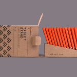
Finchtail is dedicated to the design and manufacture of simple, useful and sustainable solutions to everyday problems. Its first product, a low-cost, flat-packed card tablet and mobile phone stand, features a distinctive brand identity and packaging design treatment developed by UK based graphic design studio Believe in. Monospaced type and corrugated card sit alongside die cut detail, white ink, a bold pattern and a bright dyed board, carefully balancing moments of utility, quality and aesthetic flourish. Alongside visual identity and packaging design, Believe in went on to create point-of-sale, website, marketing materials and a stop-frame video in collaboration with Thank You Mam.
uBear designed by Hype Type Studio & Mash Creative
Posted: Filed under: Packaging Reviews, Technology | Tags: Best Packaging Designs, Black Block Foil, Brand Identity, Brand Identity Design, Branding, Branding Blog, Business Card Design, Colourful Business Cards, Creative Packaging, Designed by Mash Creative, Designed in California, Fluorescent Ink, Logo Design & Branding Blog, Mobile Phone Accessory Packaging, Negative Space Logos, Packaging Company, Packaging Design Blog, Packaging News, Packaging Opinion, Responsive Websites, Sans-serif Logotypes, Spot Colours, Stationery Design, Technology Logos, Technology Packaging, The Best Brand Identities of 2014, The Best Logo Designs of 2014, Visual Identity Design Blog, Website Design Comments Off on uBear designed by Hype Type Studio & Mash Creative
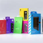
uBear is a high-end mobile phone, tablet and laptop accessories business located in Los Angeles, California. Their visual identity, developed by Hype Type Studio and Mash Creative, included a new logo, stationery set, packaging and responsive website.
By utilising the bold graphic detail of diagonal stripes, sans-serif type, a bright and diverse colour palette, fine diagrammatic illustration, foils and varnishes and a simple bear icon, Hype Type Studio and Mash Creative’s solution effectively infuses familiar technological cues, a robust and practical industrial sensibility with an accessible, high quality, and distinctive dimension.