Modernist Brand Identities
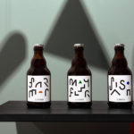
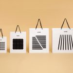
St. ERHARD by Bedow
With a desire to stand out, and in response to the extensive saturation of heritage-related visual cues throughout the German beer market, brewery St. ERHARD worked outside of the country with Swedish studio Bedow to develop a modern graphic identity for three of its brews. Farmer, Mayflower and Saison are premium beers, each of which are crafted, brewed and bottled by St. Erhard in...

Whitlam Place by Studio Hi Ho
Whitlam Place is a collection of eleven residencies located in Fitzroy, Melbourne, developed by Milieu Properties and completed this year. The residencies are described as being ideally positioned within a leafy pocket of the city’s most vibrant cultural precinct, and feature views of the adjacent Whitlam Place gardens, Fitzroy Town Hall and city skyline. the residencies were designed to engage with the historic...

Edition by South
Edition is a new property development by LEP Construction. It will be located in Parnell, a suburb of Auckland, New Zealand, and made up of 18 luxury apartments designed by architects Monk Mackenzie with a eye for flexible space and changing natural light. Edition will make the most of a sloping site, feature three levels cantilevered above ground and create what are described as...
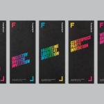
Frameline 41 by Mucho
Frameline is an American nonprofit arts organisation and the world’s longest running LGBTQ film festival. Frameline continues its mission, since its founding in 1977, to change the world through the power of gay cinema, and to connect filmmakers with audiences locally and internationally. Graphic design studio Mucho worked with Frameline on its visual identity and campaigns for its 40th and 41st LGBTQ...
Corps Reviver & L’Heure du Cocktail by Spin
Corps Reviver is a French publisher and revivalist, redesigning and reprinting classic literary works, the first of which is L’Heure du Cocktail, The Cocktail Hour, written by journalists Marcel Requien and Lucien Farnoux-Reynaud and originally published in 1927. L’Heure du Cocktail, at the time, revolutionised the cocktail book, approaching the subject in a new way. This 2017 bilingual edition, presented in French and English,...
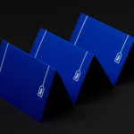
Roger Burkhard by Lundgren+Lindqvist
Roger Burkhard is a creative web development and interactive studio based in Bern, Switzerland, with a roster of clients throughout the creative industries. The studio worked with Scandinavian designers Lundgren+ Lindqvist on the development of a new brand identity. This included monogram, brand guidelines and website, as well as a stationery set that covered business card and promotional cards, letterhead,...
George + Powlett by Studio Brave
George + Powlett is a residential property development of 11 apartments, created by ICON Developments, and located in East Melbourne. ICON’s properties are described as having a precision and balance, and this continues through to their latest project, which was designed by acclaimed architectural practice Powell & Glenn. The development is set within an environment of what is described as a place of elegant contrasts. This can...

Lundén Architecture Company by Tsto
Lundén Architecture Company is a Helsinki-based design studio developing innovative structures, infrastructures and spaces. The studio, through their knowledge of strategic development, experimental building technology and urban design, drawn from their collaborations with experts from different fields, offer proposals that affect the future of the built environment. Projects have included a new school and community complex that inspires learning during...
Artek Helsinki by Tsto
Artek is a Finnish furniture and product design business and retailer with a flagship store in Helsinki. It was founded in 1935 by architect Alvar Aalto and wife Aino Aalto, the arts promoter Maire Gullichsen and art historian Nils-Gustav Hahl. Artek grew alongside and shared many of the qualities of the 20th century modernist movement, blending art and technology, and making the...

Modern by Dwell Magazine by Collins
Modern by Dwell Magazine is a new range of home decor products, tablewear and furnishings for those who want to create a welcoming space with a modern aesthetic. It is a collaborative project between design and architecture magazine Dwell, designers Chris Deam and Nick Dine of Deam+Dine, and the American retailer Target. The range features over 120 products. From chairs, tables and glassware to kitchen utensils,...
Run Mfg by Perky Bros
Run Mfg is an independent race design and production company, creating unique running events with a high-level of detail and creativity, founded by husband and wife team Nathan Barnhart and Elaine Lau working from their studio in Chicago. Nathan and Elaine commissioned graphic design studio Perky Bros to develop a brand identity that would link a variety of printed collateral,...
Superkül by Blok
Superkül is an Canadian architectural firm with a portfolio that is described as having an understated boldness, subtlety and spacial richness, and a process that intends to find the essence of each project and remain true to this throughout design and development. Superkül has won many awards and is considered one of Canada’s most progressive architecture firms. To celebrate their first...