Modular Logos
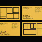
MOAA Architects by Inhouse
MOAA Architects was founded in 2010. It has an office in Hamilton, New Zealand, and a portfolio of new builds and renovations that span the residential, education, commercial and public sectors. Highlights include their work on St. Johns Church, a square plan rotated 9 degrees off the street grid, and Piako House, a renovation and extension of 1940s domestic planning to meet a 21st...
Design Museum by Bond, Finland
Designmuseo is a Finnish design museum, housed in a late 19th century building by architect Gustaf Nyström, and located on Helsinki’s Korkeavuorenkatu Street. The museum exhibits national and international work from the fields of fashion, industrial and graphic design, and, alongside its permanent exhibition of Finnish design from 1870 to the present, also hosts a variety of temporary exhibitions throughout the year....
Ridley by RE:
Ridley is a pioneer of digital architectural services and operates as a central hub from which builders, developers and architects can collaborate. Originally established, and continuing to operate as an architectural documentation specialist, Ridley, from its premises in Australia and the Philippines, has also grown to become a leader in Virtual Design Construction. This is a practice that involves attaching live...