Fonts in Use: Montserrat
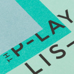
The Playlist Co. by Blok
The Playlist Co. is a Canadian business providing music management and consulting services, AV construction, live music and playlists for a wide range of spaces and events, nationally and internationally. They are renowned for their encyclopaedic knowledge of music, and have collaborated with a some of Canada’s top hospitality brands, as well as local bars such as Buca, Canoe and Bar Raval. The Playlist Co....
Ridley by RE:
Ridley is a pioneer of digital architectural services and operates as a central hub from which builders, developers and architects can collaborate. Originally established, and continuing to operate as an architectural documentation specialist, Ridley, from its premises in Australia and the Philippines, has also grown to become a leader in Virtual Design Construction. This is a practice that involves attaching live...