Designed by Moruba
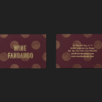
Wine Fandango by Moruba
Drawing inspiration from New York neon, and its show business associations, graphic design studio Moruba have developed a new brand identity treatment for Wine Fandango, a restaurant and wine bar, located in the Spanish city of Logroño, that features a rich interior design of textured glass, wood floors and furniture, ceramic tiles, exposed brick and gold fixtures. Wine Fandango’s identity is made up of custom typography and logotype, patterns,...
Le Naturel by Moruba
Le Naturel is an all-natural wine created without the use of sulphites by Spanish producer Vintae. Vintae describes itself as an innovative, young and dynamic enterprise, representing the avant-garde and revolutionising different aspects of the wine-growing industry. The wine’s packaging, developed by Moruba, embraces an unusual and distinctive change in communicative priorities, discarding the perceived high qualities of foil and tactile papers, verbose narrative, the...