Designed by Neue
Sing King by Nomad
I’m going to break with a decade of convention and jump right in. I love this. I was sold as soon as I saw the logo, it’s in the BP&O Gallery. It’s rare you see this kind of logo today. It’s mostly, and understandably, logotypes that prevail today. Those that are striped down to function well on multiple devices. Blanding?...
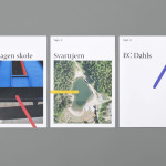
Den Norske Filmskolen by Neue
Den Norske Filmskolen (The Norwegian Film School) provides a broad range of practical film courses taught by a full-time teaching staff and guest lecturers and instructors with active careers in the national and international film industries. It is the only one of its kind in Norway, developed as a separate department at Lillehammer University College in 1997 and now part of Inland Norway University of...
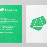
Altaskifer by Neue
Alta Quartzite is a natural building material quarried from the mountains of Norway’s Alta region with a unique green/grey colour, fine texture and hard wearing non-slip properties. These make it a good choice for both interior and exterior applications, from roofing, paving and staircases, to roads and walkways. Although it is material with a long history of use it is...
Hegel Music Systems by Neue
Hegel is a Norwegian amplifier, pre-amplifier and multi-media player business with a proprietary Error Correction System that limits harmonic distortion without compromising other parameters. Established in the early 1990’s, Hegel has grown to become a well-established supplier of high-end hi-fi products, nationally and internationally, and is committed to sound reproduction that adds nothing (or as little as possible). This is the foundation of their new packaging...
Norwegian Academy of Music by Neue
Located in the Majorstuen district of Oslo The Norwegian Academy of Music is Norway’s largest music academy. It offers both undergraduate and post-graduate courses, has educated some of Norway’s most prolific musicians, and, according to Wikipedia, ‘attempts to lay the foundation for research within the various fields of music’. Based around the concept of an ‘endless visual pulse’, design agency Neue developed a new generative...
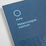
Meteorologisk Institutt by Neue
Meteorologisk Institutt provides meteorological data to Norway’s military, civil services and the general public with the intention of safe guarding life, property and the environment. Design agency Neue developed a new visual identity solution for the institute that mixes geometric shapes, material and print choices and the humanistic and environmental detail of photography to achieve communicative and aesthetic contrast and capture the data drawn from...
Tegn_3 by Neue
Tegn_3 is a Norwegian, multidisciplinary, architecture design studio that, through inclusive methods, process-oriented and competent project management, deliver holistic solutions that encompass the fields of architecture, planning and landscape, to large clients across Scandinavia. Their visual identity, developed by Neue, draws together the themes of technical knowledge, structure, connections, collaboration and creativity through neutral typography, a modular and expanding geometric...
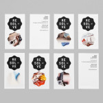
Resolve by Neue
Resolve is a Norweigen provider of a broad selection of cleaning and restoration services to both the commercial and private clients covering asbestos removal, fire and water damage mitigation and ventilation cleaning. Their new identity, designed by Oslo based Neue, rejects that hard industrial aesthetics of the sector in favour of a softer, people led proposition....

Norwegian Shipowners’ Association by Neue
Norwegian Shipowners’ Association is a group of businesses that collectively employ over 55,000 seafarers and offshore workers from more than 50 different nations. The association’s new visual identity, created by Oslo based design agency Neue, captures the open sea and sense of knowledge and experience with a two colour square and traditional serif combination....