New Logo
Kettle Kids by Two Times Elliott
The once laudable claim to have started a thriving business with ‘a small loan’ from a doting family member may have been muddied beyond recognition by the truth-stretching of serial tax-offender and part-time Presidential candidate Donald Trump. Despite this, turning ‘one thousand pounds from nan’ into a luxury watch and diamond dealership with a sparkling flagship store in Mayfair remains...
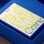
Crane by Collins
In 1775 Crane paper was used to print the first money for the American colonies, and by 1801 the company was the primary paper producer for local and regional banks. Later that century, equipped with an arsenal of innovative techniques from Europe, Crane won a contract with the Bureau of Engraving and Printing and became the supplier for the US...
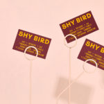
Shy Bird by Perky Bros
Shy Bird is a all-day café, rotisserie and bar in Cambridge, Massachusetts. Its core mission is to elevate chicken, and the experience of eating chicken into the realms of the exceptional through gastronomic know-how, a beautiful interior and a visual identity designed by American studio Perky Bros. Drawing their inspiration from the red junglefowl, the “original chicken” and descendant of the domestic chicken, and...
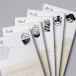
Hanji by Studio fnt
Hanji is a new brand of traditional Korean papers from KCDF created to, not just inspire interest in both professionals and the general public nationally and internationally, but to also serve as a symbol of the craft inherent to the paper making workshops. And further, to promote the paper’s potential and excellence internationally. Hanji began as a basic paper, a material...
Oji by Seachange
Oji is a sushi brand of firsts. It is the first in New Zealand to use fully recyclable and biodegradable packaging and the first to use all free-range products. This is a significant move forward and marks the brand out from well-established competitors. Oji opened in New Zealand with two locations in Auckland’s Commercial Bay, a place where they source...
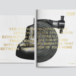
Brigade Court by Jack Renwick Studio
In The London Borough of Southwark sits the Grade II listed building and former headquarters of the London Fire Brigade, the city’s first fire station and a site currently under development. This will see it transformed into residential apartments with period conversations of the original Victorian building alongside a modern new-build. It is a one-of-kind property development that offers a...
Northstar Film Alliance by Bond
North Star Film Alliance (NSFA) is a joint venture between Estonia, Latvia and Finland. The Alliance intends to develop and promote themselves as one filmmaking region to international film and TV productions. It is a competitive marketplace, with other countries provide low tax rates and incentives to film big-budget spectacles on their stages using local crews. Together, the three countries...

Norwegian Banknotes by Metric Design
If you consider all the tangible expressions of a country’s brand, money, with its essential function as a measure of value, could easily be considered one of the most important touchpoints. In this sense a country’s banknote is often the first point of physical contact with that place prior to travel. The shape, feel, colour, language, security features, artwork and heritage of...
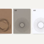
AIR Studios by Spin
AIR Studios was founded in 1965 by Beatles producer Sir George Martin. It is located in London’s Lyndhurst Hall, a former church with one of the largest recording rooms in the world and a live space capable of holding a full symphony orchestra. Since its opening, it has hosted a plethora of world-class talent. These have included Sir Paul McCartney, Adele, The...
OneFourFive Clarendon by Studio Brave
OneFourFive Clarendon is a modern workspace, developed by Salta, designed by Architectus and created for future-focused businesses looking to situate themselves in Southern Melbourne. The development aims to attract like-minded progressive people with a conscious focus on connectivity and local activity. With this in mind, Melbourne-based Studio Brave developed the narrative ‘A Life Unlimited’ as a way to express how the...

Chus x Chus by Pentagram
Spanish jewellery designer Chus Burés is recognised for the avant garde quality of his work and his ongoing collaborations with a wide variety artists and designers. These have included American-French artist Louise Bourgeois, American-Cuban painter Carmen Herrera and French fashion designer Agnès B. Working with those in the fields of contemporary art, fashion, cinema and music, Chus Burés has developed...
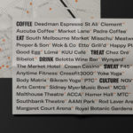
BBC Creative by Spin
With the intention of being the most creative organisation in the world the BBC has developed its own in-house agency, BBC Creative, to develop cross-platform marketing materials such as trails and idents to engage with a global audience and bring to their attention the vast range of BBC programmes and services available. To express this unified vision and creative potential, BBC Creative worked...