Everybird by Marx Design
Few products have successfully integrated ethical, sustainable and environmental concerns with a product than coffee. It’s hard to imagine a time when the conditions of cultivation (both human and environmental) were not equal to flavour and – if we’re getting technical – whether the roast is blended or single origin. With its smaller volumes, the speciality coffee market has challenged...
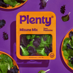
Plenty by &Walsh
Agricultural practices are constantly changing to provide greater crop yields. In an effort to achieve this goal, modern farming has created a host of ecological side effects. Most notably, overconsumption of water and a reliance on chemical fertilisers, GMOs and pesticides. Plenty is an indoor vertical farm providing green produce to the masses through sustainable practices, using less space and...
Logo
Cottage M by Saint Urbain, 2022
A production ‘house’ called ‘Cottage M‘. The name is the logo and the logo the name. A simple idea. Light and shade, positive and negative space, counter-balance, dimensionality, the typographic and the pictorial are effectively employed by Saint Urbain to generate a unique and memorable form. The mind jumps between the two, a simple aha-moment serves memory and recall. iIs...
Logo
Simon Pengelly by Spin, 2015
Drawing inspiration from one of Simon Pengelly’s plywood chairs, and specifically ‘the elegant but bold stripes on the edge’ Spin constructed a ‘P’ from a pattern and varying number of vertical lines. From this, a behaviour of expansion and contraction allowed the logo to ‘inhabit different contexts and spaces’ mirroring the considerations of contemporary furniture design. See more of this...
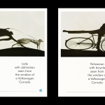
BP&O Voices
Paul Belford on Ads:
VW Corrado press & poster
A guest article from Paul Belford on BMP DDB’s press and poster for the VW Corrado (1990). BP&O Voices presents the opinions of industry experts on a wide range of topics....
Logo
Human Appeal by Johnson Banks, 2018
Although based in Birmingham the charity Human Appeal has a global impact, working to deliver immediate aid where it’s needed most. This urgency, and a common global humanity is brought together and expressed by a typographic and universal pictographic gesture that represents a cross-border initiative. Angled, Johnson Banks effectively develops an ‘H’ and figure into a distinctive and single unified...
Logo
The Magical Mushroom Company by North, 2020
The Magical Mushroom Company is the first company manufacturing mycelium-based packaging in the United Kingdom, offering a vital alternative to polystyrene and plastics. ‘To grow protective packaging at any scale’ is the proposition, and this is beautifully represented by a growing ‘M’. The logo, designed by North, cleverly moves from an initial impression of being organic and toward the realisation...
Pursue Hard Seltzer by OlssønBarbieri
New products, new markets and new consumer groups generate new aesthetics – or, at least, you would hope so. Too often, style migrates from one category to another, or the identity of a sub-culture (visually speaking), is exploited in a commercial context. This is where ‘authenticity’ emerges, to support genuine origin credentials, or to mask the appropriation with narrative context....
Logo
Renault by Gilles Vidal, 2021
In branding, to go back is to go forward. This has often been to return to simpler times (read: understandable), channeling a nostalgia and conjuring up romantic visions of the past. The past can evoke strong emotions, but it also contains some practical insights that remain relevant today. Functional requirements of a logo such as ease of use, flexibility across...
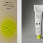
Soft Services by Decade
Skin is the human body’s largest organ while skincare is the fastest growing segment of the beauty industry. Yet with all their promises of ‘dewy’, ‘glowing’ and ‘blemish free’, most products on the market, are focused on the face. Direct-to-consumer business Soft Services creates skincare products for specific body skin problems, such as acne, ingrown hairs, stretch marks and fungal...
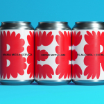
Mama Mexa by Seachange
Tacos are a Mexican staple, consisting of a small hand-sized corn or wheat-based tortilla topped with a range of fillings. They make for perfect on-the-go food, packed full of flavour. This combination of convenience (quick to make or eat) and tastiness has seen the traditional dish rise in popularity as an ideal product to package and sell in many markets....
Logo
Extinction Rebellion by ESP, 2011
Designed in 2011 and appropriated, with permission, by Extinction Rebellion in 2018 the XR logo is dramatic in its form-language, employing an hourglass motif to signal the imminent threat climate change poses. That this also forms an X and placed within a ‘globe’ reinforces a collective urgency. Elemental forms and a consistent line weight offers an exceptional functionalism, capable of...