Paper Marquetry Business Cards

David Collins Studio by Bibliothèque Design
David Collins Studio is an award-winning interior architecture practice working with brands, businesses and private clients who share their passion for detail, craft and refinement. These include Harrods, Nobu Berkeley, The Connaught Bar and those working within the hospitality, residential and retail sectors. The studio’s work is described as being iconic, timeless and having a dramatic glamour rooted in a...

FranklinTill by Commission
FranklinTill is a futures research agency working with lifestyle brands, design-orientated businesses and organisations in a variety of sectors to explore and implement design, material and colour innovation. Their services include conducting, analysing and communicating research and bringing this to life through strategic insights, publications and experiences. FranklinTill’s clients essentially turn to them for insight into form, colour and material, and their...

Tale London by Two Times Elliott
Tale London creates photorealistic renderings for both interior design and architectural clients across a diverse range of projects, from the traditional and rich to the modern and simple. Their sensitivity to both exterior structure and interior materiality, as well as associated considerations and a stylistic breadth is expressed by Tale London’s visual identity, designed by Two Times Elliott, in the graphic...
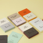
G . F Smith by Made Thought
G . F Smith is an independent British paper merchant with a heritage dating back to 1885 and a loyal staff, some of whom have provided over 20 years of loyal service. Made Thought, the design studio behind the visual identity for G . F Smith’s distinctive Colorplan range, were recently commissioned to develop a new brand identity for the company that would better...
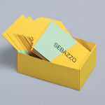
Sebazzo by Bunch
Sebazzo is the London based interactive studio of digital design duo Sebastien Hefel and Michael Azzopardi. The studio creates applications, websites and generative installations for a variety of brands and specialises in ‘innovative e-learning environments’. Design agency Bunch recently created a visual identity and stationery solution for Sebazzo that conveys digital design as a craft and the duality of the partnership...