Photography
Sigma by Stockholm Design Lab
You could argue that there’s a fair few similarities in terms of Japan and Sweden’s approach to design, and the aesthetics of life more generally. Both are known often for a specific kind of minimalism – a tastefulness that eschews fluff, luxuriates in crisp whites and keeps its edges, everything in its right place, rules and order and form following...
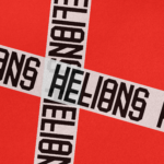
Helions by Pentagram
HELIONS… now that sounds impressive. Something to do with helium atoms and stellar fusion, the force that powers stars? Or perhaps it’s invoking Helios, the Greek god of the sun, blazing his chariot across the sky? Nope – it’s actually a tribute to Helions Bumpstead in Essex, a beneficiary of the British gift for naming that also gave us Pratt’s...
Logo
Stephen Ambrose
Paul Belford Ltd
2022, UK, Photography
Next To The Ocean by Lundgren+Lindqvist
Valand Academy in Sweden offers a complete range of undergraduate, postgraduate and artistic research opportunities. This is a unique educational environment, the only one of its kind in Sweden. Next to the Ocean is an exhibition of works created by 23 of the students from the BFA, MFA and research programmes, which was held at Röda Sten Konsthall in Gothenburg. The exhibition serves...
Lukas/Markus – Kalle Sanner by Lundgren+Lindqvist
Lukas/Markus is a decade-long photographic project by Kalle Sanner shot with a large format camera and exploring the mirrored and connected chapels of Saint Lukas and Saint Markus designed by architect Sven Brolid. The structure was built during the 1960s, a period when Swedish functionalism was at its height, and is located in the Western Cemetery of Gothenburg. The book,...
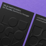
Loupedeck by Bond
Loupedeck is a Finnish startup and photo editing console designed to make the process of image manipulation faster in Adobe Lightroom for both Windows and Mac users. It is described as being an intuitive replacement for keyboard and mouse, is mapped exactly to Lightroom to encourage creative spontaneity and experimentation, and suited to beginners and professionals alike. To help establish and...

Gustav Almestål by Bedow
Gustav Almestål is a Swedish still life photographer who has built an extensive, high-profile and international client list that includes the likes of Electrolux, Wall Street Journal and Hermes. He now works from Stockholm, following several years in London, on projects that range from advertising and editorial to food and interiors. The design of Gustav Almestål’s visual identity, which rested in the hands of Swedish...
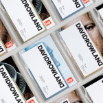
David Rowland by ico Design
David Rowland is an award-winning and straight-talking London-based photographer who has been capturing images for leading brands and agencies for over two decades. With a desire to remind existing and potential clients of his expertise and technical know-how David worked with graphic design studio and client ico Design to develop a new brand identity and supporting collateral. This included, alongside a new logotype, business...
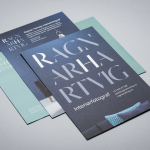
Ragnar Hartvig by Commando Group
Ragnar Hartvig is a renowned Norwegian photographer with over 20 years experience and a strong network of collaborators. Clients have included leading furniture manufacturers, magazines and books, as well as interior and product designers. Ragnar Hartvig worked with Oslo based graphic design studio Commando Group to develop a new brand identity that would convey some of his personality, skillset and experience...
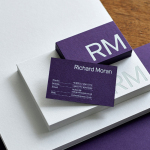
Richard Moran by Journal
Richard Moran is a lifestyle and portrait photographer with over 25 years of experience. He has worked with international businesses such as GSK, Pizza Express and Grey Goose Vodka, and secured a reputation as a passionate, straight-talking professional with a meticulous attention to detail and a portfolio of high-quality and emotive work. With a desire to communicate this and with the intention of...
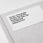
Pia Ulin Photography by The Studio
Pia Ulin is a Swedish photographer, working between New York and Stockholm, who has built a considerable reputation from her daylight-only approach. This is said to infuse her images, which cover interior, lifestyle and still life, with a warm and natural quality. As well as producing editorial photography for publications such as Dwell, Martha Stewart and Elle Decoration, Pia has also contributed...
David Ryle by S-T
David Ryle is an internationally recognised and award-winning photographer with a studio in London. He has a portfolio of work that includes shots for The Sunday Times Magazine, JWT and Saatchi & Saatchi, and is represented across Europe and America by management agency The Peter Bailey Company. Drawing on his attention to detail and relentless pursuit of quality, design studio S-T developed...