Postcard Design
FitzJohn’s by DutchScot
When my partner and I first moved to London in 2014, surviving on scarcely more than minimum wage, it obviously seemed like a sensible idea to rent in Hampstead. We’d heard of the Heath, and were familiar with the Northern Line. The flat, apparently once a Sex Pistols’ squat, was tiny and hadn’t improved much since the 70s. Back then...
TWELV. by Seachange
Maybe the recent explosion in astrology is thanks to a more secular society; or a post-Covid sense of generalised uncertainty that’s left us grasping for answers. Perhaps it’s the rise of Instagram/TikTok influencers; or maybe it’s just because its foundations lie in astronomical reality that’s been harnessed by civilisations stretching back tens of thousands of years. Whatever it is, where...
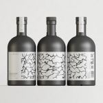
Still Waters by Makebardo
There’s a drink for all occassions. Could be with friends, out at a bar, in a restaurant, perhaps alone. There are also drinks that you might expect to take you away from the everyday, perhaps to a quieter more tranquil place, where torrent of ice water meets the churn of the sea. Still Waters, a New Zealand distilled gin and...
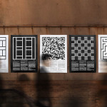
Cult 20 Years, Event & Exhibition by Toko
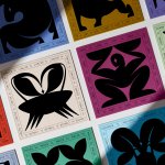
In 2017 Australian furniture retailer Cult celebrated its 20th anniversary. They marked this with an event and exhibition and worked with design studio Toko to develop a graphic identity to unify these and bring to light their extensive catalogue. Through a mix of bright illustrative silhouettes across invitations, packaging, postcards, flags and banners, the art direction of some Cult’s ranges, and...
M11 studio by Inhouse
M11 studio is a luxe salon, located in the heart of the fashion, shopping and entertainment district of Newmarket, Auckland, that references the refinery of a Tom Ford fashion boutique. It has a well-proportioned, spacious, linear and light filled interior of large mirrors, strip and spot lighting, white and black walls, gold fixtures, concrete surfaces and robust furniture developed by...
Paul’s at Haymarket by 25AH
Paul’s is a restaurant located in the Haymarket hotel which is situated at the heart of the Swedish capital of Stockholm. The restaurant is named after Paul U. Bergström, founder of a well-known department store that previously occupied the building, and features a distinctive period interior of bent wood chairs, white tiles, leather banquette seating, marble surfaces and art deco-inspired flourishes. This...
James Cohan Gallery by Project Projects
James Cohan is a contemporary art gallery with two locations in New York, one in Lower East Side and the other in Chelsea. Recent exhibitions have included work by artists such as Mernet Larsen, Fred Tomaselli and Beatriz Milhazes, with Philip Hanson and Omer Fast to follow later this year. The gallery recently collaborated with American graphic design studio Project Projects to develop...

The Practical Man by Garbett
The Practical Man is an online retail destination for men’s sports style and fitness, activewear and equipment, but also editorial content that covers reviews, fitness-focused travel guides and in-depth insight into new brands. It curates a catalogue of world-leading products that exist at the intersection of fashion and sports performance, designed by innovative and passionate brands with progressive approaches. Australian graphic design studio Garbett worked with The Practical Man...
Edouard Malingue Gallery by Lundgren+Lindqvist
Edouard Malingue Gallery exhibits work by emerging and established artists from around the world across its 6000 sq ft space in central Hong Kong. Through collaborations with international curators, and its own publications, alongside solo exhibitions, the gallery looks to introduce art into public spaces and to stimulate public discourse. The gallery features an interior that juxtaposes the white unblemished walls and plinths you might...
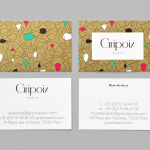
Gripoix Paris by Mind
Gripoix is a Parisian costume jewellery manufacturer with a significant history, one that stretches back to the late 19th Century and the Art Nouveau period. Gridpoix’s pieces are created using a traditional kilncasting technique, known as pate de verre, which sees molten glass poured into a thin linear framework, giving each a luxury and uniquely crafted quality. This traditional process, and the period in which...

From Babies With Love by Paul Belford Ltd
From Babies With Love is an organisation that sells organic baby clothes, blankets and accessories, as well as a range of greetings cards online. The money raised from the sale of these goes to SOS Children’s Villages, a scheme that supports babies who have lost parents to war, famine, disease or poverty, by placing them with families and within communities that are safe and stable. London based Paul...

Hardpop 7 Years by Face
Hardpop is an electronic music venue located in the Mexican city of Juárez. It plays host to both international and national DJ’s and has been acknowledged twice by DJ Magazine as one of the best clubs in the world. Hardpop’s brand identity, a contemporary interpretation of military insignia, and a mix of conventional and unconventional typographic forms created by graphic design...