Edouard Malingue Gallery by Lundgren+Lindqvist
Opinion by Richard Baird Posted 8 September 2015
Edouard Malingue Gallery exhibits work by emerging and established artists from around the world across its 6000 sq ft space in central Hong Kong. Through collaborations with international curators, and its own publications, alongside solo exhibitions, the gallery looks to introduce art into public spaces and to stimulate public discourse.
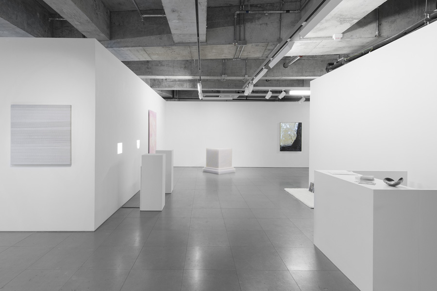
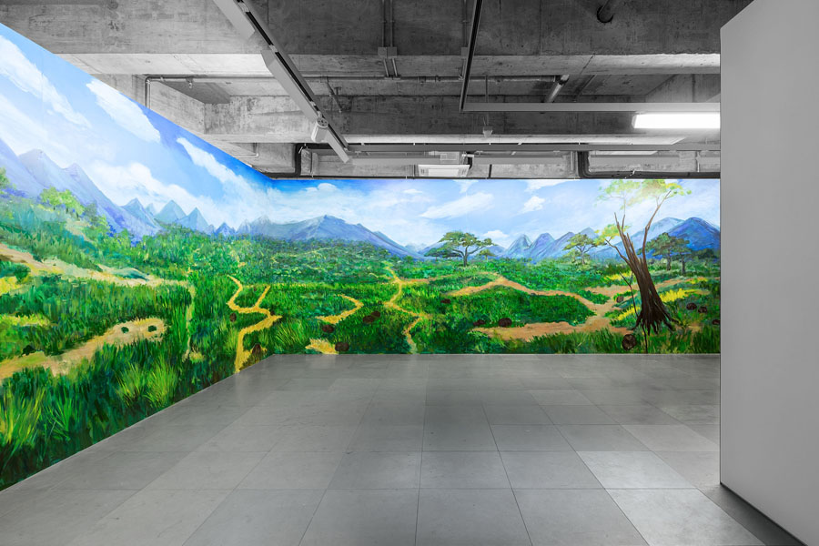
The gallery features an interior that juxtaposes the white unblemished walls and plinths you might expect from a modern art gallery with the irregular qualities and cool greys of cast concrete, exposed utilities, strip lighting above and grey tiles below. It also utilises a visual identity system developed by Swedish graphic design studio Lundgren+Lindqvist. This was launched to coincide with the gallery’s move to larger premises.
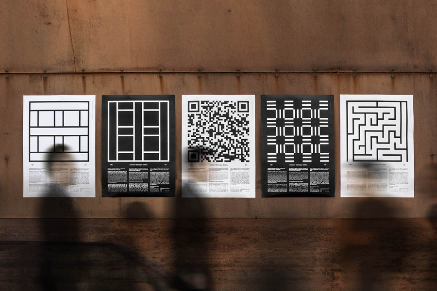
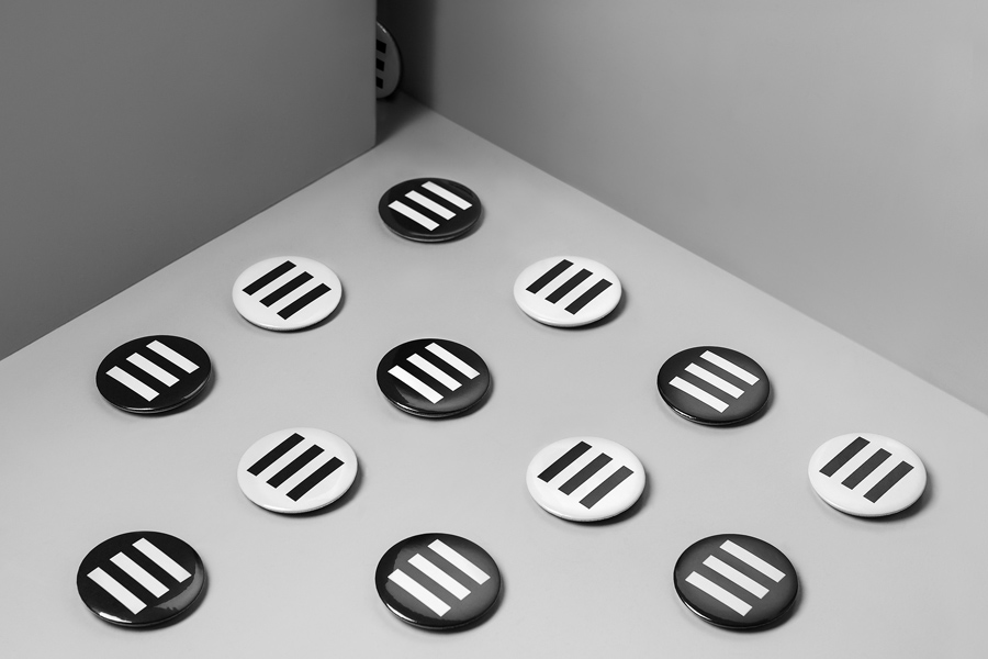
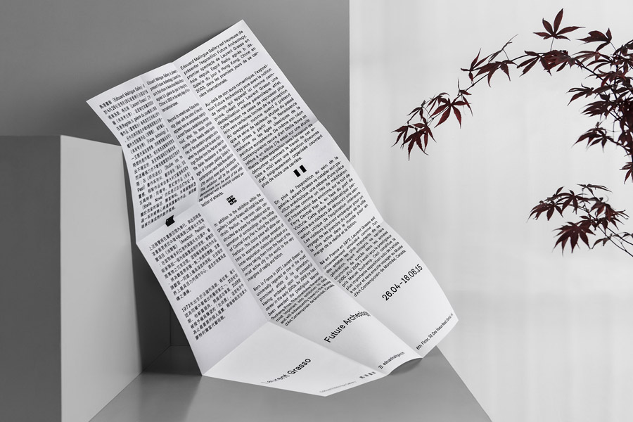
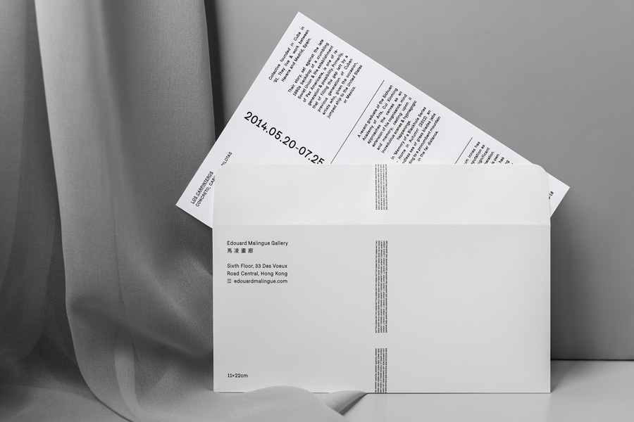
Lundgren+Lindqvist’s visual identity concept makes a connection between the three strokes of a simplified E and M (the initials of Edouard Malingue), the three words that make up the gallery’s name (Edouard Malingue Gallery) and its location on 33 Deux Veux Street. This is visualised as trisections through a grid system which underpins the print and website layout of custom typography, and informs the number folds across leaflets, letters and posters.
Lundgren+Lindqvist’s treatment is perhaps most notable for its absence of some conventions and the extent to which it favours others. This includes the approach to brand identity in general (logo, colour, type), and more specifically, its relationship with the exhibition of contemporary art (space and content).
The absence of distinctive colour palette or logo, the choice of white boards and black ink, plenty of unprinted space, and a preference for an unwavering typographic consistency mirrors the familiar qualities of modern gallery spaces and the few but precise assets that exist within these. Think panels of insight that introduce exhibitions, and the panels of information that are set alongside individual artworks.
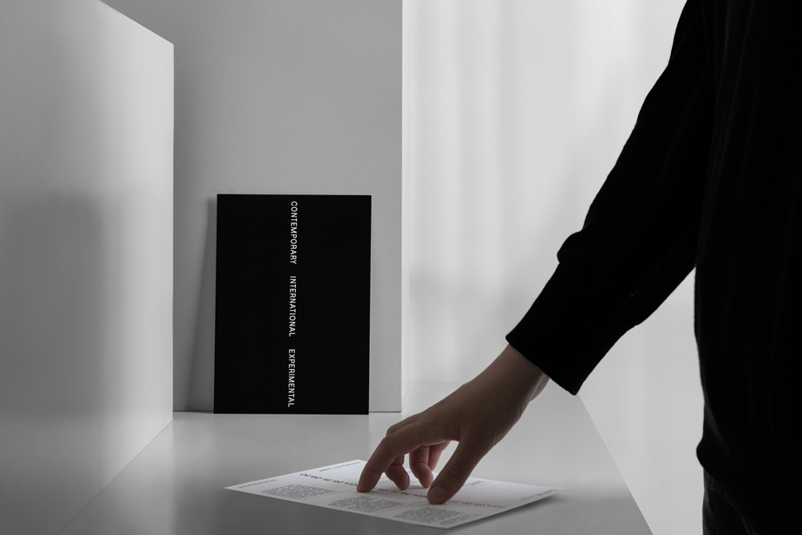
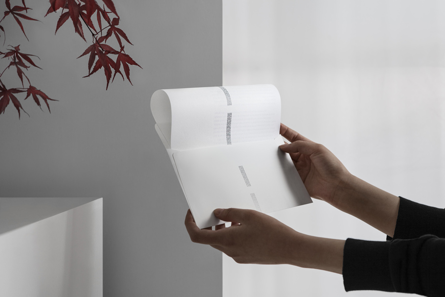
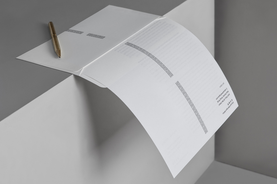
Identity draws from what is available and intrinsic to the gallery experience and its conventions. It does not add to but simply structures written content to form recognisable patterns with the intention of building familiarity, leveraging association and establishing identity. Text becomes texture, body copy becomes shape, and the folding of large format pieces leads to patterns of engagement.
Individual expression for the most part is suppressed, or at least nuanced, with brand identity functioning, much like the gallery space, as a tool to hold, frame and link changing and often disparate content (both insight and image) with a consistent and recognisable system in print and online.
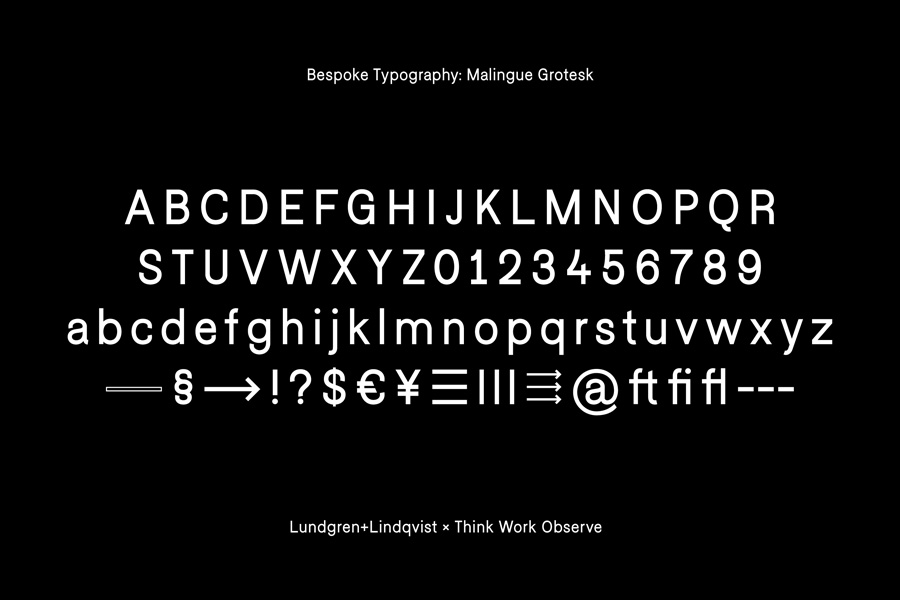
Individual character and gallery neutrality intersect within a bespoke typeface and the consistency of its typesetting. The reductive qualities of Malingue Grotesk, a sans-serif typeface based on a version of Think Work Observer’s Falafel Grotesque, shares some of the restraint inherent to contemporary art galleries, while small details, particularly across the numbers, keep it interesting whilst evoking a feeling of modernity. Memorable aesthetic impact and a sense of experimentation comes from its unusual implementation and placement rather than its letterforms.
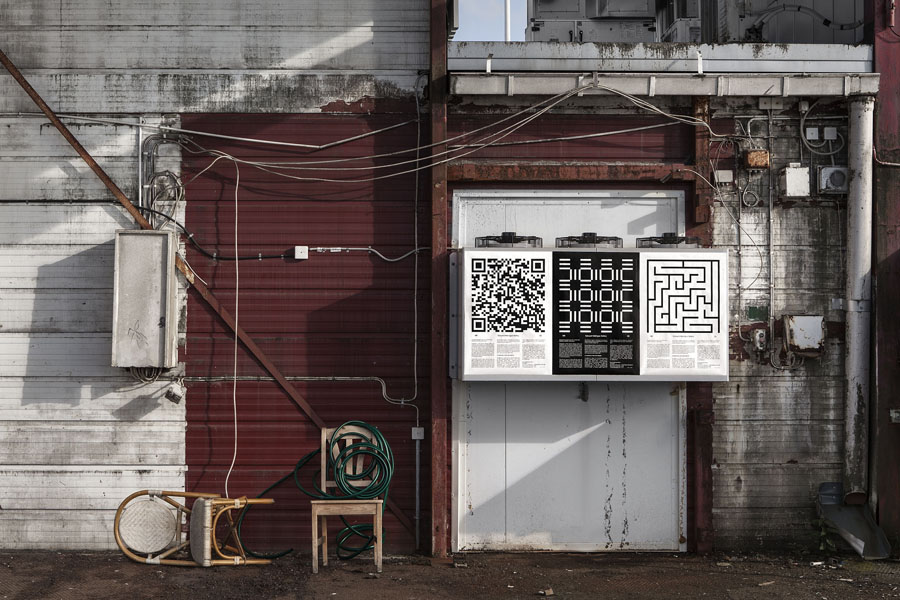
The posters are a departure from the typographic simplicity of the postcards and stationery, and acknowledge the necessities of outdoor communication through large, bold geometric forms to secure impact from a distance, and a layer of informative detail up close. Although the geometric patterns appear perhaps a touch communicatively arbitrary, a curious mix of maze, QR code and shapes that draw on the concept of three, these function well to draw attention.
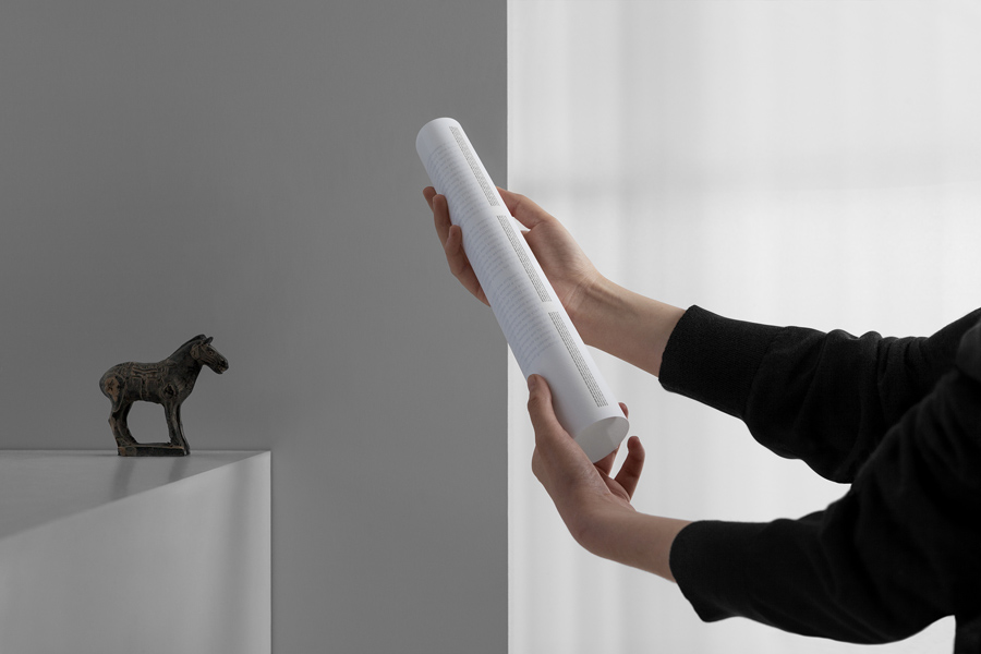
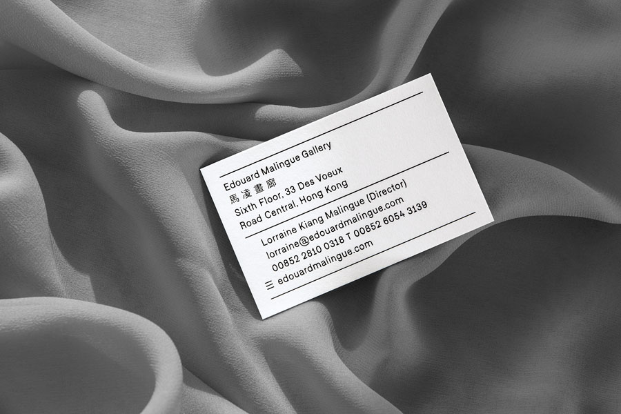
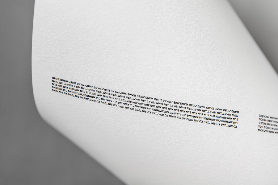
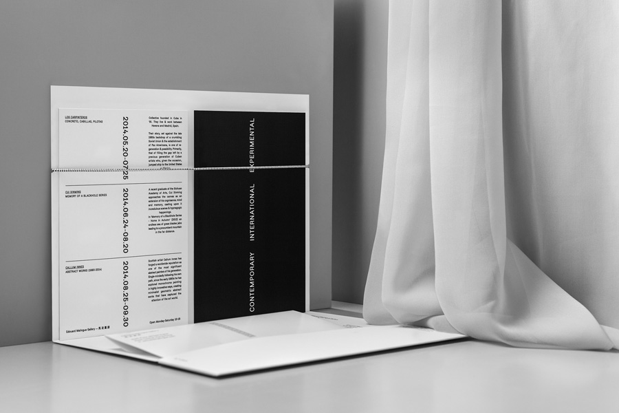
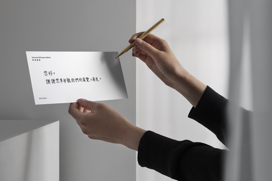
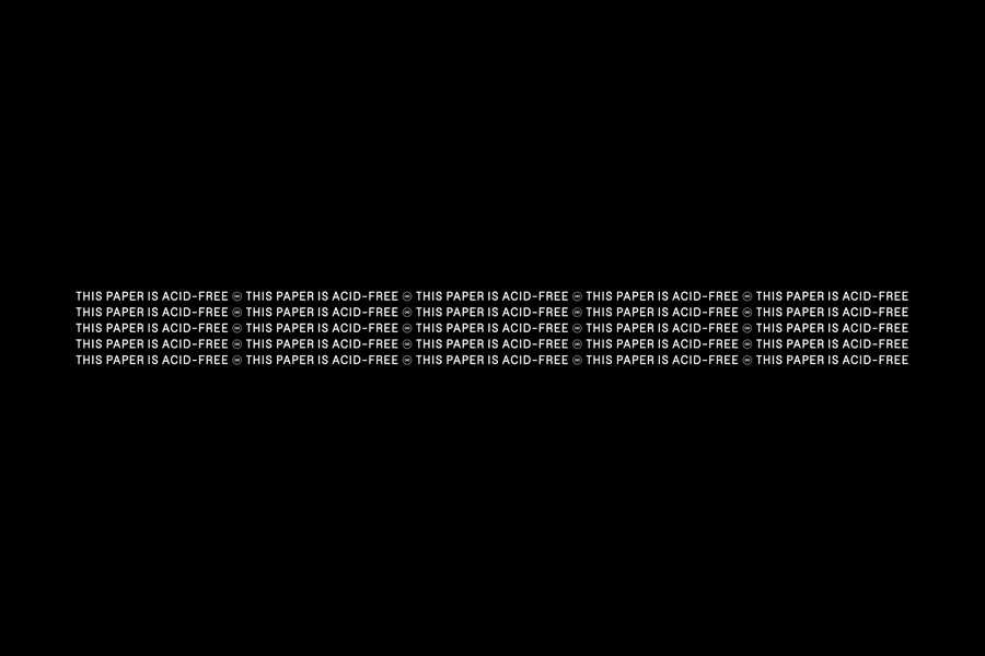
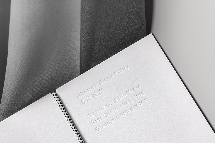
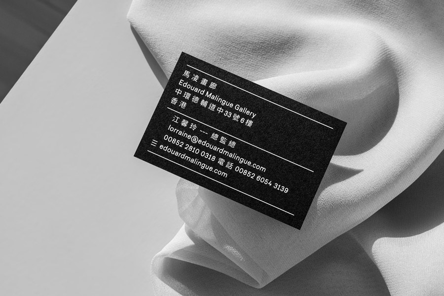
Where graphic detail remains minimal, material choice, weight, transparency and texture, alongside letterpress and blind deboss print finishes add a layer of physical detail without undermining the reductive visual tone of the work, and its ability to frame content.
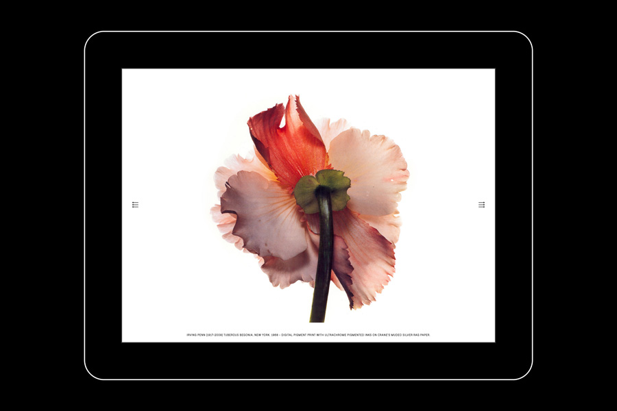
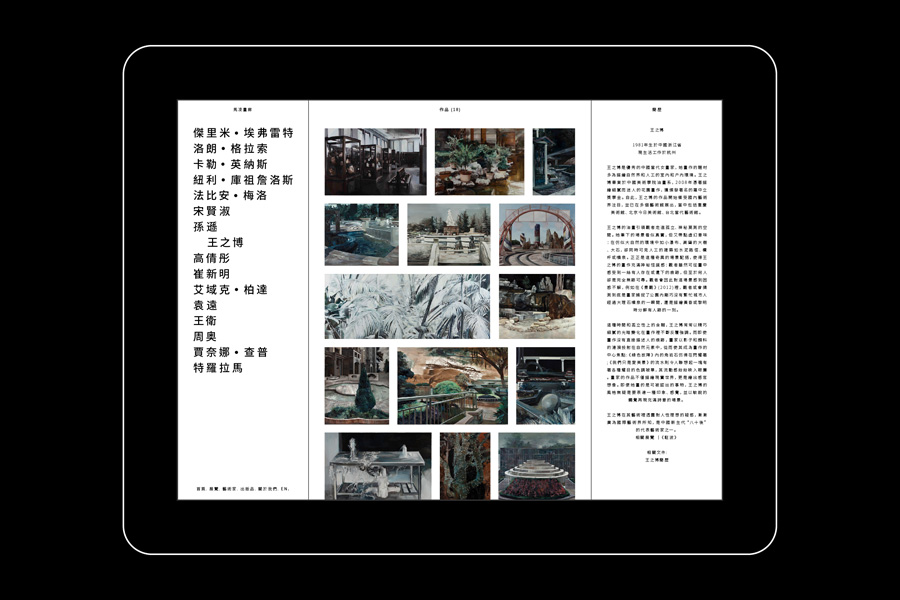
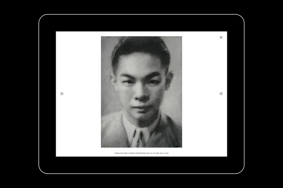
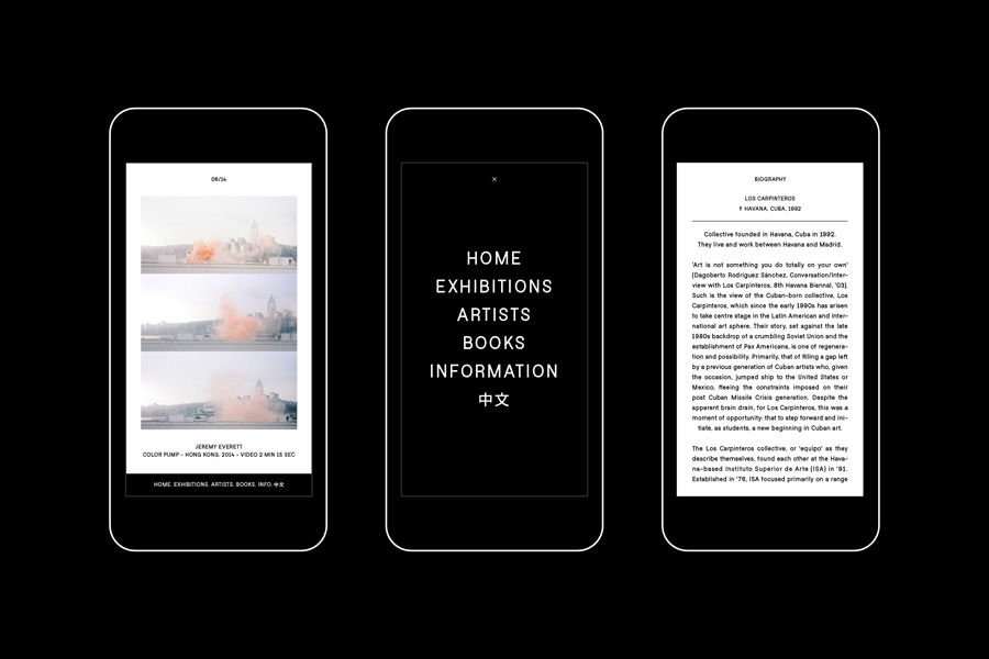
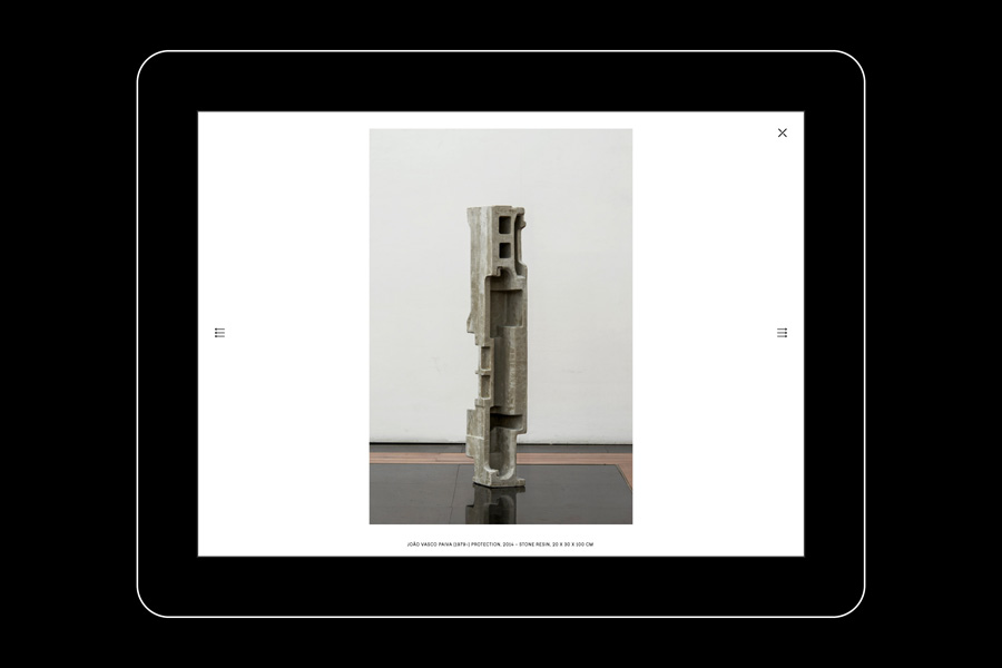
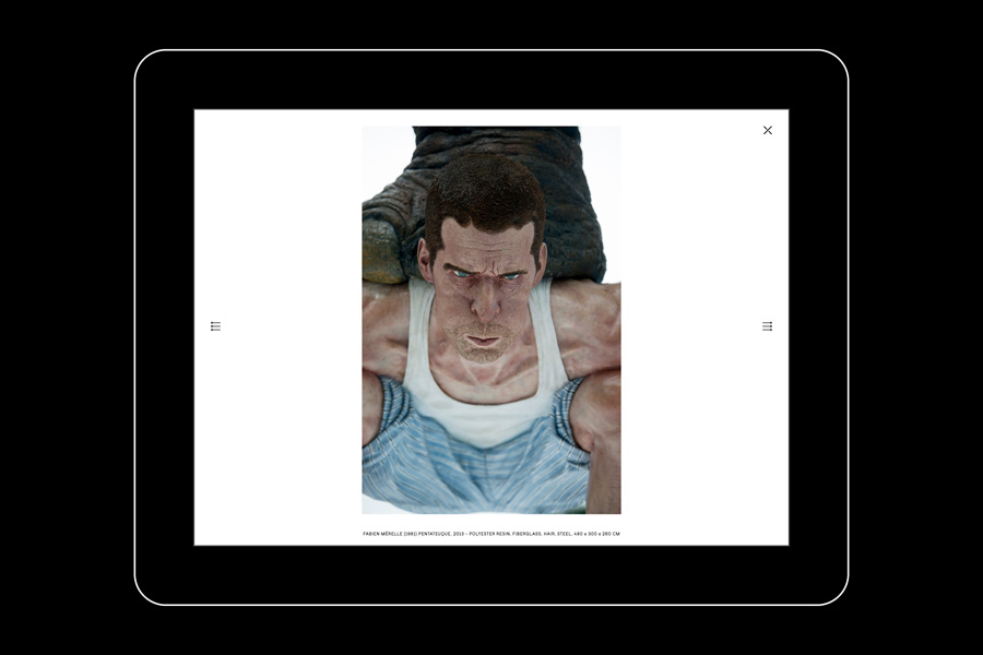
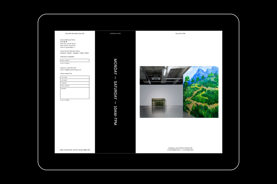
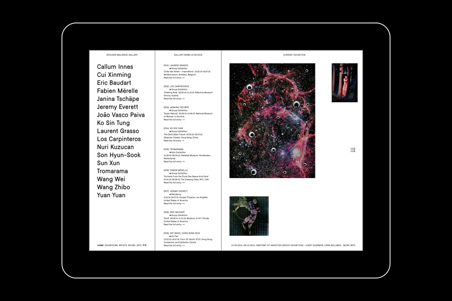
The Edouard Malingue Gallery website features an unusual three column layout, each with individual scrolls, derived from the new identity system, functioning to divide content and using content to reinforce identity.
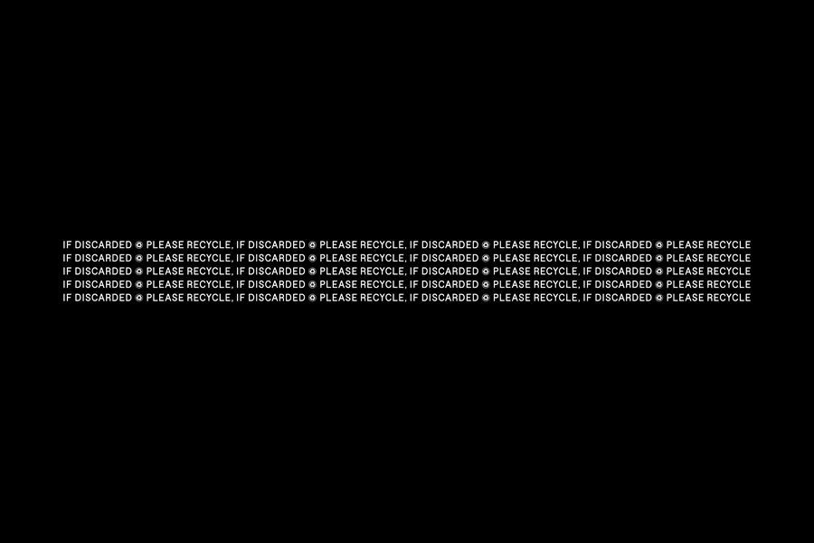
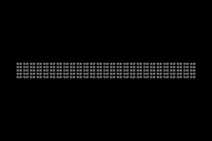
The website feels very closely related to print, sharing a similar typographic and colour consistency and structure. A mix of sentence case and all uppercase, the use of arrows and interpuncts break up text with an academic quality. There are also some nice transitions between three and two column layouts on desktop while image colour and detail punctuates type with moments of visual rather contextual interest, as does the transitions between pages with different column numbers.
The concept of three, while simple in its ideation, creates a foundation from which to link a variety of assets, without the overbearing qualities of a logo, and a process in which to structure content in a way that is consistent and cohesive. It is not conceptually heavy, leans more towards the associative rather than the communicatively explicit, and is content-centric, which is fitting for a gallery. Although for the most part the brand identity is reductive, there are some nice transitions online and finishes in print that layer the graphic simplicity of the idea with a layer of detail. More from Lundgren+Lindqvist on BP&O.
Design: Lundgren+Lindqvist
Opinion: Richard Baird
Fonts Used: Malingue Grotesk (A custom version of Falafel Grotesque)
