Smile In The Mind
Whale Tales by Interbrand
Every year an impressive 40,000 humpback whales travel along the Sydney coastline. This annual migration pattern is one of the many awe-inspiring natural spectacles that make the city so unique. It is fitting then, that the New Sydney Waterfront Company chose to revitalise Sydney’s Western Harbour Precinct with an installation of thirty whale tail sculptures, telling thirty individual stories, or...
Lookbooks by Studio Lowrie
Lookbooks is an online bookstore that specialises in fun and quirky publications of the past. Recent acquisitions include Old Bohemian and Moravian Jewish Cemeteries by Petr Ehl, Arno Parik & Jiri Fiedler, 1991 and 101 Cake Design by Mary Ford, 1987. There is a cultural value to many of these, reflecting a time and particular niche interest, and how these...
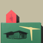
The Architect’s Bookshop by Garbett
The Architect’s Bookshop is a new design-focused retailer, located in Sydney’s Surrey Hills, devoted to the books of architecture and interior design, landscaping and urban development. The space was conceptualised as being more than a bookshop but a place to take time out to browse, a chance to engage with the material and form of the books, and as a place...

Heyday by Collins
Heyday is a range of 150 moderately-priced high-quality own-brand consumer tech products from American retailer Target and their first foray into the electronics and tech accessories sector. The range includes battery packs and chargers, cables, covers and wireless speakers amongst many other products. These share a form language that balances an everyday simplicity, robustness and utility with novelty and cheerfulness by...
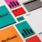
Brilliant by The Studio
Swedish employee engagement consultancy Netsurvey and Bright, experts in customer surveys, have been merged and rebranded as Brilliant by The Studio. This merger and rebranding intended to create a new platform capable of encapsulating the skills and corporate cultures of both companies and develop a visual expression that people from each could identify with and stand behind. In the same spirit as The Studio’s...
Schubertíada Vilabertran by Mucho
Schubertíada is an annual festival run by Associació Franz Schubert that celebrates the works of the 19th-century Austrian Romantic composer Franz Schubert. This takes place in the Spanish municipality of Vilabertran in July. The festival includes a programme of chamber concerts, lied recitals, instrumental solos and lectures. Schubert is known, not just for his compositions, but for his contribution to Lieder; German poetry...
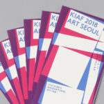
Korea International Art Fair 2018 by Studio fnt
Each year KIAF plays host to and brings to the Korea domestic market the artworks of international artists and galleries. This year, the 17th Korea International Art Fair took place between the 4–7 October in the city of Seoul. With a desire to become the pre-eminent art platform of South Korea, serve as a conduit between the Asian and international art...

New Chapter by Paul Belford Ltd
New Chapter is a UK-based word therapy start-up that offers a unique approach to counselling. This involves participants being invited to express themselves through the written word. The synergy between personal development, a forward momentum and the written word as a mode to achieving this forms the basis of New Chapter’s clever logo design created by Paul Belford Ltd. This appears...

Enter Arkitektur by Lundgren+Lindqvist
Enter Arkitektur is a Swedish two-office architectural practice located in the cities of Jönköping and Gothenburg. It has a rich history that goes back to the 1950’s and a portfolio that moves between residential housing and commercial building projects. In response to restructuring and expansion, the practice worked with Lundgren+Lindqvist to develop a graphic identity that would better represent their...
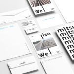
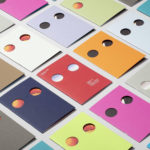
Mitsulift Elevators by Base Design
As the built environment expands, as it seeks new places to fill and accommodate a growing populace, time spent in and our reliance on modern conveyance systems develop in tandem. Reliability is central to this experience. Mitsulift is an elevator specialist tackling this need, balancing what is described as a Japanese technical expertise with exceptional Middle-Eastern service. Its graphic identity, however,...
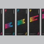
Frameline 41 by Mucho
Frameline is an American nonprofit arts organisation and the world’s longest running LGBTQ film festival. Frameline continues its mission, since its founding in 1977, to change the world through the power of gay cinema, and to connect filmmakers with audiences locally and internationally. Graphic design studio Mucho worked with Frameline on its visual identity and campaigns for its 40th and 41st LGBTQ...
Sydlexia: Making Sense Of Dyslexia by BBDO Dubai
Sydney Dyslexia intends to challenge the misconception that dyslexia is a learning disability, and instead, move the conversation forward, to more appropriately address it as a learning difference. Sydlexia is an innovative and pioneering platform, created by Sydney Dyslexia, to help aid this change, and offers new techniques and training methods to help facilitate “dyslexia correction”. Dyslexia is the most common learning disorder....