Stitch Detail
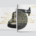
Brigade Court by Jack Renwick Studio
In The London Borough of Southwark sits the Grade II listed building and former headquarters of the London Fire Brigade, the city’s first fire station and a site currently under development. This will see it transformed into residential apartments with period conversations of the original Victorian building alongside a modern new-build. It is a one-of-kind property development that offers a...
Hages by The Studio
Hages began selling shortwave radios in Stockholm during the 1940s and is one of the oldest of its kind in Sweden. While the retailing of electronic goods has changed dramatically, sold increasingly online and on price by large chains, Hages has remained true to an independent spirit and established and developed a solid reputation. To coincide with the opening of their second store,...
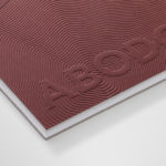
Abodo by Richards Partners
Abodo is a New Zealand-based timber specialist producing high performance and carefully crafted materials for architectural and structural contexts, and has a catalogue of cladding, decking, screening and timber panelling. Abodo worked with Richards Partners to better articulate its brand story, bring clarity to and emphasise the company’s respect for timber; where it comes from, where it is used and by...
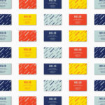
Helio by Bedow
Helio is a flexible co-working space and meeting venue with 8 different locations in and around the Swedish capital of Stockholm. It is made up of spaces with large desks for groups, small quiet areas for individuals, private meeting rooms and places to mix. These share an interior design language of modern utility and high quality handcrafted surfaces, upholstery and finishes. Helio...
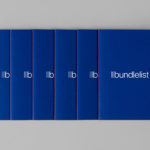
Bundlelist by Bunch
Bundlelist is an online platform that simplifies and draws together international mobile bundle costs, with a specific focus on mobile retail data, and facilitates comparisons between countries and mobile operators. Design studio Bunch worked to develop UX, UI and visual identity for the platform, which included logotype and a bundle of promotional notebooks....

Prism by Matchstic
Prism is a new thermally fused laminate brand from Arauco—a global manufacturer of sustainable wood products—created to appeal to the art and design market currently dominated by well-known brands. Arauco worked with American graphic design studio Matchstic to develop a brand identity for Prism that would communicate the value of a product often perceived as low-value within a market that often favours reclaimed woods and...
Héctor Ayuso by Mucho
Héctor Ayuso is the founder and director of renowned festival OFFF, a celebration of creative process that takes place each year in the Spanish city of Barcelona. Héctor recently looked to graphic design studio Mucho to help define and express who he is and how he works through a new visual identity. This extends across business cards, postcards and moodbook, and features loose hand...
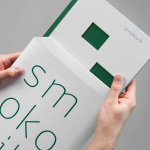
Smokovik by Studio8585
Smokovik is an exclusive property development, located on the Croatian Island of Krk, designed by renowned local architect Idis Turato. The development will be made up of both residential and commercial buildings that share a functional and sustainable build practice, a favour for modernity, flat surfaces and Mediterranean sea views. Smokovik’s brand identity, created by Studio8585 now working from Copenhagen, included logotype, brochure and website design, a...
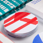
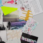
Rendez-vous des Créateurs by Marks
Rendez-vous des créateurs 2014 was an event that took place in September at experimental meeting, performance and exhibit space Flux Laboratory in the Swiss town of Carouge. The exhibition was an opportunity for those servicing the graphic design chain to show off finishes, materials and techniques under the title “onomatopoeia of printing”. Participants included silk screen printer Atelier Fuerm, binder Bubu, hot stamper...

Here East by dn&co.
Here East is a 1.2 million sq ft commercial space developed by Delancey and housed within the former Olympic Press and Broadcast Centre near Hackney Wick in East London. Here East is described as an ecosystem looking to attract businesses from the design, technology and modern manufacturing sectors who are looking to scale, and those of scale looking to behave more creatively....
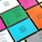
KVGD by Kerr Vernon
KVGD is a Glasgow based graphic design studio run by Kerr Vernon that works within the fields of brand identity design and print, has a ‘be nice, do good work’ philosophy, and a reputation for producing engaging, thoughtful and crafted projects. The studio’s client base is diverse, local and national, and includes businesses such as gallery, event and creative workspace The Whisky Bond,...

Mark Milton by ico Design
London-based design studio ico Design have recently completed their brand identity work for Mark Milton, a jeweller with a family heritage within the industry that dates back to 1947, and who carefully selects and retails a range of necklaces, earrings, bracelets and rings for women. Bound by the theme of curation, ico Design’s solution provides the Mark Milton brand with a high quality communicative breadth...