Designed by Studio Brave
OneFourFive Clarendon by Studio Brave
OneFourFive Clarendon is a modern workspace, developed by Salta, designed by Architectus and created for future-focused businesses looking to situate themselves in Southern Melbourne. The development aims to attract like-minded progressive people with a conscious focus on connectivity and local activity. With this in mind, Melbourne-based Studio Brave developed the narrative ‘A Life Unlimited’ as a way to express how the...

Salbini by Studio Brave
Salbini, formerly Fesal, is an online retailer of premium European furniture and appliances based in southern Italy and shipping internationally. It deals in both one-off purchases and tailoring for large commercial projects, offering both local and global brands. Fesal comissioned Studio Brave to rename and refresh its brand and overhaul its online store. While the project features revisions to type...

Everlea by Studio Brave
Everlea is a new property development described as a private sanctuary of townhouses located in the Melbourne suburb of Keysborough, an expanding community marked by its space and natural surroundings of native trees, shrubs, parkland and a landscaped network of safe pedestrianised streets. Developed by SB&G, working in collaboration with Bruce Henderson Architects, landscape architects Tract and Kathy Demos, Everlea “offers a pairing of design expertise guided by...
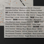
246 Queen by Studio South
246 Queen has a long and storied history. Opened in 1964 on Auckland’s Queen Street, it heralded a new era of modern architectural vision, exclusive boutique-based experience and an urban post-war retail sophistication. The building played host to fashion shows, designer concessions, furniture showrooms and contemporary dining. However, the architectural ideas drawn up by the original architects Rigby Mullan (Alan...

The Maitland by Studio Brave
The Maitland is a luxury 22 apartment residential property development from Gibson Developments located on Malvern Road in Glen Iris, a suburb of Melbourne, Australia. It is marked by an architectural, interior and landscape design language—created by Bruce Henderson (architecture), Charlotte Henderson (interiors) and Jack Merlo (landscape)—of colour, texture and form that connect it intimately to the neighbourhood and its leafy...

George + Powlett by Studio Brave
George + Powlett is a residential property development of 11 apartments, created by ICON Developments, and located in East Melbourne. ICON’s properties are described as having a precision and balance, and this continues through to their latest project, which was designed by acclaimed architectural practice Powell & Glenn. The development is set within an environment of what is described as a place of elegant contrasts. This can...

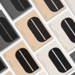
Faymus by Studio Brave
Faymus is a Melbourne based property developer committed to building intelligent and sustainable spaces and ecosystems for tomorrow’s living in a way that is sensitive to the heritage and diversity of local communities. Property developed by Faymus is rooted in a philosophy that anticipates rather than follows change, interlinks tradition and innovation, and, working collaboratively with affiliated professionals, covers planning, build and interior design....
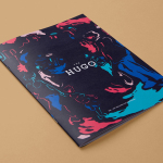
The Hugo by Studio Brave
The Hugo is a new residential property development, made up of 23 apartments, located in the Melbourne suburb of Foostcray. It is a hi-tech building with a distinctive perforated façade, and a design that leverages natural light and air flow. Its apartments were designed to be flexible and secure, with a particular focus on livability, functionality and beauty, and feature interiors...
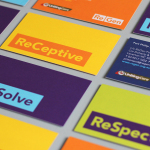
ReGen by Studio Brave
ReGen, formerly known as Uniting Care Moreland Hall, is a not-for-profit drug and alcohol treatment and education agency established in 1970 for the Victoria and Tasmanian regions of Australia. Following the recent name change Studio Brave developed a new visual identity that would better reflect the ReGen’s evidence based practices and the positive, practical outcomes it achieves, through a combination of...