Faymus by Studio Brave
Opinion by Richard Baird Posted 3 December 2015

Faymus is a Melbourne based property developer committed to building intelligent and sustainable spaces and ecosystems for tomorrow’s living in a way that is sensitive to the heritage and diversity of local communities. Property developed by Faymus is rooted in a philosophy that anticipates rather than follows change, interlinks tradition and innovation, and, working collaboratively with affiliated professionals, covers planning, build and interior design.
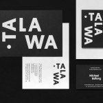
This philosophy and the extent of Faymus’ projects is communicated across their new brand identity, created by Australian graphic design Studio Brave, through a contrast of type, colour and image, and extending across duplex business cards and website. This was developed by Studio Brave alongside campaign work for other Faymus projects, one of which was The Hugo, also featured on BP&O.

Contrast is effectively used to secure aesthetic impact and to satisfy a clear communicate intention; the meeting of tradition and modernity, solid build and interior flourish. This is drawn out through two typographical choices and the juxtaposition of bright colour alongside the earthy materials and textures contained within full-screen photography online.


The condensed, monolinear and uppercase letterforms of the logotype, and the use of the similarly styled typeface Cervo online, sits alongside the finer detail, variable strokes and flourish (particularly the ampersand) of what looks like Garamond. These touch upon the robust and reductive, but also the hand finished and ornamental.
The disparate qualities of these two is pronounced, as is their typesetting and proportion, however, it is this disparity that works well to really emphasis the communicative intention of the project, and feels well-suited to a business that covers build and interior design, and looks to connect modernity and tradition.
This is explored more explicitly online through contemporary layout, responsiveness and functionality, the use of large well-shot images which capture interiors of natural materials, and panels of solid red. This combination of bright flat colour and rich visual texture detail give the site a disintctive and unusual quality but one grounded by the intentions of the business.

Other considerations such as the paint texture of the logotype, emphasised by the motion of its animation, the logotype’s proportions in relation to business card, the business card’s duplex weight, areas of space and the value associated with dyed boards, build on the tone established by type, colour and image, and add a layer of physical quality and further visual interest. More from Studio Brave on BP&O.
Design: Studio Brave. Opinion: Richard Baird. Fonts Used: Cervo & Garamond.