Designed by Studio Hi Ho
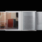
Napier Street by Studio Hi Ho
231 Napier Street is an eleven apartment building, now sold out, created by property developer Milieu, set with the culturally rich part of Fitzroy, Melbourne. It is their first collaboration with architect Edition Office—an innovative practice with a strong conceptual focus—and part of the developer’s ongoing enquiry into and interrogation of the dialogue between architecture and place. This interrogation forms...

Lagotto by Studio Hi Ho
Lagotto is a new all-day café, wine bar and food store situated inside Nth Fitzroy, a residential property development project from Milieu located at the heart of Melbourne’s, inner north. Named after the truffle-hunting Italian dog breed, the café offers a relaxed European surrounding in which to enjoy an Italian menu with a “joyful vibrancy that avoids kitschiness or pastiche”. Studio Hi Ho,...
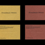
Freadman White by Studio Hi Ho
Freadman White is a Melbourne-based architectural practice, led by Ilana Freadman and Michael White, that seeks to embed a curiosity-driven and experientially charged tension into their architectural work, reveal beauty in simple and overlooked settings, and design contextually informed structures with a disciplined whimsy. Further, rather than responding literally to physical surroundings, the practice develops spaces that are visually intriguing,...

Nth Fitzroy by Studio Hi Ho
Nth Fitzroy is a residential property development project from Milieu located in the heart of the inner north of Melbourne. It features 26 uniquely breathable apartments within an innovative architectural structure with an exterior skin of single and double story shutters. In response to seasonal environmental conditions, the changing light of the day, and the minute by minute activities of its...

Whitlam Place by Studio Hi Ho
Whitlam Place is a collection of eleven residencies located in Fitzroy, Melbourne, developed by Milieu Properties and completed this year. The residencies are described as being ideally positioned within a leafy pocket of the city’s most vibrant cultural precinct, and feature views of the adjacent Whitlam Place gardens, Fitzroy Town Hall and city skyline. the residencies were designed to engage with the historic...
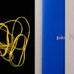
Neometro & Nine Smith Street by Studio Hi Ho
Nine Smith Street is the latest residential property project from Neometro, a company that describes itself as having a reputation as Melbourne’s most design-focused development group and recognised as one of the first holistic design and construction businesses in Australia. Neometro are dedicated to creating architectural buildings that are beautiful, functional and timeless, and have a sense of place and belonging. Neometro’s brand...

Level Improvements by Studio Hi Ho
Level Improvements is a small-scale builder that possesses, in the words of Hi Ho – the studio responsible for their new identity – a characteristic often lacking in others in their field — a high level of craft and attention to detail. To reflect these values, Hi Ho developed a ‘easily managed and straight talking’ visual identity solution that leverages the...
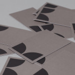
K2LD Architects by Studio Hi Ho
K2LD is a small Melbourne-based architecture and interior design firm with a project history that includes individual private homes, community precincts, multi-unit developments and large-scale commercial projects. The firm’s identity, an abstract, structural and modular amalgamation of initials (check the ideation animation here), uncoated materials and a monochromatic colour palette – developed by brand and communication studio Hi Ho – unapologetically embraces the established and reductionist cues of the industry....
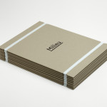
Milieu Property by Studio Hi Ho
According to Studio Hi Ho, the branding and communications partnership responsible for this project, Milieu Property is a Melbourne-based ‘boutique developer with an emphasis on creating spaces of influence’. The moniker ‘Milieu’ immediately positions the brand at the cerebral end of the property development spectrum. Indeed, for those without a thesaurus brain, the highfalutin’ vocabulary is even explained on the minimal...