The National Institute of Dramatic Art by Maud, Australia
Posted: Filed under: Art and Design, Fonts in Use, Logo Reviews, Theatre | Tags: Black Block Foil, Brand Guidelines, Brand Identity Reviews, Branding Blog, Branding Reviews, Business Card Design, Colour in Use: Yellow, Coloured Paper, Design For Print, Design Opinion, Design Reviews, Designed by Maud, Designed in Surry Hills, Designed in Sydney, Foil Blocking, Fonts in Use: Theinhardt, From Australia, Graphic Design, Graphic Design Blog, Letterhead Design, Logo Design & Branding Blog, Logo Design Inspiration, Logo Design Resource, Logo Designs, Logotypes, Minimal Logos, Sans-serif Logotypes, Spot Colours, Stationery Design, The Best Brand Identities of 2015, The Best Logo Designs of 2015, The Very Best of 2015, Ticket Design, Type Foundry: Optimo, Typography, Uncoated Papers & Cards, Window Decals Comments Off on The National Institute of Dramatic Art by Maud, AustraliaOpinion by Richard Baird.
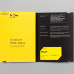
The National Institute of Dramatic Art is a national education and training organisation for the performing arts in Australia, and is responsible for developing the talents of some of the country’s biggest stars. With the continued democratisation of performance through digital platforms such as Youtube, and concerns that this had the potential to undermine NIDA’s conservatoire approach, NIDA pursues a technical mastery as a way to preserve a high standard of education.
NIDA looked to design studio Maud to help redesign its visual identity system in a way that help a world-renowned organisation maintain its international presence, prominence and authority within an increasingly accessible field, and broaden its appeal beyond the dramatic arts to include performance skills across a wide range of industries. The project included logotype, signage, prospectus, business cards, brand guidelines and brochure.
Investec 2014 Team Conference designed by Garbett
Posted: Filed under: Business, Banking, Law and Finance | Tags: Brand Identity Reviews, Branding, Branding Blog, Brochure Design, Colour in Use: Pastels, Coloured Paper, Design For Print, Design Reviews, Designed by Garbett, Designed in Surry Hills, Designed in Sydney, Die Cut Design Detail, From Australia, Graphic Design, Graphic Design Blog, Illustration, Logo Design & Branding Blog, Logo Designs, Logos, Logotypes, Notebook Design, Tote Bag Design, Visual Identity Design Blog Comments Off on Investec 2014 Team Conference designed by GarbettOpinion by Richard Baird.
International banking specialist and asset management group Investec’s 2014 annual team conference took place in Port Douglas, a coastal town located in the tropical north of Queensland, home to the Great Barrier Reef and the rainforest of Daintree and Cape Tribulation.
The conference’s identity, designed by Sydney-based Garbett, draws on themes of travel, tropical destination and for the most part avoids any hint of corporate convention. This is achieved through simple geometric illustrations across beach towels and tote bags, a bright colour palette, the generosity of dyed papers, die cut detail to create luggage tags and a passport-like notebook and the dual nature of the language choice. The result is a playful summer holiday aesthetic with a practical edge.
Making: designed by Garbett
Posted: Filed under: Architecture and The Built Environment, Logo Reviews | Tags: Architecture Logos, Brand Identity, Brand Identity Reviews, Branding, Branding Blog, Branding News, Brochure Design, Design News, Design Opinion, Design Reviews, Designed by Garbett, Designed in Surry Hills, Designed in Sydney, Festival and Event Brand Identities, Fonts in Use: Brown, Graphic Design, Logo Design & Branding Blog, Logo Opinion, Logos, Logotypes, Sans-serif Logotypes, The Best Brand Identities of 2014, The Best Logo Designs of 2014, Type Foundry: Lineto, Typography, Visual Identity Design Blog Comments Off on Making: designed by GarbettMaking: is the Australian Institute of Architects’ 2014 conference. Working in collaboration with creative directors Sam Crawford, Adam Haddow and Helen Norrie, Sydney based design studio Garbett developed a brand identity for the conference, which included logo, lanyard, merchandise and print design, that explores the role of the architect as maker of environments and connections that extend beyond the bounds of traditional practise. This was expressed visually and dynamically in print and online using handmade detail, an alphabetic ‘matrix’ that creates imagery when words are input, dot-to-dot portraits of the speakers, animations and a stop motion video.