The Very Best of 2016
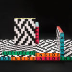
Inside Lottozero by Studio Mut
Inside Lottozero was an exhibition of international artists that covered a wide-range of artistic disciplines. It was conceived by Arianna and Tessa Moroder and curated by Alessandra Tempesti. The exhibition took place at Lottozero / textile laboratories in Toscana, Italy and ran until November 20th, 2016. Under the concept of “Non-stop Fruition”, the exhibition opened with a 12 hour overnight event in...
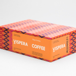
Víspera Coffee by Stockholm Design Lab
Víspera is premium coffee brand that intends to bring together the best of two worlds, a blend of 100% Arabica coffee beans sourced from the high altitude plantations of Colombia and a Swedish eye for quality and craftsmanship in its roasting. This meeting is visually articulated through type contrast, colour and pattern across Víspera’s packaging, developed by Stockholm Design Lab....
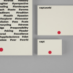
Capt by Bunch
Capt is a San Francisco-based start-up that connects creators wanting to monetize their videos with brands looking for new content and talent. The platform is made up of an app that allows creators to shoot, upload and license their videos, and a website that acts as a market place for buyers. This website also serves as a place to connect creatives with those...
East Sydney Early Learning Centre by Toko
East Sydney Early Learning & Community Centre is a state of the art space located on Bourke Street. It provides childcare places for parents living or working in the inner city suburbs of Sydney. The centre, designed by ABA Architects, features five play rooms set over three levels, indoor playground on each floor and an open-air play area on the top floor. The space...

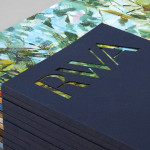
Brewdog Abstrakt by O Street
Brewdog’s Abstrakt is a limited edition craft beer concept that has released 20 different varieties since it began in 2010. Each beer is bottle-conditioned (bottled with a small amount of yeast, providing further fermentation and maturation), brewed and released just once, individually numbered and known only by their release code. It is a concept described as more art than beer, as boundary pushing and blurring...

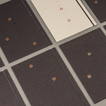
Brewdog Menus by O Street
O Street worked with craft brewery Brewdog; best known for their beers and big attitude but also a growing hospitality presence throughout the United Kingdom, to create a distinctive menu design and system for over fifty of their bars. This included both a full menu which features a handmade backboard, and a Daily Drafts menu, individually finished at each location....

Karla Black + Kishio Suga: A New Order by O Street
A New Order is an exhibition of the work of Karla Black and Kishio Suga taking place at Modern One of the Scottish National Gallery of Modern Art between 22nd October and 19th February. The artists, unaware of each other’s work prior to the conception of the exhibition, working on opposite sides of the world, are described as being united in their use of...
UAL 2017–18 Campaign by Spy
The University of the Arts London is Europe’s largest specialist arts and design university. It is made up of six colleges, each with its own unique character and programme, yet unified in their effort to deliver a high quality creative eduction. This united position is expressed through a visual identity system developed by Pentagram partner Domenic Lippa. Based around Helvetica, UAL’s visual identity affords each...
Royal West of England Academy by Spy
Royal West of England Academy brings world-class visual art from around the world to Bristol. It is the city’s first art gallery, the UK’s only regional Royal Academy of Art, and is located in a grand Grade II listed building. RWA worked with London-based graphic design studio Spy to develop a visual identity that would feel relevant and engaging, and re-establish confidence...
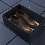
Faust by Snøhetta
Faust is a high-end shoemaker with its first signature store located in Oslo’s Barcode area. The shop is a small but impressive space consisting of five concrete niches and large carved wooden doors. Faust worked with Scandinavian studio Snøhetta to create both interior and brand identity. This was based around the The legend of Faust from the Renaissance, its basis for many literary, artistic, cinematic and musical...
Common Lot by Perky Bros
Common Lot is restaurant located near the Papermill Playhouse in Millburn, New Jersey. It has a menu of seasonal dishes made from locally foraged produce and fresh ingredients, and features an interior design described as being minimalist with unexpected finishes, natural materials, texture and light. The restaurant was created by Australian chef Ehren Ryan and draws upon his globally diverse culinary background and free spirit....
Helsinki City Museum by Werklig
Helsinki City Museum, through its collection of objects and images, provides visitors with historical insight into the everyday lives and personal experiences of the people of Helsinki. It is free to enter and features 2400 sqm of exhibitions and public spaces, a cafe, inner courtyard, areas to relax and conference rooms. To coincide with a move to a new space;...