Type Foundry: Optimo
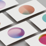
Bacàn by Pentagram
We’ve covered no shortage of work by Pentagram in the past, most recently Cohere but spanning projects for London Fashion Week, NYC Parks, National History Museum and more. This is the first time, however, that we’ve looked at a project by new-ish New York office partner Andrea Trabucco-Campos and his team – and it’s safe to say, we’re impressed. Graphic...
Corps Reviver & L’Heure du Cocktail by Spin
Corps Reviver is a French publisher and revivalist, redesigning and reprinting classic literary works, the first of which is L’Heure du Cocktail, The Cocktail Hour, written by journalists Marcel Requien and Lucien Farnoux-Reynaud and originally published in 1927. L’Heure du Cocktail, at the time, revolutionised the cocktail book, approaching the subject in a new way. This 2017 bilingual edition, presented in French and English,...

Verso Architecture+Interiors by Studio South
Verso is a small Auckland-based architecture and interiors business working within the residential and commercial sectors. Drawing on the oppositional nature of name and using a mix of simple typographical form, high-quality materials and print finish Studio South developed a new visual identity for Verso that is described as being both sophisticated and playful, whilst effectively working in some universal architectural principles. This links a variety of printed...
Primary by DIA
Primary is a new co-working space in New York that introduces health and wellness into the workplace. This can be seen in the approach to interior design; a mix of wood, contemporary soft furnishings and greenery, experienced in the fusion of office space, business events and relaxation classes, and expressed throughout Primary’s brand identity, created by graphic design studio DIA. DIA were tasked...
Smithey Ironware Company by Stitch
Smithey is an ironworks producing kitchenware from its location in Charleston, South Carolina. Smithey’s first product, a 10 inch skillet, features a smooth, non-stick cooking surface, created using a handcrafted method of finishing and polishing. This process was developed in response to the rough, coarse and sandpaper-like finish that proliferates the ironware market, which creates an uneven surface temperature, makes it...
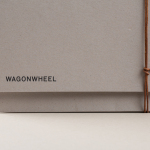
Wagon Wheel by Perky Bros
Wagon Wheel is a Nashville-based boutique real estate title and escrow company established by three partners with substantial experience working for larger corporate law offices who wanted to establish a company with a more casual corporate culture and client experience. This, and Wagon Wheel’s Nashville roots, is expressed throughout its new brand identity, designed by graphic design studio Perky Bros, using...
Arde by IS Creative Studio
Arquitectura Diseño y Espacio, abbreviated to Arde, is a Peruvian architecture and design firm creating contemporary structures that have a strong sense of light and space, a preference for the geometric and often juxtapose exposed architectural surfaces with those that are natural and crafted. Lima-based IS Creative Studio recently worked with Arde on naming and visual identity that would link a variety of assets. These included stationery, business...
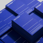
Fathom Architects by dn&co
Fathom is a new UK based architectural practice, set up by Justin Nicholls, former partner at Make Architects and Foster+Partners, that draws beautiful and logical buildings from complex briefs, and within the context of sensitive sites. Fathom Architects worked with dn&co. to develop a visual identity that would encapsulate this focus as well as their curiosity and use of technology....
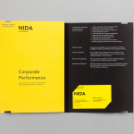
The National Institute of Dramatic Art by Maud
The National Institute of Dramatic Art is a national education and training organisation for the performing arts in Australia, and is responsible for developing the talents of some of the country’s biggest stars. With the continued democratisation of performance through digital platforms such as Youtube, and concerns that this had the potential to undermine NIDA’s conservatoire approach, NIDA pursues a...