Posted: | Author: Richard Baird | Filed under: Cafes, Bars and Restaurants, Logo Reviews | Tags: Brand Identity, Brand Identity Design, Brand Identity Reviews, Branding, Coaster Design & Beer Mats, Copper Block Foil, Designed by Uniform, Fabric Covers, Fabric Menu Covers, Foil Blocking, Illustration, Logo Design & Branding Blog, Logos, Logotypes, Norwegian Design, Restaurant & Cafe Menu Designs, Sans-serif Logotypes, The Best Brand Identities of 2013, The Best Logo Designs of 2013, Uncoated Papers & Cards |
Festningen is a brasserie that serves a rustic French menu and is located in Oslo’s Akershus Fortress—a medieval castle and former prison. The brasserie’s brand identity, created by design studio Uniform, juxtaposes the traditional detail of etched illustration, a copper foil print finish and fabric texture, alongside a bold sans-serif, simple geometric pattern and light ink across dark papers and boards. This establishes what the agency described as a historical and contemporary guideline for Festningen.
Continue reading this article
Posted: | Author: Richard Baird | Filed under: Cafes, Bars and Restaurants, Logo Reviews | Tags: Brand Identity, Brand Identity Design, Brand Identity Reviews, Branding, Coaster Design & Beer Mats, Colour in Use: Red, Design For Print, Designed by Uniform, From Scandinavia, Logo Design & Branding Blog, Logo Opinion, Logos, Logotypes, Norwegian Design, Restaurant & Cafe Menu Designs, Sans-serif Logotypes, The Best Brand Identities of 2013, The Best Logo Designs of 2013, Tinted Photography, Vintage Photography |
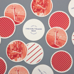
Ingierstrand Bad is a newly refurbished restaurant located on the shore of Norway’s Oslofjord that balances the area’s history as a 1930’s summer retreat with a contemporary dining experience. Oslo based design agency Uniform recently captured this juxtaposition of past and present through a new brand identity solution for the restaurant that mixes vintage photography, cream substrates, geometric forms, two inks and the Art Deco sensibilities of the logotype, resolved with a contemporary consistency, eye for space and simplicity.
Continue reading this article
Posted: | Author: Richard Baird | Filed under: Art and Design, Business, Banking, Law and Finance, Logo Reviews | Tags: Brand Identity Reviews, Branding News, Design Opinion, Design Reviews, Designed by Uniform, From Scandinavia, Logo Design & Branding Blog, Logo Designs, Logo News, Logotypes, Norwegian Design, Sign Design, Stationery Design, Stencil, Stencil Cut Logotypes, The Best Logo Designs of 2012, Typography |
Onsagers is an Oslo based consultancy that specialises in the protection of intellectual property through patents, trademarks, design and law. Since its establishment in 1945 Onsagers has grown, aided by merger with Defensor in 1997, to become one of Norway’s leading IPR firms. Its new identity, developed by brand and packaging design agency Uniform earlier this year, is a simple but bold combination of a mono-line weight logo-type, icons and a striking, authoritative, white, black and bright yellow colour palette.
Continue reading this article