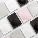
UV Varnish
ITO Gin by Analogue
ITO Gin is first and foremost, brilliantly eyecatching – huge fluorescent letters, the epitome of ‘make it big’ when it comes to a brand name; deep black bottles – behind this bold exterior lies a narrative woven across cultures, histories, and generations. The brand was born of a collaboration between Komaki Distillery in Japan and UK-based gin brand Kokoro. However,...
Dark Arts Coffee by NOT Wieden+Kennedy
If a brand that fuses memes, hot takes, occultism, and coffee is going to succeed anywhere, it’s probably in east London. Dark Arts Coffee started out in 2014 in a Homerton railway arch, and managed to corner that distinct subgenre of goth/metal/biker-ish aesthetics which opts for craft ale over snakebite; Hackney over Camden; self-care over self-destruction. Where the old guard,...

Edition by South
Edition is a new property development by LEP Construction. It will be located in Parnell, a suburb of Auckland, New Zealand, and made up of 18 luxury apartments designed by architects Monk Mackenzie with a eye for flexible space and changing natural light. Edition will make the most of a sloping site, feature three levels cantilevered above ground and create what are described as...
Meg’s Tailoring by Studio South
Meg’s is a tailoring service, established by Megan Kenny, that began as a single store on Garfield Street in 1995. Meg’s now has two locations in Auckland, New Zealand, provides a broad range of services; from hems to full garment design, and works on large projects with high-end designers and labels such as Hugo Boss, Prada and Gucci, and on smaller jobs from High Street drop-ins....
Bryan Pearson by Strategy
Drawing on his extensive experience as a successful CEO, one that spans 20 years in the corporate, private and public sectors of New Zealand and Australia, Bryan Pearson has developed a niche business that provides strategic leadership and support to CEOs. His brand identity, created by design and advertising studio Strategy, is informed by the personal skills and experience that defines his business, and...

Meteorologisk Institutt by Neue
Meteorologisk Institutt provides meteorological data to Norway’s military, civil services and the general public with the intention of safe guarding life, property and the environment. Design agency Neue developed a new visual identity solution for the institute that mixes geometric shapes, material and print choices and the humanistic and environmental detail of photography to achieve communicative and aesthetic contrast and capture the data drawn from...
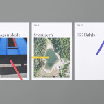
Tegn_3 by Neue
Tegn_3 is a Norwegian, multidisciplinary, architecture design studio that, through inclusive methods, process-oriented and competent project management, deliver holistic solutions that encompass the fields of architecture, planning and landscape, to large clients across Scandinavia. Their visual identity, developed by Neue, draws together the themes of technical knowledge, structure, connections, collaboration and creativity through neutral typography, a modular and expanding geometric...

Brewer St by Designers Anonymous
Brewer St. is a new fair-trade coffee range developed by UK based hospitality brand Fuller’s to take advantage of continued coffee market growth and build on the day-time custom of their pubs, bars and hotels. London based graphic design studio Designers Anonymous, following their successful rebranding of Fuller’s flagship King’s Cross pub The Parcel Yard, developed a visual identity solution for the brand based around...

Norwegian Shipowners’ Association by Neue
Norwegian Shipowners’ Association is a group of businesses that collectively employ over 55,000 seafarers and offshore workers from more than 50 different nations. The association’s new visual identity, created by Oslo based design agency Neue, captures the open sea and sense of knowledge and experience with a two colour square and traditional serif combination....