Gourmet Tucker by Supply
Opinion by Richard Baird Posted 18 April 2012

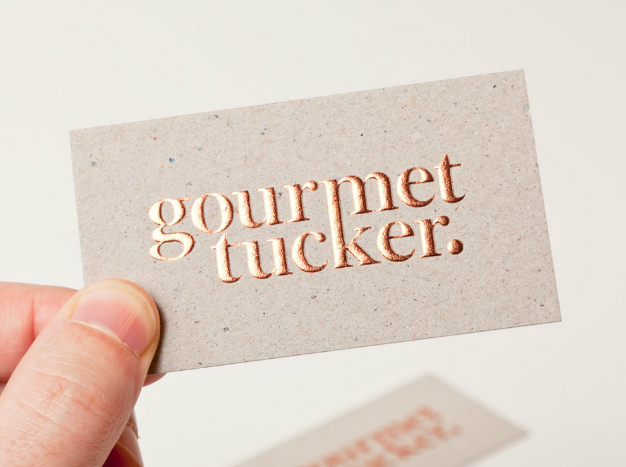
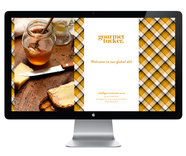
Gourmet Tucker is a new deli located on Auckland’s Glenmore Road. Its identity, created by multi-disciplinary design agency Supply, delivers a dual sense of high-quality and affordability through an contemporary mixture of serif letter-forms, a bold contemporary ligature, block foil print treatment and a tactile uncoated substrate.

There is a smart, informal, formal split nature to the Gourmet Tucker name that has been aptly extended across the brand’s visual identity. The blend of classic transitional serif and the sharp modernity of a bold vertical ligature appropriately unites the juxtaposition of language, conveys an ‘accessible quality’ and visually resolves the two lines into one form.

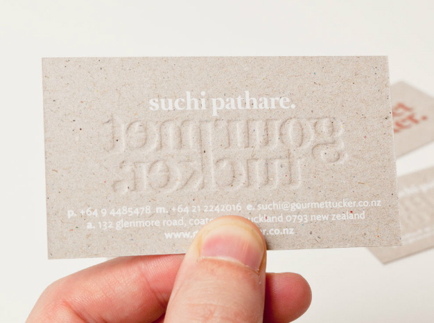
Like the logo-type the business card takes a contrasting approach by fusing the two quite different perceptions of an embossed copper foil print treatment and its adoption of the textural qualities of an uncoated, unbleached substrate that has an open and honest sensibility. The candy-like flecks set amongst the warm mixed fibre grey of the board is a wonderful detail that delivers a subtle craft-like depth to the identity. Printed with a subtle white spot colour, the content on the reverse of the card, neatly set around the emboss, frames the wholesome foundation that underpins the premium aesthetic of the copper foil and reinforces the brand’s contemporary proposition.


