Daum & Co by Hunt & Co
Opinion by Richard Baird Posted 27 February 2012

Daum & Co, formerly Daum Partners is a Melbourne based business advisory and management consultancy founded by Tony Karantonis. Their new identity, created by boutique design agency Hunt & Co., combines the brand’s smart, strategic thinking and productivity with a simple monogram device and its sense of character, creativity and individuality of the service through a series of contrasting illustrations.
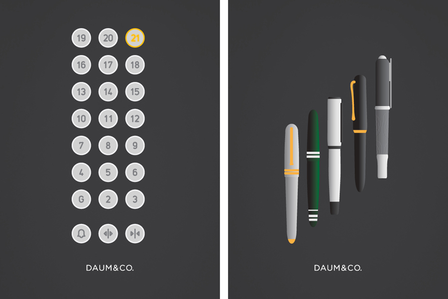
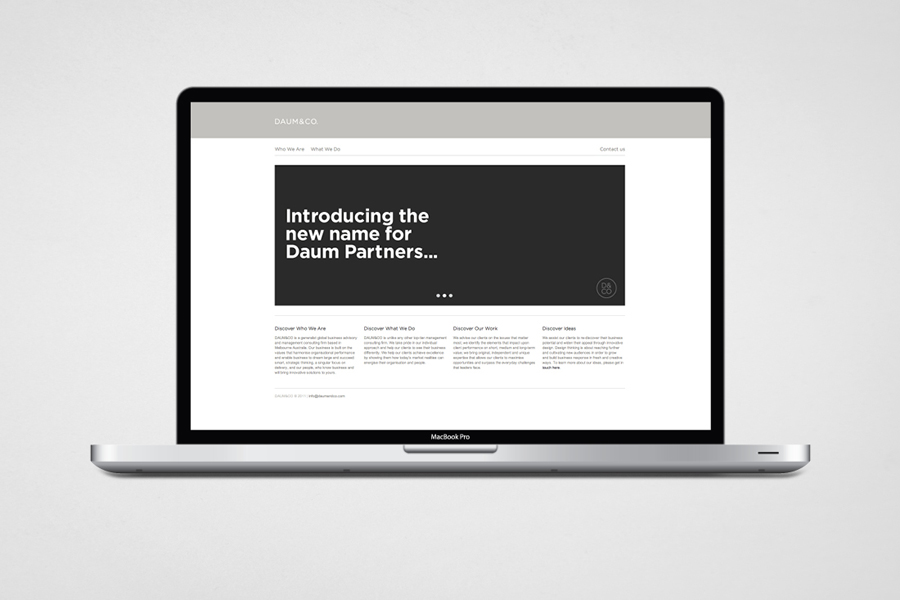
“Top tier management consultant Daum Partners engaged Hunt Studio to redevelop its branding and identity to facilitate a name change from Daum Partners to DAUM&CO and reflect its high level of professionalism. The deliverables included a custom logotype, alternate logo marque, typeface selection and colour palette development. The identity applications consist of a complete stationery suite, website and promotional material. As part of the overall solution, a series of brand illustrations was also developed to represent each of the capabilities provided by DAUM&CO. The illustrations appear on the website and in promotional material, and have been developed to convey the personality and the unique way of thinking conducted by the firm.” – Hunt Studio
The utilisation of a monogrammatic logo-mark delivers a classic sense of personalised service that, through its geometric letter-forms, constructed from a consistent line weight and square terminals, a stacked layout and circular container manages to creatively resolve a structured and reliable approach with the company’s global experience. These ideas are reinforced across a logo-type with a wide monospaced execution that, while slightly more corporate adds a more straightforward sense of professionalism. A fairly conventional corporate grey and white colour palette has been given a nice contemporary application across an uncoated substrate along side a subtle embossing of the mark as well as a number of coloured highlights within some of the illustrations. Although these images rely quite heavy on gradients, which appears perhaps a little off-the-shelf, they deliver a nice contrast against the formality of the logo-mark and type whilst representing the brand’s key capabilities and conveying a bit more personality.


It is hard to get to the heart of what the Daum & Co brand is about because of the volume of business buzzwords on their website but the identity works well to cut through the majority of this and visualise a strategic and individualised approach. Each component contributes to the resolution of a broad set of brand propositions and avoids any superfluous details in its minimalistic execution. Ultimately it feels quite genuine for what can often be a difficult and generically represented industry.