Mark Milton by ico Design
Opinion by Richard Baird Posted 19 March 2014

London-based design studio ico Design have recently completed their brand identity work for Mark Milton, a jeweller with a family heritage within the industry that dates back to 1947, and who carefully selects and retails a range of necklaces, earrings, bracelets and rings for women.
Bound by the theme of curation, ico Design’s solution provides the Mark Milton brand with a high quality communicative breadth through an asset architecture that includes a monogram, print and packaging, still life and model photography, website and an editorial approach to blogging.

“Mark Milton is a respected figure in the jewellery business with over 30 years experience and expertise. He approached ico having recognised the need to build his business online and shift the focus from selling wholesale to marketing directly to the consumer. Working closely with an independent industry expert, the product offer was edited into a series of discerning collections. This theme of careful curation is one that runs throughout the brand.”


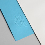
“The visual identity conveys an understated elegance – demonstrated on items such as gift packaging, publications and window displays. A pattern was developed that references gold filings, and a deep red was chosen as a sophisticated accent colour. To further emphasise Mark’s role as both curator and creator an ‘MM’ monogram provides a personal endorsement on each piece of jewellery.
Brand photography shows the products as worn by models, and a series of carefully art-directed still lifes celebrate the jewellery as beautiful curated objects. Combining these with an editorial blog puts industry expertise at the heart of the brand.” – ico Design

The concept of curation is evident throughout, from the personal signed-off signature detail of a hand drawn monogram to the still life-like arrangement of the photography, the consideration given to space and the authority and experience that will be established by an editorial blog style.
These details are framed by a limited but communicative combination of a metallic gold print finish, a bright red spot colour and plenty of white space, and utilised to great effect over the internal and external walls of the packaging, stationery and different sheet sizes of the print work. Together these neatly resolve a contemporary energy and style, a modernistic restraint, traditional values and a familiar sense of high quality.
While the monogram’s oversized application across the front of the brochure and its repetition over the surface of the wrapping paper borders on an unnecessary logo-centricity, especially within the context of a wider restraint, it is distinctive and very well rendered with a humanistic but considered irregularity that leverages a little of the individuality and craftsmanship of the past.


The layout of the brochure, its current typographical treatment, use of unprinted space, panels of flat colour, still life imagery and open stitch binding, alongside the unusual crops of the model photography and an inside page with a full bleed finger print-like pattern, intelligently mix high fashion and art gallery sensibilities that tie in well with the concept of curation and exclusivity.
The result benefits from a variety of long established and more recent design tools, a mix of photographic, graphic, typographic and linguistic cues across multiple touchpoints united by a solid restraint and a clear concept in a way that balances style and substance.