Norwegian Shipowners’ Association by Neue
Opinion by Richard Baird Posted 18 May 2011
Norwegian Shipowners’ Association is a group of businesses that collectively employ over 55,000 seafarers and offshore workers from more than 50 different nations. The association’s new visual identity, created by Oslo based design agency Neue, captures the open sea and sense of knowledge and experience with a two colour square and traditional serif combination.

“Norwegian Shipowners Association has around 160 members – shipowners in the tanker and bulk transport sector, short sea sector and offshore activities. We wanted to create an iconic, simple and elegant identity that communicate NSA’s universe as well as being serious, bold and forward-looking, showing NSA as a compent global actor.” – Neue

This an incredibly simple solution that manages to distil the open sea down to two colours within one form. This also creates a sense of stability (a steady ship) and reliability (community support) through their horizontal union also while visualising the opportunity and freedom shipowning provides in its representation of an endless horizon.
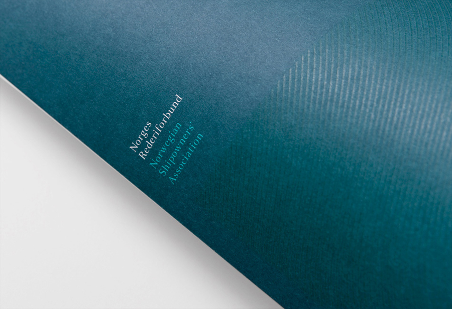
A light serif logo-type, stacked to mirror the structure of the mark and with a good eye for line spacing, introduces contrast to the heavy fill, basic geometry and contemporary sensibilities of the mark, offering a more formal and long-serving traditional quality that conveys professionalism, timeless knowledge and experience. This juxtaposition continues with thin wave-like line work that, like the typography, add finer layer to the bold and oversized format of the mark across the collateral.

The uncoated nature of the substrate and its UV and embossed print finish add a tactile, raw and light reflecting quality that neatly mirror the elemental nature of the sea while the icy colour palette and photography suitably conveys a little of the cool Nordic regions.
Design: Neue. Opinion: Richard Baird. Fonts: Romain.