Striptind by Neue
Opinion by Richard Baird Posted 23 May 2011
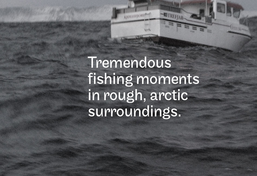
Striptind is a provider of guided deep sea fishing experiences based in the Artic surroundings of Kjøllefjord Norway. Their new minimal identity designed by Neue (known for their interactive Visit Nordkyn work) was inspired by the exclusive nature of halibut and the prospect that there is ‘always a bigger fish to be caught’.
I am really inspired by work from Nordic countries, they seem to have a great gift for simple and iconic identity work often showing great restraint that delivers a powerful and relevant aesthetic. Neue’s work for Striptind follows a similar philosophy. The geometric fish logo mark could be seen as rudimentary but within the context of the brand through colour and photography it takes the characteristics of a premium experience. Where once I saw triangles and squares I now clearly see the fish and this is reinforced in its application as a pattern across stationary and animated on-line. The typography feels like a suitable choice with interesting little flourishes and details across the ‘R’ ‘N’ ‘D’ that contrast well against a bold and simplistic logo-mark and deliver a sense of undulating motion, the ‘S’ does suffer from a slight imbalance but this is only a tiny criticism. Overall this is a really strong and crisp visual structure that captures the very nature of the environment and the potential quality of fish that inhabit the Barents Sea.