Good Heavens! by B&B Studio
Opinion by Richard Baird Posted 31 May 2011

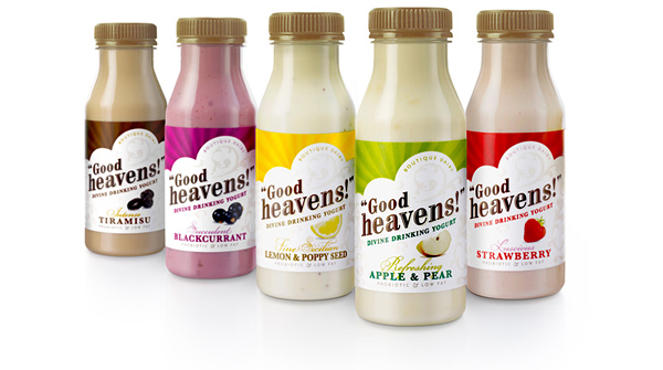
Bio Green Dairy is a UK producer of drinking yoghurt that blends real fruit and good bacteria. As part of a brand overhaul they turned to London based design agency B&B to develop a new name, identity and packaging proposition that would deliver a stronger presence in an increasingly saturated market. Now retailing under the name Good Heavens! and labelled a ’boutique dairy’ the product has been repositioned as ‘indulgent’ and ‘feminine’.

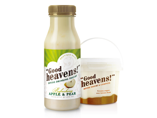
The original identity and packaging had a very generic, unremarkable and almost synthetic looking brand proposition. This has clearly been addressed and replaced with a new lighter and healthier direction. The typographical word-mark is a nice choice that is sensible and dynamic with a hint of tradition which carries a strong almost posh/polite/friendly conversational style. The colour palette is earthy delivering a significantly more genuine and wholesome aesthetic while the labels benefit from a stronger visual hierarchy and tone of voice. The bits of fruit and colour choices work well together, quickly conveying the flavours in a straightforward and consistent manner.
The background illustrations although light feel a bit fussy and the compote proves the identity and packaging works well without these. The choice of script much like the illustrations appear superfluous and doesn’t contrast well with the heavier weighted type selections, combined, these elements look like a box ticking solution for ‘feminine’ and are unnecessary in my opinion.
The conversational style feels like a suitable solution that creates a fun and good-natured sensibility, one that should establish trust in a product that is built on high quality natural ingredients.


