Pockit by Someone
Opinion by Richard Baird Posted 14 June 2011
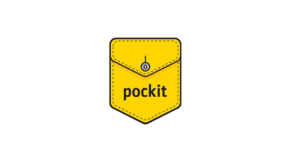
Pockit is a new on-line service that provides subscribers with the opportunity to save money on their household bills while facilitating a community that will provide a platform for sharing money related advice. The name and identity was handled by London based Someone who developed a clear and simple proposition that would express an open, transparent and consumer lead service.
“‘The brand and branding is all about keeping things simple and easy. It’s called Pockit. So it features a pocket and a stitching theme that joins everything up. Simple & Easy…” – Someone
This identity is very straightforward in its conceptualisation but comfortably conveys the simple and easy nature of the service. The pocket illustration is well balanced and the line thickness both on the stitching detail and outline feel suitably weighted for smaller applications. The button is a nice touch and works well to carry a informal and casual denim style with familiar qualities. The choice of a bright yellow delivers a high impact, low cost print solution that is reminiscent of budget supermarkets. Its application as a bag really stands out for me utilising the brands fundamental qualities in a strong, functional and potentially iconic way. This is a great budget-branding job with plenty of character and an open accessible visual style.