Saxton Cider by Supply
Opinion by Richard Baird Posted 25 July 2011
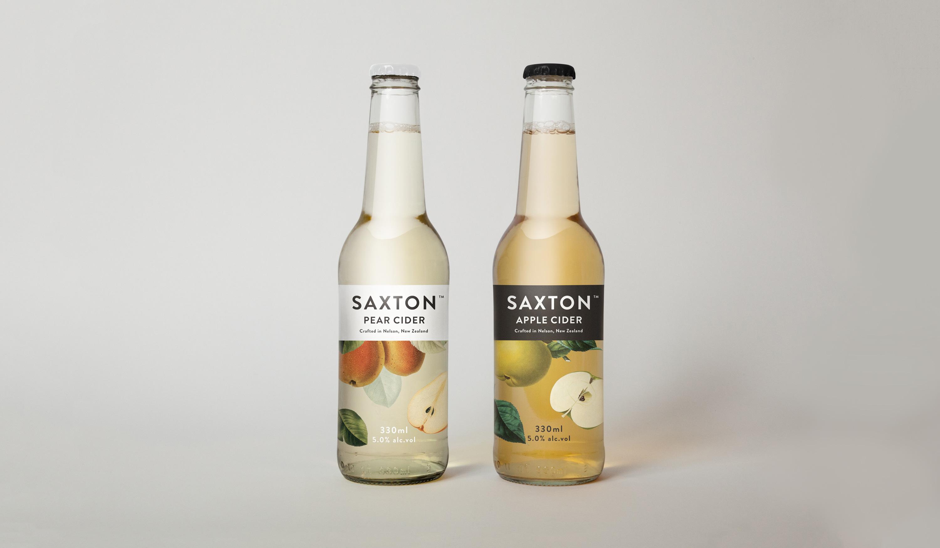
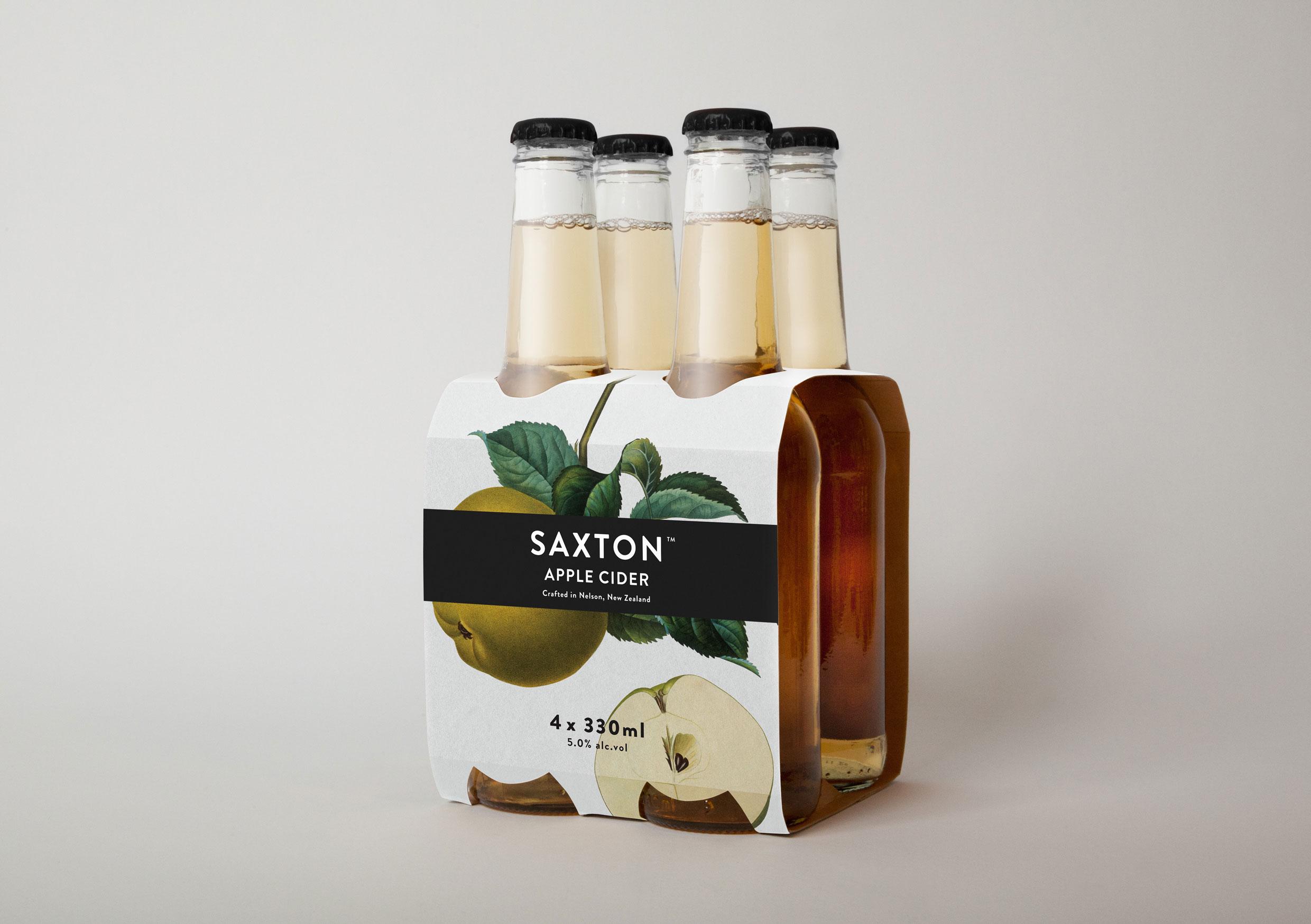
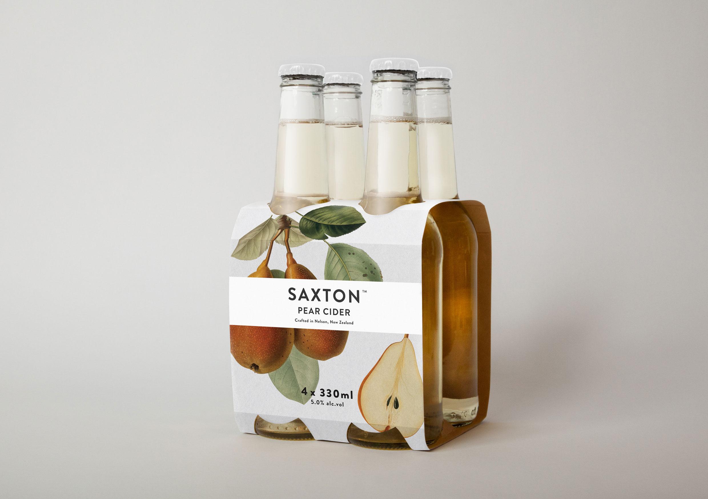
Saxton is a new range of ciders from New Zealand brewery McCashins developed for fresh food retailer Woolworth’s, Australia. The products identity and packaging, developed by Supply, utilises a classic 17th, 18th and 19th century botanical fruit print and engraving illustrative style to communicate a hand-crafted sensibility.
Drawing on the past for inspiration has always been a very valid technique to capture a sense of nostalgia and a more wholesome aesthetic. At the moment this is typified by the popularity of 1950’s Americana so it is very refreshing to see something that has taken its cues from much further back.
This design is very simple in its ideation and execution and is built from a few elements that have been wonderfully handled and laid out to deliver a very classic looking packaging solution that expresses a genuine sense of detail and craft. The fruit illustrations have been intelligently coloured and applied to the packaging retaining their authenticity and a consistency across both cider varieties. The logo-type and content, set in Brandon Grotesque, compliments the idea of period botanical guides while the black on white and reverse applications add a nice variation across the two packs. My only criticism is the letter spacing between the SAXT seems a little close (or tight on the TON) but does not really detract from the original and uniquely styled packaging.