Elmika by Hattomonkey
Opinion by Richard Baird Posted 21 September 2011
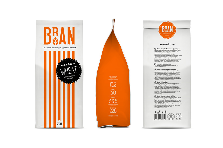
Bran and Crisp are sub-brands of Elmika, a range of wheat products owned and distributed regionally and internationally by Moscow based Эль-Про (El-Pro). Elmika’s new packaging, designed by Hattomonkey, blends a traditional handcrafted bakery aesthetic with a very modern, bright and minimal execution.
This project really struck me as a clever take on a vintage aesthetic that manages to unify the ideas of locality, tradition and quality with a confident and minimal style that appears as both familiar and contemporary. Each of the two logo-types have been very well rendered and feature a raised R that suitably draws on the visual dynamics of vintage packaging while also clearly expressing the key proposition through a simple wheat motif.
These typographic focal points are complimented by an equally weighted striped frontage that mirrors shop awnings of the past but with a bright and colourful twist. The Elmika branding sits on a contrasting, black rosette device that communicates the aspect of quality and is utilised as a neat sticker detail on the reverse of the Bran pack.
The supporting typography, set in Mr Moustache, articulate the subtle flavours varieties with a hand drawn and fine quality that compliment and contrast against the bold and wholesome lines of the brand.