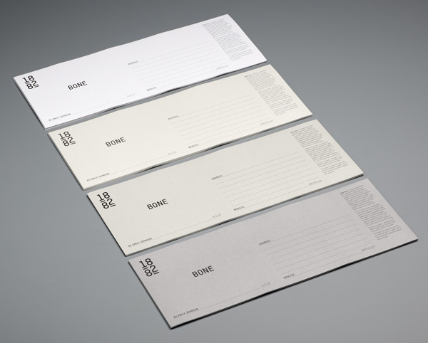
1882 by Pentagram
Opinion by Richard Baird Posted 23 September 2011

1882 is the brand identity of designer Emily Johnson who creates contemporary bone china products using traditional techniques practised by her family since 1882. The logo, created by internationally renowned studio Pentagram, lead by partner Domenic Lippa, unifies the themes of heritage and tradition and juxtaposes it with a modern and minimal typographical solution.
“The team decided to focus on the heritage of the brand by referencing the date of the foundation of the family company and the original Johnson Bros mark which featured a line under the ‘o’. This logo then features on all collateral picked out in a white foil which hints at the nature of the product as it reflects light. The serene nature of the product is matched by the clean, straightforward approach to the graphic identity.” – Pentagram
The brand name clearly implies heritage while the logotype’s execution is contemporary. Together these form a smart visual analogy of Emily’s work. The underlines tie it subtly to the past while adding a more weight to the 1 and 2 balancing these against the heavier forms of the 8’s. The stacked and vertical lock-up marks it out as slightly more unusual and suitably characterises the tall and distinctive lights in Emily’s new range. The black and white application of the identity across the printed collaterals neatly draws on the aspects of light and dark while the fine lines, modern type and linear layouts continue the theme of a modern take on classic detail. The uncoated substrate and white foil finishes give it a tactile and contrasting reflective/unreflective quality similar to both glazed and unglazed ceramics adding further depth to the brand.


