Carbon Loft by Carbon Loft
Opinion by Richard Baird Posted 30 September 2011

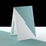
Carbon Loft is a Middlesbrough (UK) based independent graphic design studio that was established this year. Their identity, developed in-house and art directed by designer and illustrator Masha Chughtai, is a neat union of simple design and virtuous materials.
What really drew my attention to this branding exercise was the commitment to the more unusual recycled substrate as a device to deliver a clear message about the studio’s sustainable design practices. This is not only reflected in the materials but also in its open and clear approach to layout, typesetting and identity. This idea is complimented by a circular logo-mark that contains an abstract CL monogram that acts as both a global and sustainable reference as well as a personal mark of quality much like the Green Dot. The clean and modest type choice of Helvetica is sound and although a little tight on the vertical spacing is simple and honest much like the substrate. The slightly grey/black colour palette (the result of printing on an uncoated paper) has a charcoal/carbon quality and works well with the slightly off-white sun-bleached effect of the compliment slip and business card giving the identity a very natural and truthful sensibility.