El Camino by Tsto
Opinion by Richard Baird Posted 2 November 2011

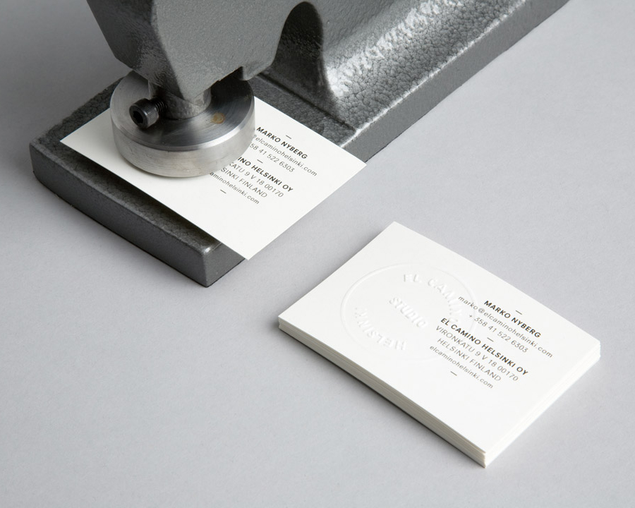
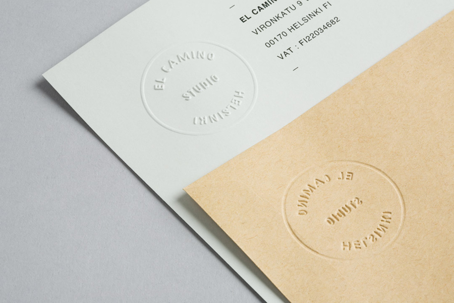
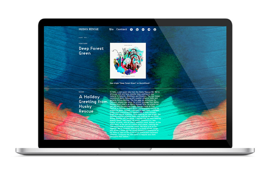
El Camino is a Helsinki based audio production and sound design company who work in collaboration with the band Husky Rescue producing music for international television and film. Finnish design agency Tsto was commissioned to develop the identity for El Camino which is based around a custom typeface, also utilised across the Husky Rescue website and a practical, self embossed brand stationary concept.
“Tsto based El Camino’s identity around an embossing stamp and a custom typeface, which was used for both projects [El Camino & Husky Rescue]. The forms of the typeface were shaped from ten geometric modules, resulting in a geometric sans with characteristic faults.” – Tsto
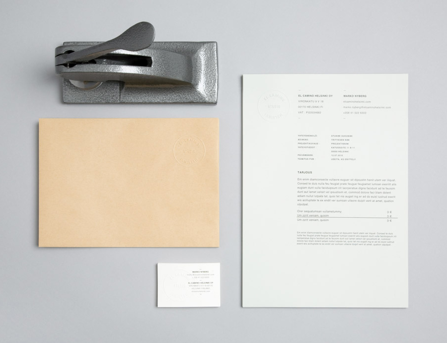
When I first saw this project I was not sure what to make of it but I knew I liked it and felt that it needed to be seen by other designers and hopefully discussed. For me it challenges the conventional by basing the identity around a custom typeface that would be considered by many as broken or poorly executed. This theme of imperfection runs throughout the brand giving it a unique and distinctive character. The embossing stamp is a fantastic direction that instantly translates this quality directly into the substrate (as an often uneven punch) and adding a humanistic sensibility. The geometric and modular construction of the typeface resonates well with the brand’s utilitarian execution and follows the stamp’s unpolished, industrial aesthetic and underlying futuristic/dystopian quality.
To discuss the overall technical quality of the typeface would be missing the point but it is consistently executed and resolves the intentional ‘faults’ of the typography into a professional piece of identity work.
