More4 by ManvsMachine
Opinion by Richard Baird Posted 4 November 2011

More4 is a UK digital television channel owned by Channel Four that reruns documentaries, drama and lifestyle programmes of its parent channel as well as broadcasting a number of original pieces. Yesterday it was announced that from January 2012 More4 will have a new identity developed by London based digital design agency ManvsMachine, dropping the single colour and organically animated four, in favour of a new, geometric and colourful logo-mark.
“More 4, Channel 4’s successful digital channel is evolving. From January 2012 a channel re-brand will mark the introduction of an even clearer programming proposition with the schedule focusing more fully on popular factual and features – life enhancing content, helping viewers to get the most out of their everyday lives. Programming which offers insight and inspiration to the way they live, including homes, property, food, health and fashion, will form the main stay of a more user friendly schedule, but there will be an additional feel-good factor with quality acquisitions.” – Channel Four
Televisual identities are clearly more than just a logo but I am pretty excited about this new direction. I have always seen the original, designed by Spin, as confident and intentionally simple during a period of brightly coloured and over dynamic on-screen identities which suited the demographic. As its popularity has grown and an increase to its original programme line-up the decision to give the channel a more diverse character, a tonal range of sorts, seems a sensible choice.
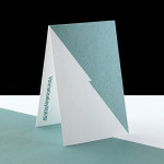
As a static piece of design the new logo-mark looks bold and modern with a playful almost retro toy like aesthetic that should make it an interesting animation. The bright and diverse colour palette appears to neatly reference n number of the tones from the classic Channel Four identity (used until the late 90’s) that works well to characterise the lifestyle/documentary aspect and essentially the diversity of the people featured in a more fact based schedule. The angular, geometric and modular construction suggests that it could be assembled in a number of different ways and ties in with the Channels vision of customisable content. The new identity sits neatly between the significant brand equity of Channel Four and the overt personality of teen focused E4.
Original animated identity designed by Spin – Brand guidelines are available to read here.
“The re-brand is centred round a bold, flexible logo that morphs through a series of flips, folds and reveals. The colour palette reflects the vibrant nature of interiors, food culture, fashion and other contemporary lifestyle programming.”
“Live-action idents see the brand break out into the real world in the form of mechanical ‘flippers’. The installations inhabit environments from a domestic staircase to an abandoned fishing boat in Dungeness. To achieve this ManvsMachine teamed up with installation design pioneers, Jason Bruges Studio, to help design and build a flexible system consisting of over 400 individual flipper units.” – ManvsMachine