Ray Lemon by Leib Und Seele
Opinion by Richard Baird Posted 16 November 2011

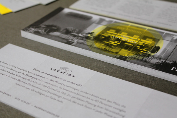
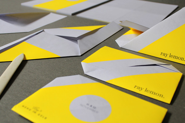
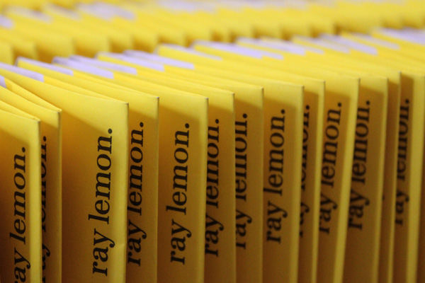
Ray Lemon is a bar located in the city of Heilbronn, Germany. As part of the monthly event ‘Menu in Yellow’, a four course fine dining menu, Stuttgart based design agency Leib Und Seele were commissioned to develop the communication materials for the event that could resolve the bars vivid and industrial themes with a delicately crafted gastronomical experience.
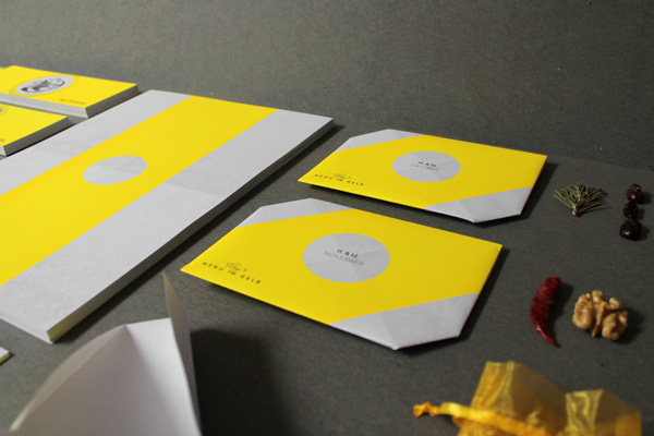
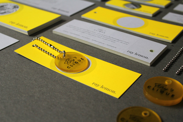
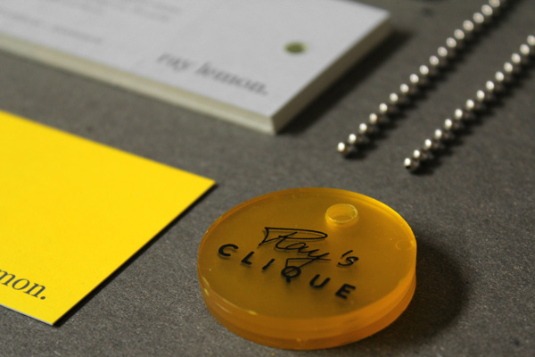
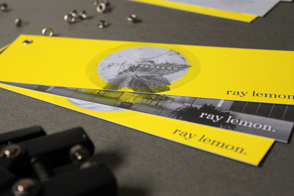
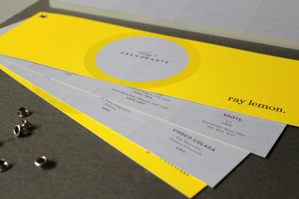
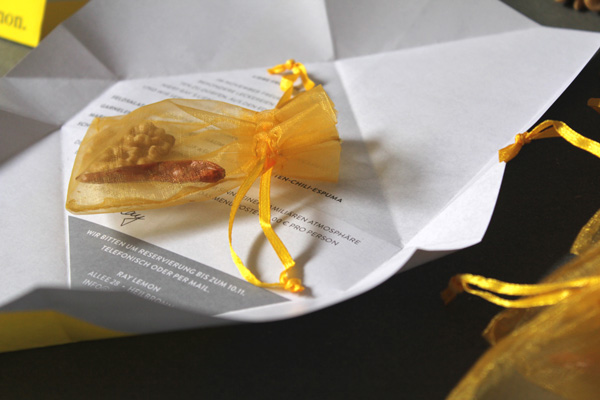
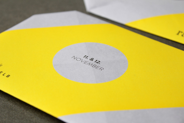
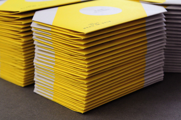
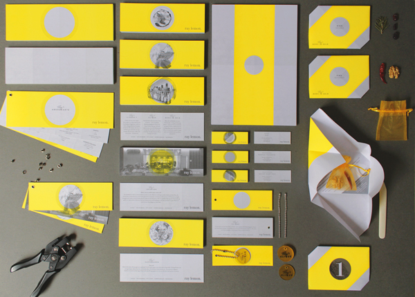
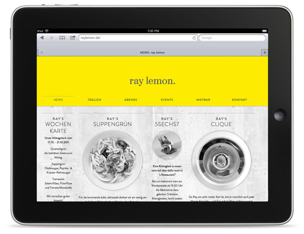
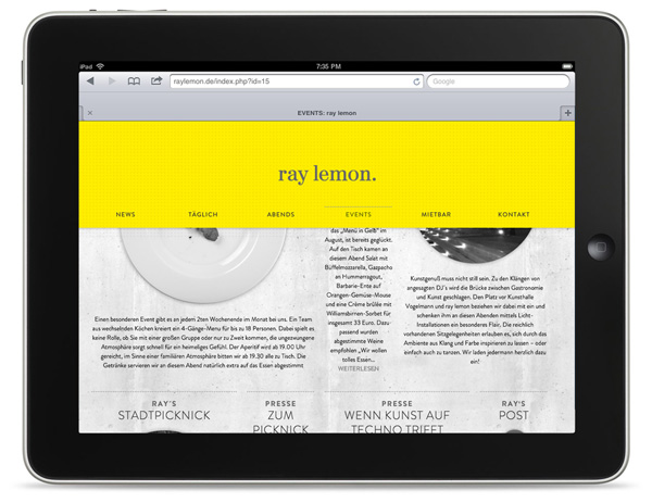
“For the Heilbronner Bar “Ray Lemon” We create communication and a design concept with two constants: the brand color yellow in conjunction with the existing concrete and the fictional character “Ray”. This occurs from now on personally in any dialogue, and even established their own friends, the clique, easily recognizable by the embossed marks.The invitations to the event “menu in Yellow” We are each provided with the spices used and produced by the origami folding a high quality and individual character.” – Lieb Und Seele (Google Translated)
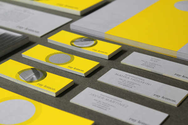
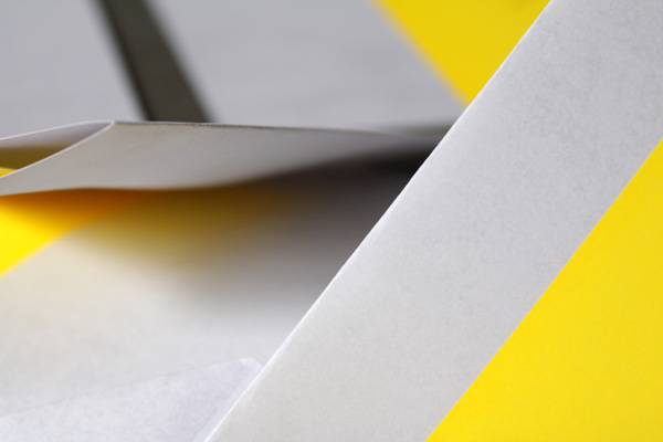
In a slight break from tradition I have decided to publish a bit of communication design as I felt that this projects neat combination of colour, material and folds to articulate the crafted nature of the food and the opportunity taken to reinforce the brand’s values with new and tactile touch points had an intelligent and sophisticated resolution. The utilitarian nature of the concrete, glass and steel interior comes across well in a print system that is hand folded, self punched and utilises uncoated, unbleached materials and geometric forms. These neatly juxtapose the fine dining experience while emphasising a truth to ingredients. The contemporary and industrial approach to the print work is appropriately balanced by a script rendering of the bars first name ‘Ray’, delivering an exclusive quality and establishing a personal dialogue for future communication.
