Keaykolour by Blast
Opinion by Richard Baird Posted 29 November 2011

Keaykolour is a premium sustainable paper brand aimed predominantly at the creative industries owned and distributed by Arjowiggins. The brand’s identity, created by independent and London based design agency Blast, unites an iconic double K symbol and a finer logo-type (carried over from the previous design) to characterise the distinctive, bold choice and detailed quality of the materials.
Our work includes distinctive brand elements, marketing tools for designers and a website which positions Keaykolour as a market leader of premium sustainable coloured paper. The new brand was launched by our ‘Colourful Life’ marketing campaign, which centred around a unique collaboration with artist Ian Wright. – Blast
I love the two-part nature of this identity and its contrast of bold symbol (that resolves the idea of weighty stocks and functions as a window for a diverse colour range) and the light type treatment (that implies high quality and a suitability to detailed print work).

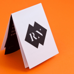
The double K symbol works well to represent the dual sided nature of the substrates (in its mirrored construction), the unique characteristics of the paper (essentially forming a new letter) and a consistent guaranteed quality with its stamp and seal like aesthetic. Animated it has a swatch book sensibility which builds on the vibrancy established by the static mark and its print applications as well as a sense of dynamic and creative opportunities that fits the designer market. The overlay effect and heavy weight of the character is a particular highlight for me that works exceptionally well when used to convey different and integrated print techniques and is taken full advantage of across the collaterals. The symbol also functions as a window to some of the available colour choices online adding to its flexibility and delivering a level of interactivity.


The logo-type, set in what appears to be Arial Condensed with a modification to the K’s has been well executed and has a slight technological undertone that neatly emphasises its suitability to new ideas and techniques. The colour palette across the collaterals is modern, broad and appropriate, utilising contrasting tones to compliment both the finer lines of the logo-type and the heavy set symbol.