Multicourse by Bravo
Opinion by Richard Baird Posted 28 November 2011
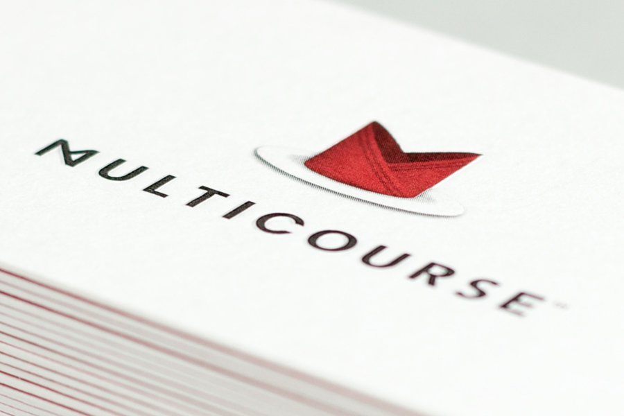
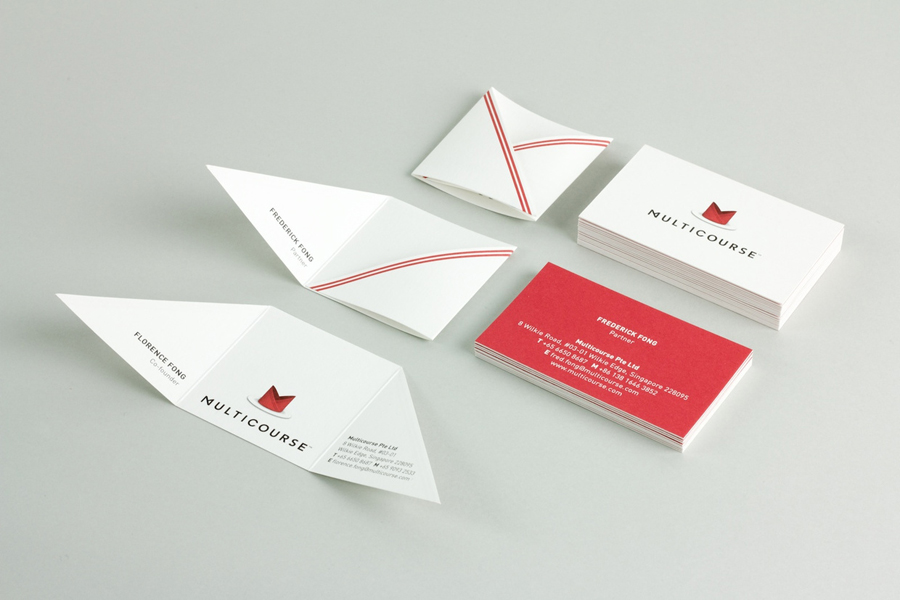
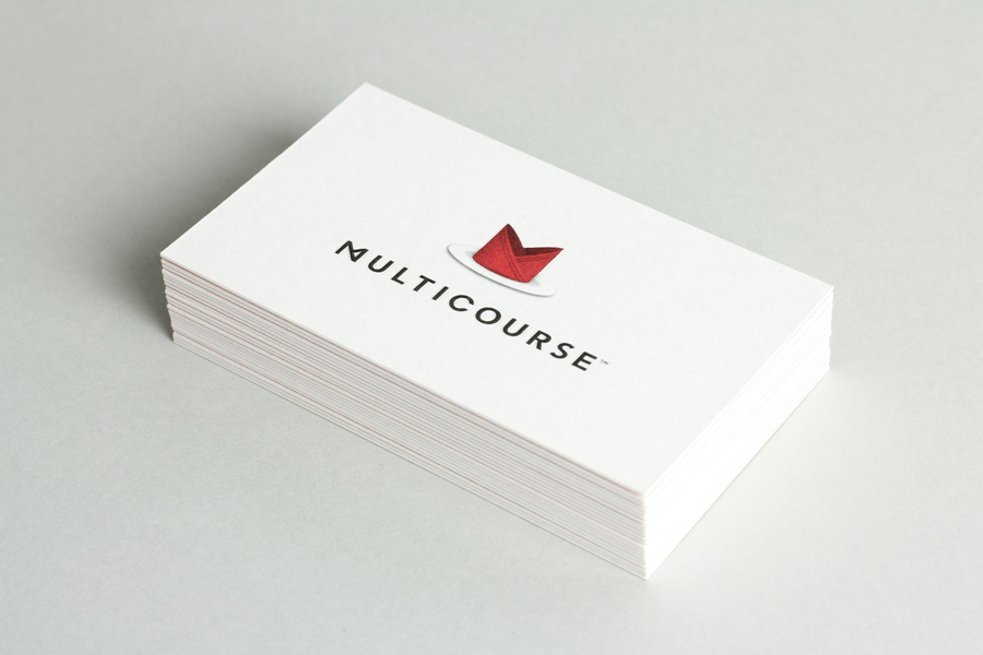
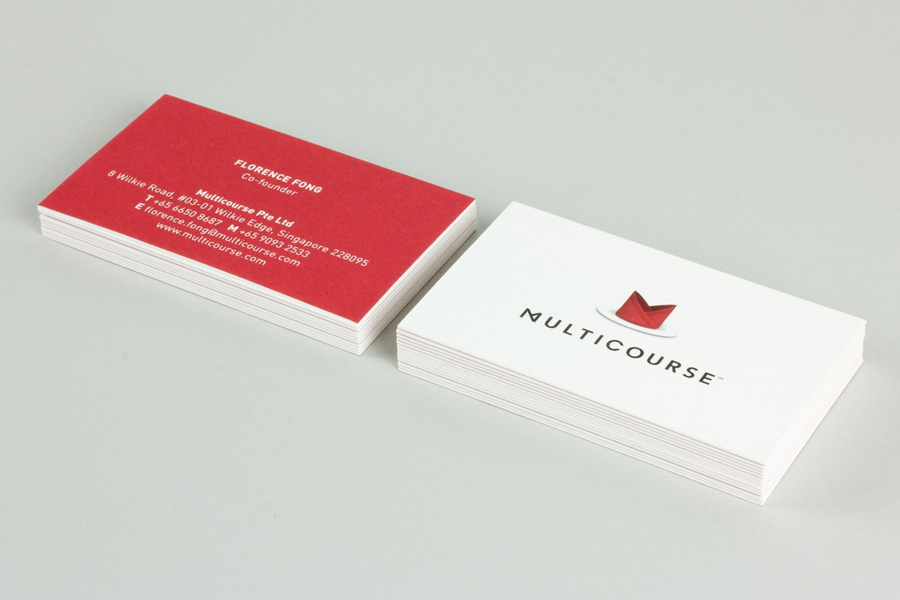
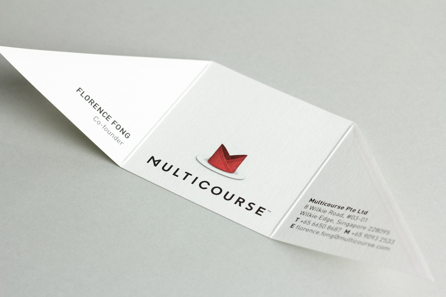
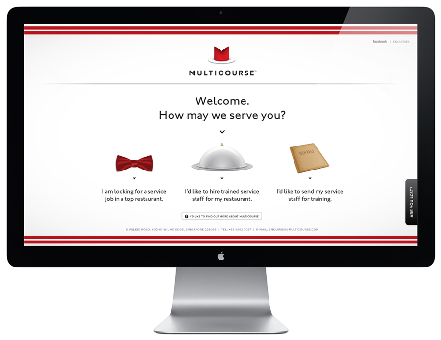
Multicourse is a provider of F&B service training for catering staff developed by industry experts and operates across Singapore. Their identity, developed by independent design agency Bravo (also based in Singapore) translates the brand’s high quality service proposition and accessibility in a neat logo-type solution and a playfully contrasting, folded napkin logo-mark and collateral.
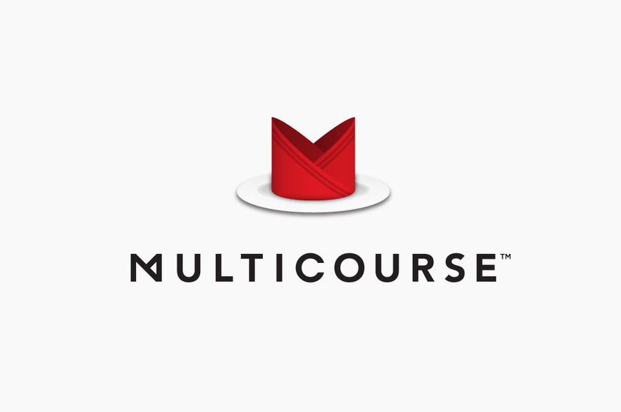
I love the simplicity of the folded ‘m’ at the start of the logo-type. This, in conjunction with the geometric sans-serif characters of Avenir establish a clear sense of standardisation and formality but with a subtle twist. The napkin logo-mark above, while well-executed (and setting a lighter more accessible tone) feels like a detail too far and conceptually more effectively communicated through the tactile and engaging collateral solution. That said, the identity is very well put together and consistently applied across each touch point. The black and white colour palette appropriately reinforces a classic fine dinning experience and professionalism while the bright red adds a creative highlight.
Design: Bravo
Opinion: Richard Baird
Fonts Used: Avenir
