Kalinka Fruit by Studio In
Opinion by Richard Baird Posted 1 December 2011

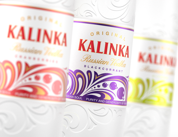
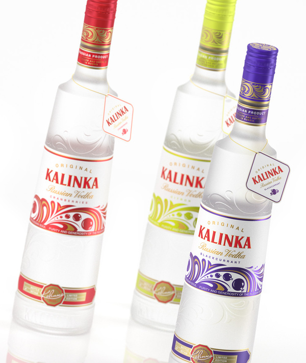
Kalinka is a Russian premium vodka brand exported internationally by the Yat Vodka Association. Further to a structural, label and brand redesign of the original product back in 2010, Moscow based Studio In have developed the labels for an accompanying range of fruit based editions that take the frosted, metallic/foil and raised design cues and add a bright and playful twist.
“StudioIN came up in the competition for redesigning the appearance of the Kalinka vodka. The professionals of the studio suggested a fundamentally new solution for the product. They came up with an original shape for the bottle, its unique surface relief, logo and tracery. The bright elements of the company style and the clear-cut tastes differentiation form an effective identity. The simple and laconic design of the packaging creates an organic image and an easy to recognize company style. That advantageously sets Kalinka apart from the competition, allows to correctly position the product on the market and brings the central idea of the brand home to customers.” – Studio IN
The fruit illustrations are fairly straightforward in their ideation but fit neatly into the flock details of the original product retaining the dynamic and liquid like sensibility. The metallic colour choices of the blackcurrant and citroen are bright and lively and compliment the brand’s primary red and gold colour palette while the cranberry feels a little more reserved in comparison. The tags have a far cleaner layout in comparison to the original (which appeared a little too heavy on the gold) and reinforce the brand’s premium proposition.


