Born Builders by The Drop Studio
Opinion by Richard Baird Posted 1 March 2012
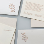
Born Builders is a build management, renovation and carpentry service provider with offices in London and Warrnambool, Australia. The company’s new brand identity—which included logo, stationery and website design created by The Drop Studio—draws together the brand’s collaborative and integrated approach and an honest and reliable business practice through a simple sans-serif monogram and logotype combination executed as a single colour print treatment across uncoated substrates.
“Our business was created in order to meet a demand for reliable, professional, honest and experienced design and build services in an industry that often fails to deliver. From renovations, to building a new home, we use only the most experienced and reliable partners to ensure that each project is delivered with the minimum of stress, on time and on budget.” – Born Builders

The logo is a simple idea that neatly captures the aspirations of moving onwards and upwards through a stacked and structural composition while collaboration and partnership is subtly implied through the integration of two ‘B’ letter-forms. The logo draws on the values of personal service, craftsmanship and guaranteed quality through its traditional monogrammatic foundation but with a contemporary approach conveyed through its rendering while a subtle maternity/creation sensibility exists in the bowls of the b that draws on the name.
The heavy and consistent line weight of its sans-serif typographical construction and that of the logotype introduce the aspects of reliability and robustness which is then complimented by the finer detail, structure and floor-plan like grid-based layout of the stationery.
A black on white and white on black mix across the stationary gives the identity an economical, practical and contemporary edge that, alongside an uncoated substrate is reflective of fundamental building materials and an honest, trustworthy business practice.