Agromundo by Anagrama
Opinion by Richard Baird Posted 7 March 2012

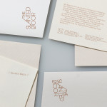
Argromundo is a Mexico-based retailer and manufacturer of agricultural pesticides. The brand’s new identity, created by design studio Anagrama, resolves a technological but environmentally considerate approach through a simple geometric interpretation of a clover, bright neon ink and uncoated unbleached paper.

“Our task was to give it a brand identity that was both modern and tech-saavy, and that would reflect sustainability. We designed a very simple logotype based on the shape of a clover and traced by an interlaced line, the typographic selection consists exclusively of Helvetica, in order to make the products more serious and give them an almost clinical look. We designed a very simple logotype based on the shape of a clover and traced by an interlaced line. The typographic selection consists exclusively of Helvetica, in order to make the products more serious and give them an almost clinical look.” – Anagrama
The most distinctive aspect of this project is its utilisation of a bright neon and earthy colour palette, executed across an uncoated substrate. For me it is a clever and contemporary balance that expresses a chemical yet environmentally considerate character. The complementary use of black and white introduces a more conventional and understandle aesthetic that works well within the context of a content heavy label helping to keep the information clear and formal.
The logo-mark has a well-balanced geometry, a neat use of a consistent line weight, intersections and parallel strokes that imply and unify the themes of consistency, reliability and technology. This triality also extends to the clover’s straightforward reference to nature, a sense of care and responsibility delivered through its heart shape leaves (emphasised by a combination of pointed terminals and circular bowls), and a vivid neon colour choice that has a clean and pharmacological sensibility.The logo-type and block copy, set in Helvetica, successfully deliver the clinical sensibilities Anagrama sought and has been very well spaced but there are a number of other similar typefaces that would have perhaps introduced a tiny bit more of a proprietary sensibility.
It is a very simple idea that has both a conceptual depth and a well executed visual resolution that feels brand appropriate and consistent throughout the packaging and stationary.