Sissy’s Southern Kitchen by Tractorbeam
Opinion by Richard Baird Posted 20 March 2012
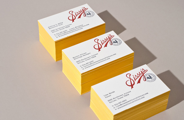
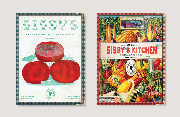
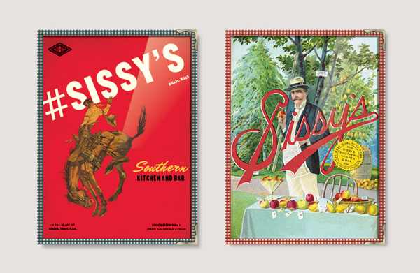
Sissy’s Southern Kitchen is a Texas based restaurant created by celebrity chef Lisa Garza, a former contestant on The Next Food Network Star, that serves southern classics such as fried chicken, bourbon bread pudding and gulf shrimp n’ grits. Developed by brand design agency Tractorbeam, Sissy’s visual identity takes a classic 50’s photo-illustrated approach and gives it a consistent quality across a diverse set of assets.
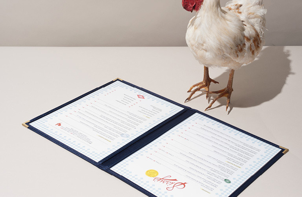
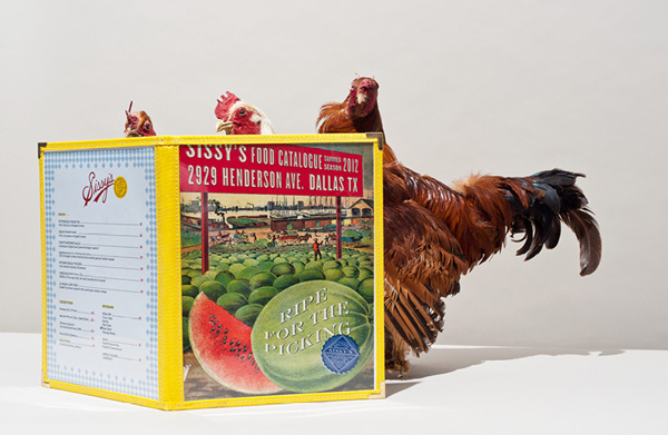
“Challenge – Create a brand that complements the southern sophistication of the menu and the carefully appointed interiors. Develop a versatile menu system to support seasonal offerings and daily specials.”
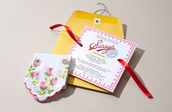
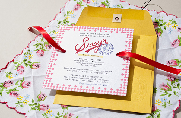
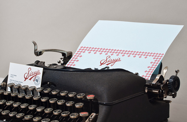
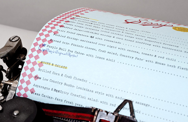
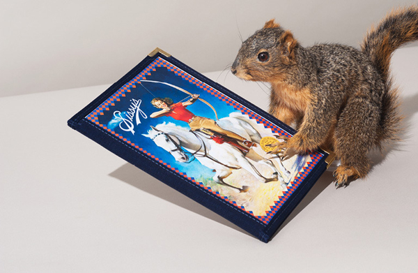
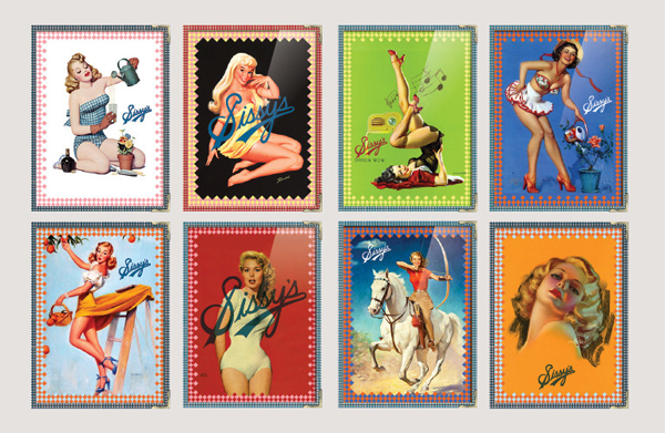
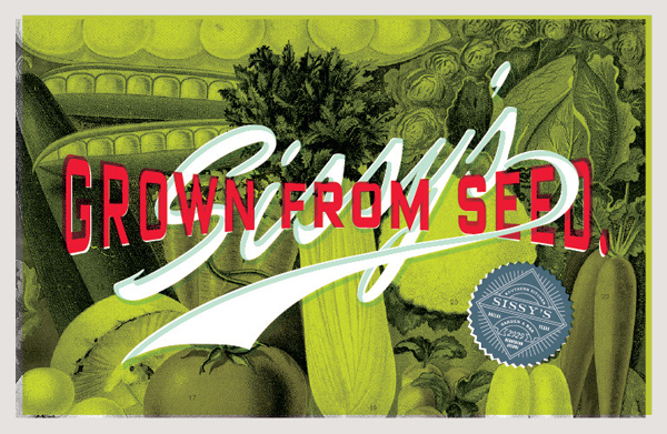
“Execution – Drawing inspiration from pin-up artwork and vintage seed packets, bright colored imagery dominates the brand. The logotype was drawn from the script found on mason jars, and the menus were created with typewriter fonts, complete with blemish marks and hand-written notes.”
– Tractorbeam
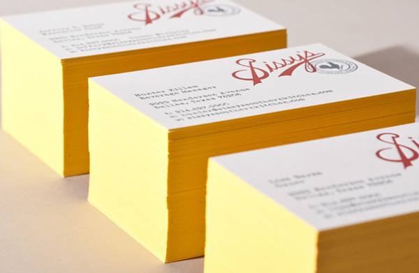
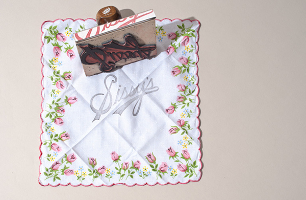
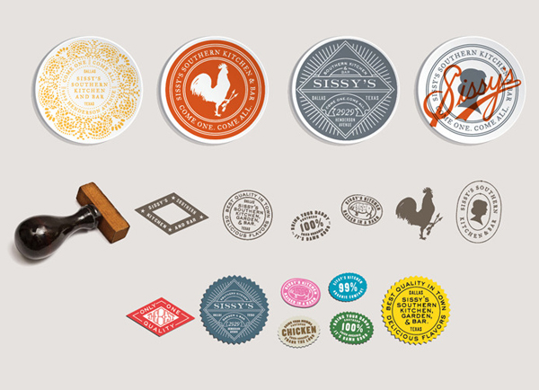
I really love this project’s retrospective approach and the contemporary consistency Tractorbeam has managed to achieve throughout the restaurant’s collaterals. There is no doubt that this could be perceived as a little kitsch but with techniques such as embossing, stamps, stickers, letterpress and edge treatments the solution manages to bridge the gap between a sense of authenticity and modern intelligent design.
The logo-type’s energetic script resolution has been really well crafted and clearly translated from a period source with small details like its twin terminals and baseball sensibility that infuse a great sense of individual personality while its single colour juxtaposes the bright and highly contrasting imagery that takes its cues from hand coloured photography.
The intentional utilisation of type blemishes, a typewriter and print miss-alignments helps to emphasise the imperfect period feel and give the brand a more accessible and humanistic quality rather than appearing too distant. Like the photography and logo-type the business cards neatly blur the line between contemporary and classic through the use of vintage print techniques and treatments that like the graphic design of the post war period continue to have a 21st century renaissance.
