The Shilling Group by Touch
Opinion by Richard Baird Posted 27 March 2012
The Shilling Group is an Scottish independent pub operator that owns and runs the Edinburgh venues: Carriers Quarters, The Pond and Bar Kohl. The group commissioned creative agency Touch to develop a name, visual identity and an on-line presence that would be simple, timeless and trustworthy.
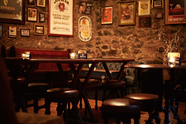
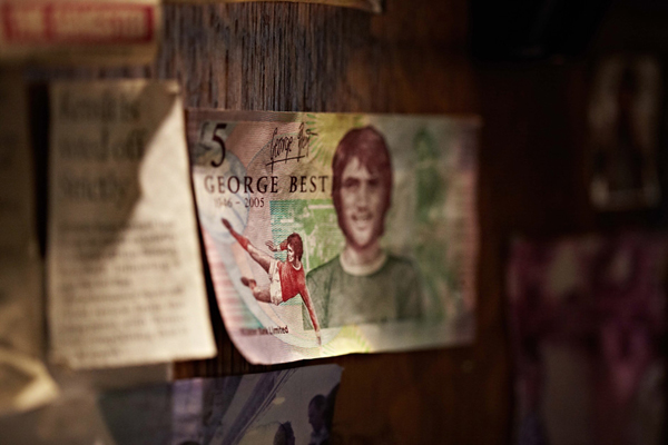
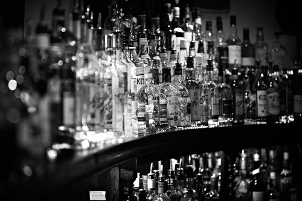
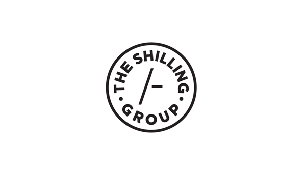
“After researching the history of brewing in Scotland, we proposed a number of names, and a favourite quickly emerged. The Shilling Group makes reference to the price charged per barrel of beer in the nineteenth century – and the subsequent Shilling System, still recognised in Scotland today. A marque incorporating the iconic /- symbol was developed along with a bold, assured type style, and we art directed a series of images showing the history, character and diversity of the venues. This identity was then consolidated through a series of striking, content-managed websites.” – Touch
The Shilling Group’s new identity is neat union of modern sans serif, consistent line weights, a simple geometric coin-like form and a monochromatic execution set against a retrospective theme that neatly characterises a traditional pub experience with a sense of contemporary quality. The restrained and minimal form works really well to subtly tie each venue together while delivering an interesting contrast to the rich, familiar and nostalgic detail of the venue photography utilised across each website.
