Quarterly Co. by Oak
Opinion by Richard Baird Posted 29 May 2012
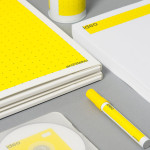
Quarterly Co. describes itself as ‘a new way to connect with the people you follow and find interesting’ and is an on-line subscription based service that delivers, on a quarterly basis, curated products selected by influential bloggers, designers and artists. Each package is built around a unique concept or story reflective of the philosophies of each contributor providing the subscriber with a tangible link to the people they follow in the digital world. Contributors include, among others, Amanda Hesser & Merrill Stubbs, Josh Rubin & Evan Orensten (from Cool Hunting) and Tina Roth Eisenberg. Quarterly’s visual identity, created by web, app and brand design studio Oak (who also developed the service), is an interesting combination of a utilitarian postal aesthetic, retro illustrative details, badge and san serif logo-type.

“The postal service offers a rich visual history. There are common themes honoring couriers, the airmail service, the pony express, and others. We chose a style that would allow us to blend in with contemporary startups while honoring the heritage the postal service offers. We chose to honor the package as the iconic twine-bound box. The perspective on the box creates a unique silhouette.” – Oak


“Package size and shape is different for nearly every shipment. We designed flexible elements such as tape and stamps that can adorn a variety of packages. We specified color and illustration style but the brand remains malleable. The linear style has a sense of nostalgia, can be used to illustrate and letter any number of things, and reproduces well on cardboard and as stamps. The illustrations on the packaging salute about a dozen pop culture references (which Seinfeld character resides in apartment 5E?).” – Oak
Rather than attempting to distill a fairly detailed proposition into a single identity, Oak have built a broad and engaging experience that resolves the themes of craft, delivery and quality through a lovely mix of identity design, illustration and a tactile material and print combination.
Based around an elemental, monochromatic logo-mark, constructed from a three dimensional parcel, geometric ribbon, heavy border and string tie, the visual identity manages to balance detail and simplicity, positive and negative space and a retro playfulness. Its internal line weights have a contemporary and underlying technological consistency that is also reflected through a logo-type fused with a couple of interesting quirks across the R and E that make it a little more unconventional and craft-like.
The packaging, through the utilisation of uncoated material textures, graphic design and sticker, tape and stamped print treatments, really enhances the service experience and captures the passion and enthusiasm Quarterly has for unique, well designed products and the creativity of its contributors. The depth and illustrative detailing of the box tape is a real highlight that confidently juxtaposes the simplicity of the visual identity through an interesting, on-trend union of type styles, line weights and iconography bound together under a postal theme and set against the unbleached brown of the substrate. The stickers add further texture, sense of personalised quality and a contemporary red highlight that lifts the predominantly black and white colour palette.
The result is both practical, retrospective and engaging, suitably enhancing and reflecting the positive experience of receiving mailed products, building brand enthusiasm and effortlessly communicates the concept of craft and delivery.