JOC by Francesc Moret
Opinion by Richard Baird Posted 30 May 2012

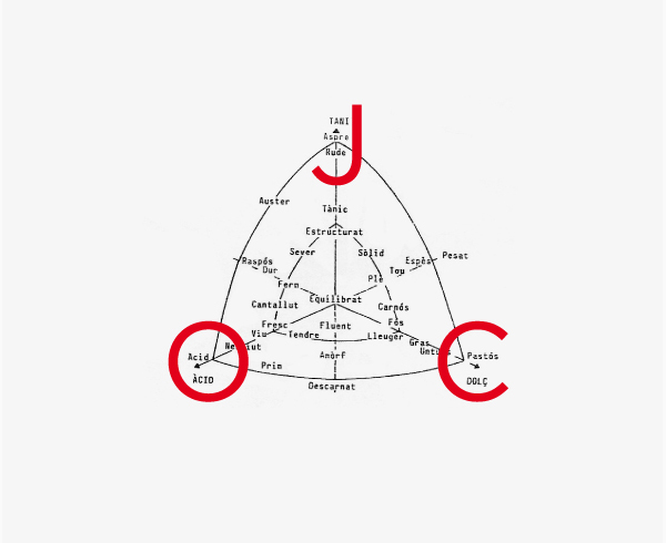
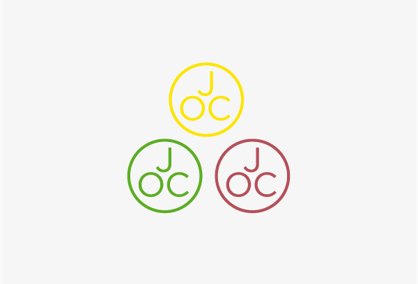
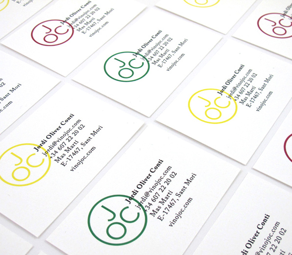
JOC is a wine range produced by Jordi Oliver Conti from vines selected for their rarity, geographical location and limited production. JOC’s identity, developed by Barcelona based art director and graphic designer Francesc Moret, is founded on the three elemental characteristics of wine; tani, acid and sweet with a personal, monogrammatic resolution.
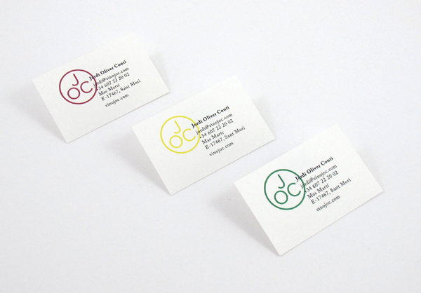
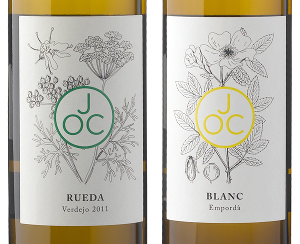
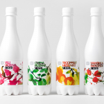
This a very simple idea but really well executed. The consistent line weight, roundel and reflection of curves through each character feel modernistic, iconic and an appropriate monogrammatic representation of personal pride. Its triality and geometric construction is an interesting and smart distillation of the elemental properties of wine while its over-print treatment across the business cards introduces a regional and localised craft aesthetic. Together these add a bit more depth to the simplicity of its form. The mono-line weight and structured geometry is juxtaposed alongside a fine and loose hand-rendered illustrative floral label that captures an artisan approach and creates a striking contrast between the organic and the manufactured.
