ÅKA Hair by DC
Opinion by Richard Baird Posted 21 June 2012

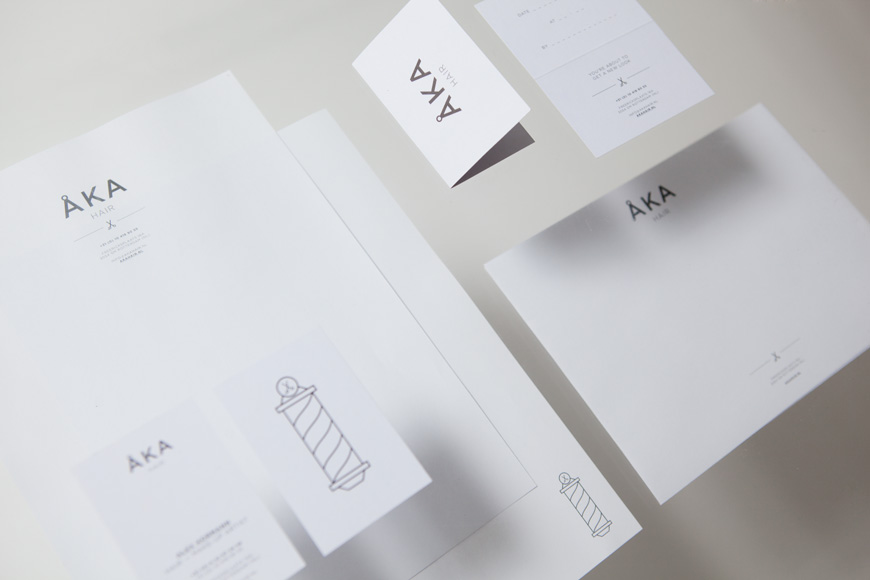
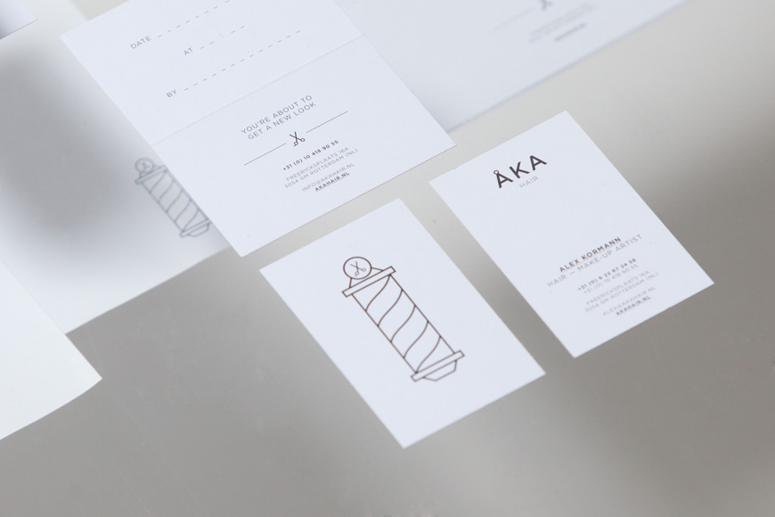
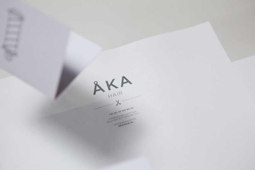
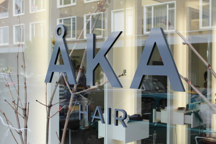
ÅKA is a hair salon, developed by stylist and makeup artist Alex Kormann, located in the Hillegersberg area of Rotterdam (NL). The salon’s name and visual identity, created by multidisciplinary design agency DC, utilises the high fashion and architectural sensibilities of a bold and well spaced sans serif set alongside a mono-line weight twist on the classic barber’s pole to convey precision, contemporary style and personal service.
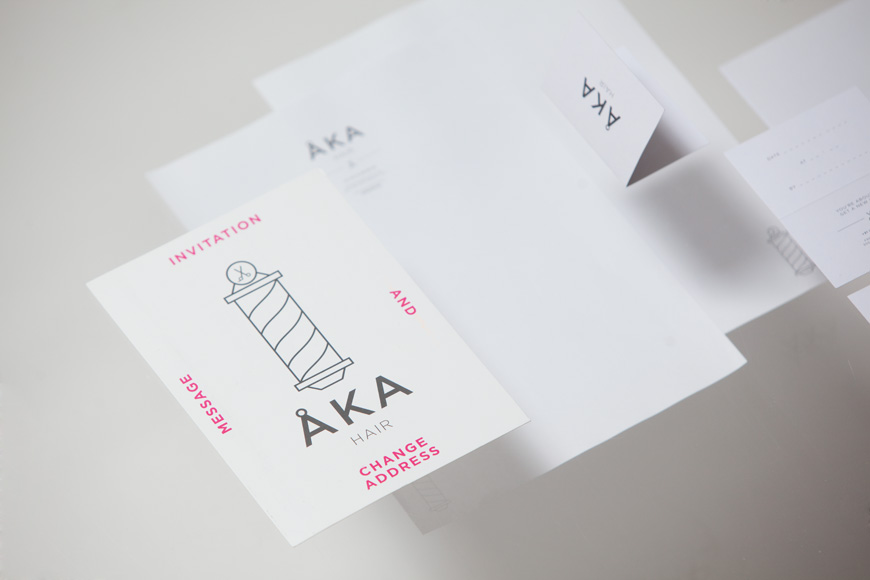
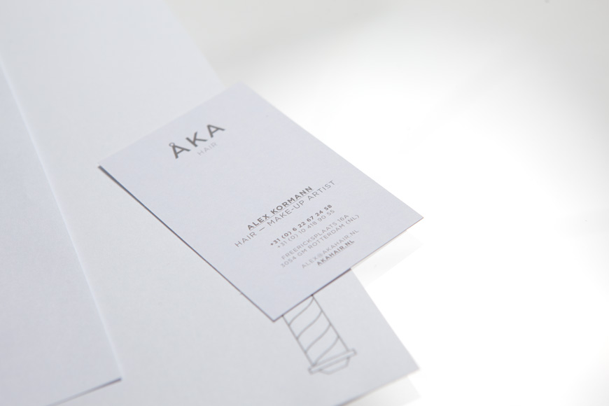
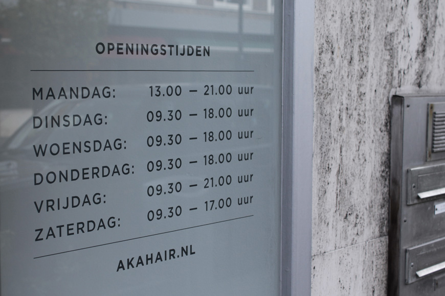
The broadly spaced, wide geometric characters and contrasting line weights of the logo-type, the stationery’s grid based layout, centre alignment, use of plenty of white space and a cool grey colour palette (reflecting some of the elemental materials of the salon’s interior) is an interesting solution that manages to draw a parallel between structural design, fashion and contemporary hair styling. A mix of vertical and horizontal, all uppercase type and pink highlight across the collateral have a confident tone of voice with a subtle art and craft quality that adds a little more character and sense of creativity to what is essentially a very clinical and restrained approach. The light mono-line weight execution of a classic barber’s pole delivers a neat contrast to the heavier weight of the logo-type while appropriately mirroring its geometry and hinting at a more traditional, personal approach to contemporary styling.
