Logo, Branding and Packaging: Patchett’s
Posted: July 20, 2012 Filed under: Food & Drink, Packaging | Tags: artisan, branding, confectionary, craft, design, Designers Anonymous, food, gourmet, graphic design, handcraft, handmade, logo, logo-type, marshmallow, packaging, sweets, typography 6 Comments »
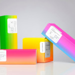
Patchett’s is a UK gourmet confectioner that specialises in the creation of natural, handmade and batch produced sweets. The brand’s visual identity and packaging for their first range, a selection of uniquely flavoured marshmallows, was created by London-based agency Designers Anonymous and utilises a pale colour palette, soft geometric shapes and classic typographical cues to capture the artisan and craft based nature of the brand and the light but natural flavour profiles of the marshmallows.
“Spending time with our client, we were impressed by the lengths she went to perfect her recipe for gourmet marshmallows. After many test sessions, Ms Patchett finally arrived at a recipe and process that met her strict standards. It was at that point that we created the line ‘Patchett’s makes perfect’.”
“The packaging is inspired by vintage confectionery and features a repeat pattern that continues the ‘Practice makes perfect’ repetition theme. The patterns show the transformation from key ingredient to marshmallow shape… Each flavour has a unique pattern based on a key ingredient.”
- Taken from the Designers Anonymous website
What really stands out for me is the amount of communicative value drawn out of a very simple combination of pattern, type and colour. The relationship between pattern and pragmatism is very subtle but resonates well through geometric form and the incremental grid based layout, details which add an interesting contrast to the more organic, imperfect and handmade qualities of the marshmallows and celebrating the use of basic ingredients. A logo-type with a low X height, a feature common to the Art Deco period, and pastel colour palette introduce an art and craft-like sensibility while the candy cane keeps it looking playful (neatly drawing on the classic candy shop association). The broadly spaced use of Gotham delivers a slightly on-trend, but solid sense of practical professionalism, reliability and contemporary consistency. Plenty of white space has a natural freshness and traditional restraint that alongside the tangy (but natural) highlights neatly compliment the tone of the marshmallows and emphasise their distinctive flavours.


Must be contender for tagline of the year.
It’s also heartening to see pastels being given a good workout.
Personally, I would keep the lockup between the logotype and the tagline consistent, so it reads without the unnatural pause that separation introduces. I think it looks way stronger in the top picture than on the pack header cards. That might have allowed the flavour variations to play a slightly stronger role on the pack, even introducing appropriate varietal typefaces to add a bit more personality to each flavour. Am I being a super picky devil’s advocate to spark a debate – probably.
Debating points aside, this is thoroughly delightful project that is just as sweet all the way through. Designers Anonymous need to step forward and take the applause. Now where can I find a stockist…
Hi Shaughn, good to get another opinion on this. I kind of like the expanding nature of the tagline, for me it builds on the grid of the pattern and its sense of incremental process. As for the flavours/variation I also like the subtly of it all, perhaps there’s an excessive neutrality across the accompanying type work that doesn’t necessarily help with flavour differentiation but for me this gives it a contemporary edge to its ‘traditional restraint’.
I would love to get hold of this too, I love marshmallow and the packaging is very complimentary.
You have a valid point, but I’ll stand by my original comment.
On the Pachett’s website the type and icons are beautiful, its full of personality that is amplified by the crafted content of the text. The header cards are a little more astringent.
Marshmallows are indulgent, delightfully unctuous and a bit of a guilty pleasure – you have a choice, compliment or contrast – trowel on the flouncy, fruity sugariness or amplify it by restrained opposition. Both approaches could yield interesting results. Here the restraint works for you more than it does for me. But that’s fine. I’m sure that, should either of us get our hands in a pack, the debate would come to a swift end as the header card would be discarded and we’d be enjoying a luxurious mouthful of mallow.
Indeed it’s easy for us designers to fall into the trap of discussing the merits or shortcomings of very specific design elements when these are largely discarded by consumers (who rely on rely on instinct, essentially comparing it to what has gone before). Handcraft is pretty clear and I think that’s probably the dividing and deciding factor when it comes down to this purchasing decision.
Have a good weekend.
Do we know what font is used?
Perhaps Brandon Grotesque?