Rakia Bar Preserves by Coba & Associates
Opinion by Richard Baird Posted 30 July 2012
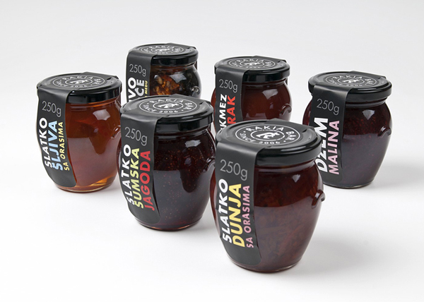
Independent design agency Coba & Associates were recently commissioned to develop the packaging for a new range of preserves created by Rakia, a bar located in the centre of Belgrade that offers a mix of local and exclusive coffees, spirits and snacks, which has grown to include a gift-shop selling a variety of high quality, traditional own brand ranges.
“What set us opening Rakia Bar is the fusion of our love for Belgrade and Serbian tradition and our wish to present a characteristically Serbian product in a contemporary way.”
– Founder Branko Nešić
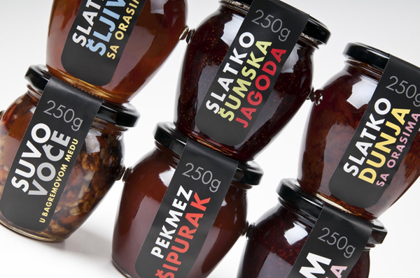
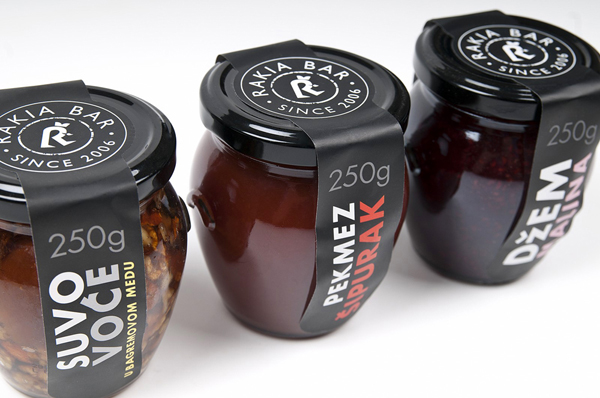
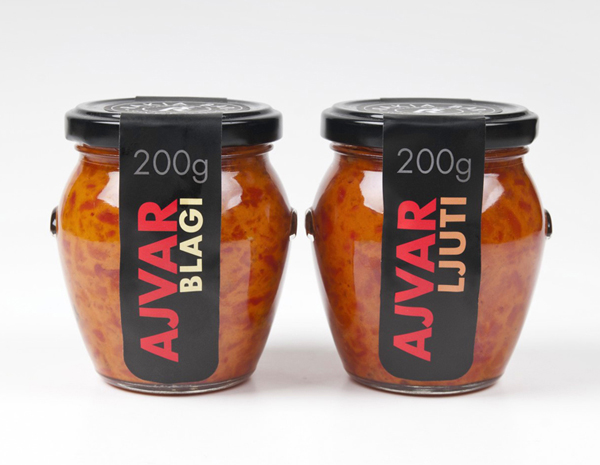
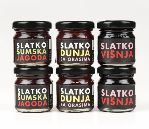
While the diacritics make the characters a little tight in places, Coba’s type only solution neatly juxtaposes a modern, weighty and geometric sans serif, a simple die cut, black satin adhesive label alongside a soft craft-based pastel colour palette and a traditional, high gloss structural design. It is a smart contrast of classic and contemporary design cues that deliver a distinctive and unique resolution of handcraft and exclusivity.
