Accents Decoration by La Tortilleria
Opinion by Richard Baird Posted 1 August 2012
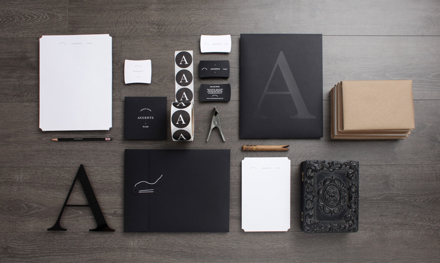
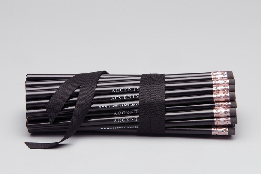
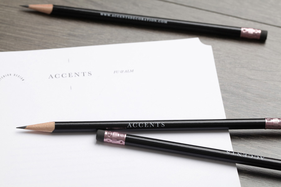
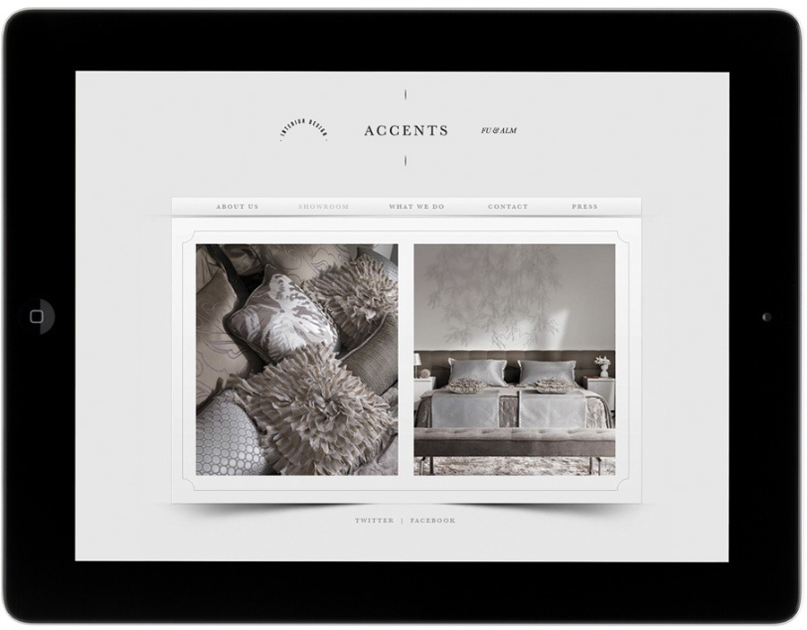
Accents is a MX based home furnishing, lighting, interior design service and retailer established in 2005. Their new brand identity, created by La Tortilleria to coincide with the brand’s sixth anniversary and which included logo, stationery and website design, is a wonderful and communicative union of die cut detail, sans serif and serif type, fine lines, uncoated and varnished textures and a simple monochromatic colour palette.
“We had two girls, one business and a whirlwind of creative ideas ready to be shared. They wanted to boost the look of their boutique and we were definitely up for the challenge. In this project, our main goal was to highlight the meaning of an accent and its importance in different settings to create a unique space. With that in mind, we decided to give a face-lift to their image for their sixth anniversary to mark the beginning of this new phase. The ultimate makeover included a new logo, website, shopping bags, tags, stationery and presentation materials which are the undeniable portrait of absolute style.” – La Tortilleria
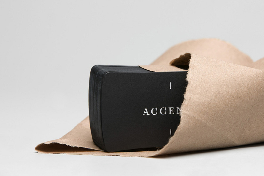
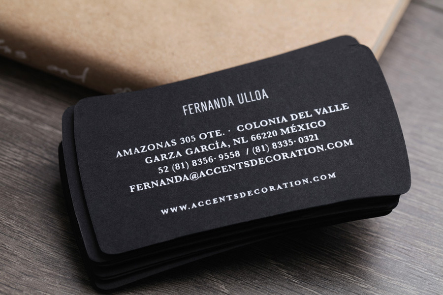
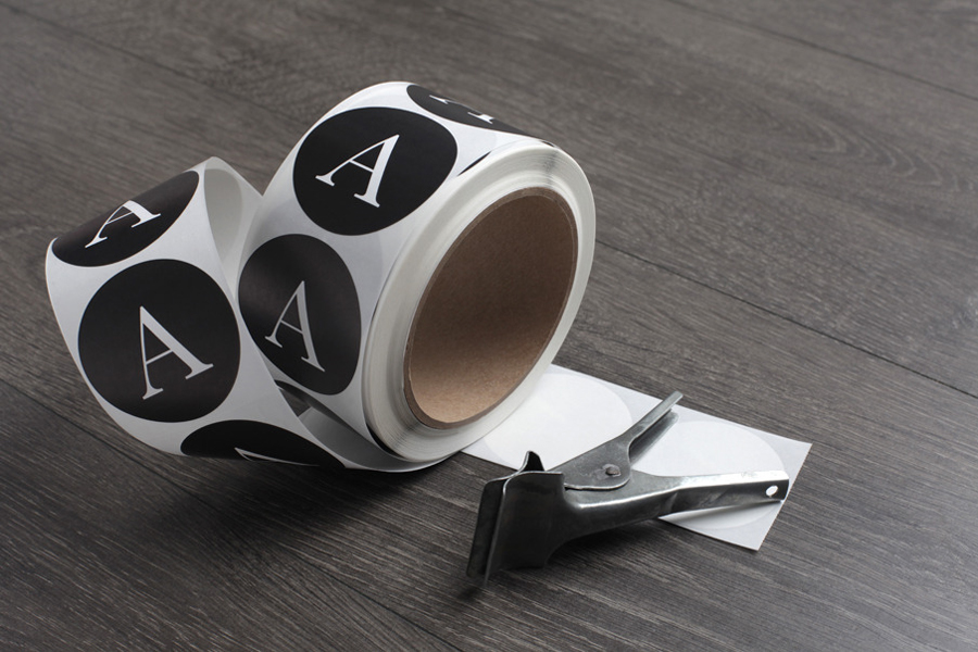
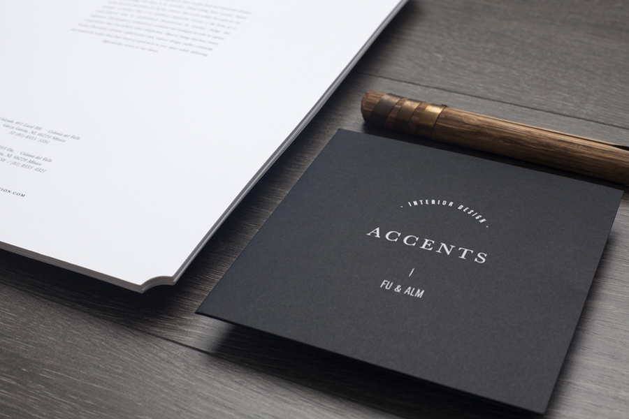
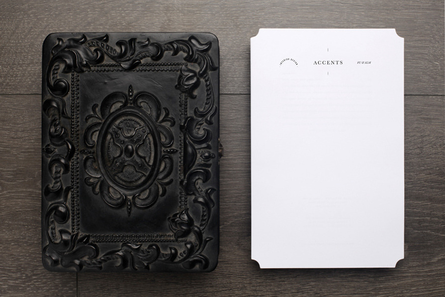
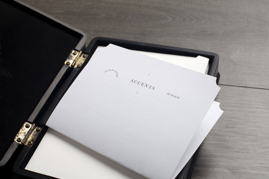
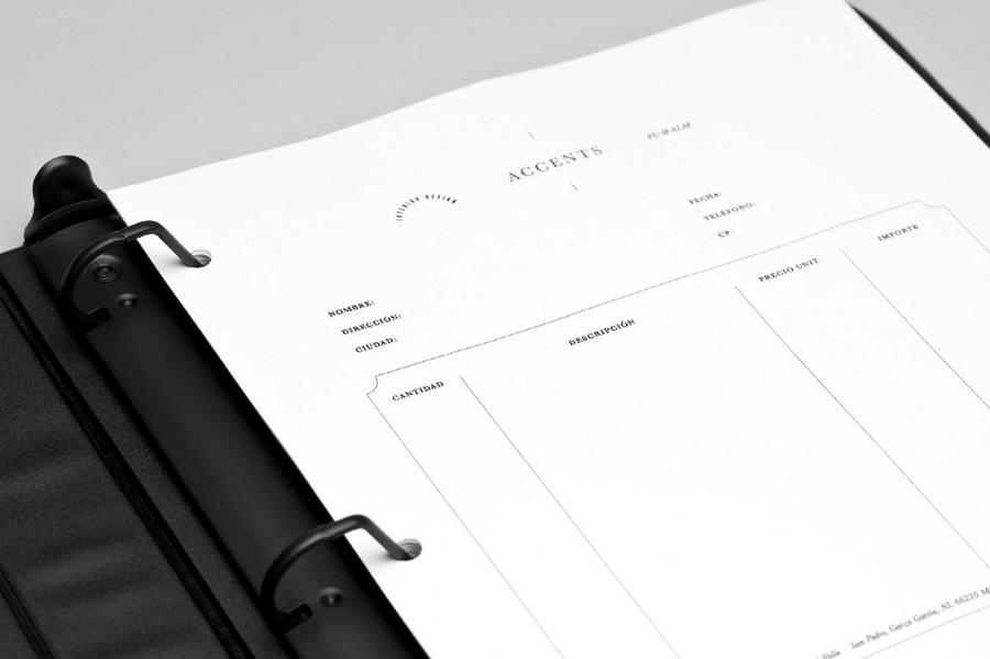
The highlight of this identity project clearly lies in its printed execution. The subtle use of die cut detail around the corners of the headed paper and the concave edges of the business card both have an unusual and antiquarian quality that suggests an understanding of classic/vintage furniture and traditional design ideas. This is neatly countered by a more contemporary combination of an uncoated substrate, sticker treatment and a white on black that introduces the themes of craft and creativity. The fine line work, type and layout of the invoice and logo-type suggest an attention to detail while a monochromatic colour palette delivers an appropriate sense of restraint, simplicity and sophistication.
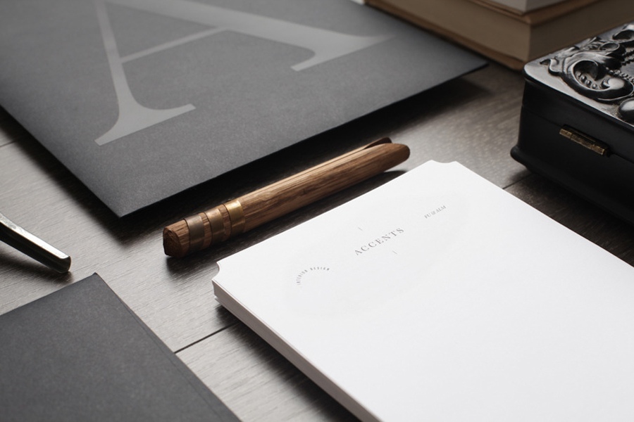
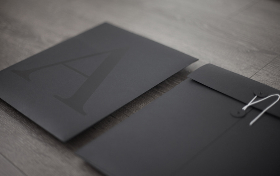
For me there is also an underlying architectural quality in the oversized triangular and structural nature of the A and its contemporary UV varnish treatment across the envelope that, alongside a modern white on black colour choice works quite well to draw on the influence light and shadow have on the built/furnished environment.
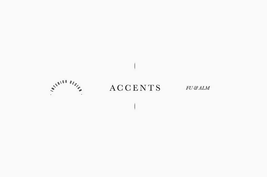
The logo-type’s unconventional horizontal and uppercase line-up of tall sans serif, classic serif, italics and ornate flourishes reflect the individual qualities of the print work (the subtle juxtaposition of the classic and contemporary, bold statements and fine details) with an uppercase formality and confidence that suitably conveys a flexible service founded on a broad range of experiences and knowledge.
