Hotel Daniel by Moodley
Opinion by Richard Baird Posted 1 August 2012
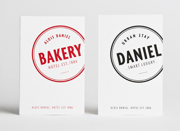
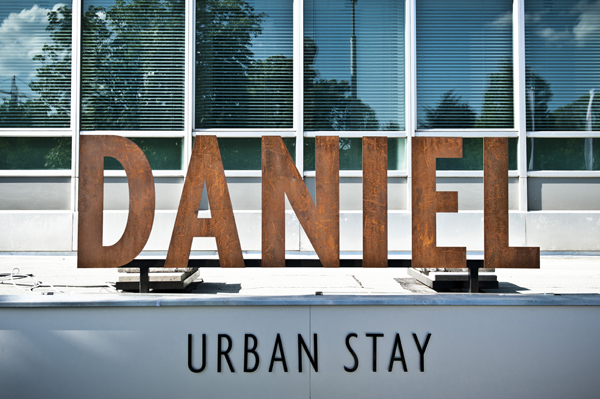
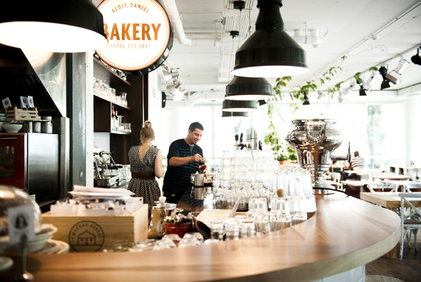
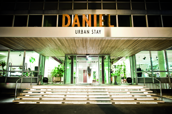
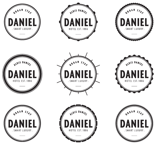
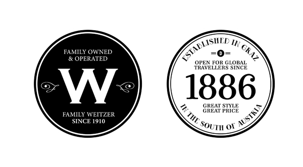
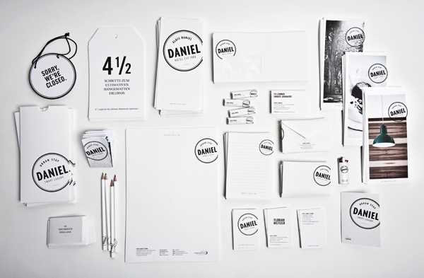
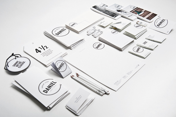
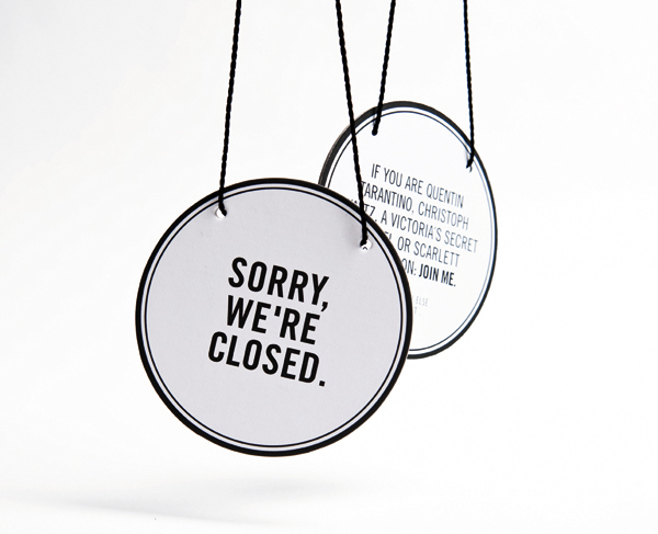
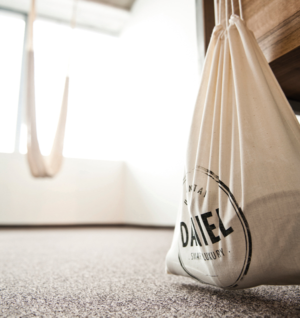
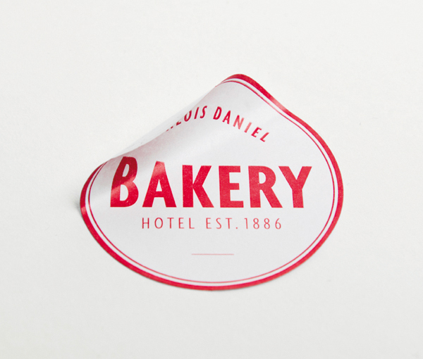
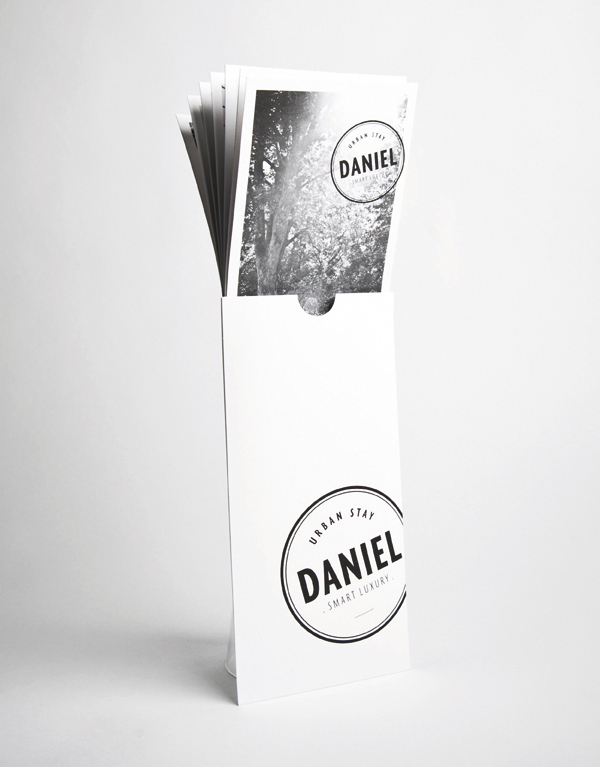
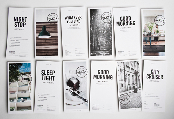
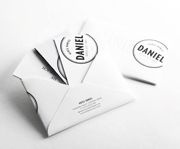
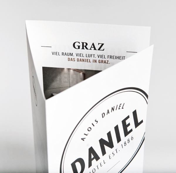
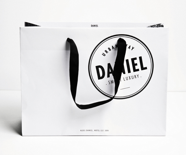
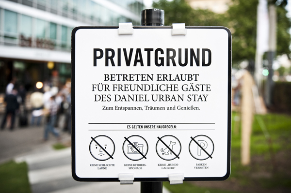
Daniel is a hotel located in the Austrian cities of Vienna and Graz with a smart, urban, luxury proposition and a history dating back to 1886. Daniel’s visual identity, designed by brand specialist Moodley, reflects the contemporary simplicity, high quality, personal service and heritage of the brand through a stamp based logo-mark, plenty of white space and subtle texture.
“Simplicity instead of flamboyant excess and fresh ideas instead of awkward hospitality. The hotel’s owner, Florian Weitzer, calls it “Urban Stay / Smart Luxury” – perfectly tailored to the needs of the modern traveller. “Smart Luxury” doesn’t force anything on you, instead it offers possibilities and inspiration. This also applies to the design of the entire hotel, which is the polar opposite of heavy and sedate. And this is what is called stylish reduction in corporate design. There’s no “just pretend” but rather “be yourself”. Simple black and white with a personal touch.”
– Moodley
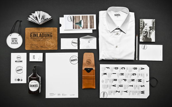
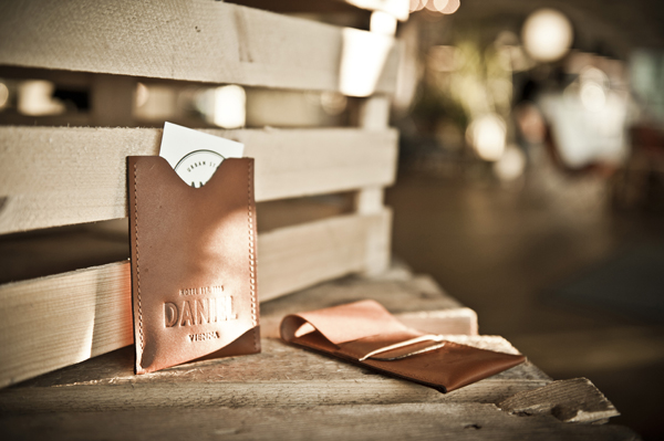
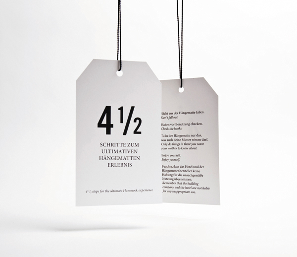
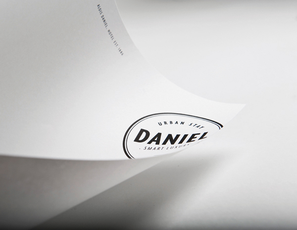
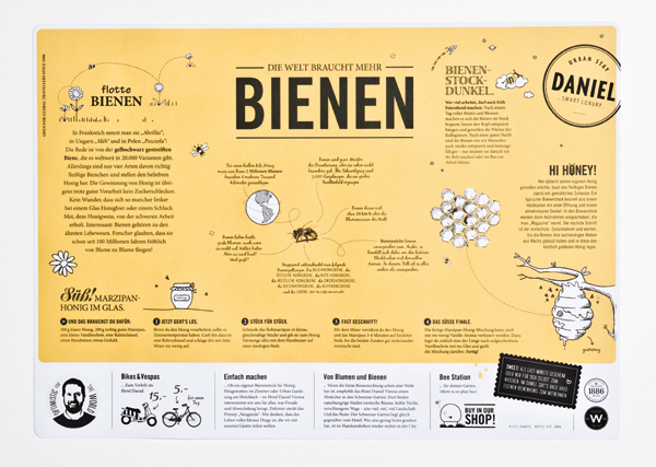
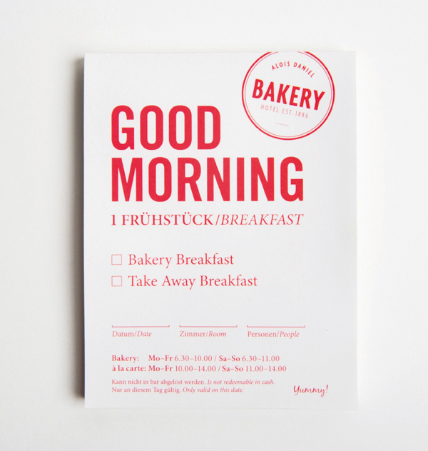
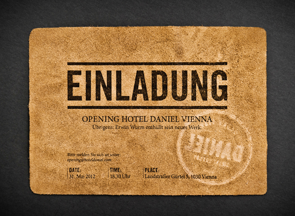
The contemporary combination of tall uppercase sans serif letter-forms, roundel, stamp execution and a mix of type and line weights is a familiar aesthetic but one applied with meticulous consistency across a broad collateral line-up with a distinctive linen freshness, lightness and restraint. The subtle embossed texture of the uncoated substrates alongside a tan leather introduce a nice sense of fine detail and classic luxury while the stamp treatment keeps it personal and neatly draws in, through its traditional seal like construction, a subtle reference to the heritage of the brand.
